ThePessimist's Content
There have been 63 items by ThePessimist (Search limited from 04-June 23)
By content type
More filters
|


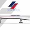
Aerospatiale-BAC Concorde Transaérienne 1984-2003in TransaérienneGreat work a creative story and two plausible liveries. I actually really like this more modern neuvo livery on the Conky. Appreciate you for taking the time that this aircraft deserves! |
|

|
|


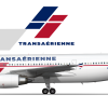
Airbus A300-600 Transaérienne 1984-2003in TransaérienneThe logo has nice symmetry it's quite basic but manages to be quite fresh which is a great combo. Particularly interested to see the livery canonically before this one |
|

|
|


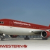
Midwestern “Burgundy Blaze” Boeing 767-300ER (1998)in Midwestern AirlinesThis is some nice work fitting onto the 3D model. The highlights seem to me particularly well done. |
|

|
|


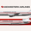
Midwestern “Scarlet Voyager” (1979)in Midwestern AirlinesI think that of the liveries you posted this one is the weakest for the Midwestern brand and given that the 80s are my spiritual home and this is a livery that supposedly existed for most of the 80s I have comments. I think for one the United callback is a little too strong here and ends up feeling a little more derivative than you want to be. As much as some airlines did carry relatively minimalist majority white liveries through this period you'll make something that feels much more quintessentially 80s if you go for lots of colour. Specifically, the font looks good but particularly with the low belly this just doesn't fit quite right into the period its supposed to represent. Overall good work and I look forward to more lmk if you have questions. |
|

|
|


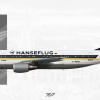
Hanseflug | Airbus A300B4in EverythingOther than looking remarkably evil this is a very clean livery. I particularly think the nose area and the wing behind the cockpit windows is great. |
|

|

|


Airbus A330 900neo Viasain VIASA - Venezolana Internacional de Aviación S.AThis livery wasn't a great fit on the A350 with its pointiness but this has a certain kinda retro flair and charm on the 330neo |
|

|
|


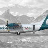
ATR 42-600in Northern AirwaysIn fairness I think this refresh fits better here and looks pretty slick on the ATR |
|

|
|


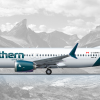
Boeing 737-8in Northern AirwaysI liked the old tail but I can see this as a logical and entirely believable modernization even it really removes the very nice feeling of the constellation. I guess I can accept the font change as maybe realistic too but I'm not a big fan it's a little chunky and looks too Tonka-truck-looking for my taste given that I see this airline as having gone and continuing to go for a somewhat more upscale carrier. |
|

|

|


Private Ownerin Livery #1What a sleek and modern looking livery. The gold is a little anemic green but this has a good look to it good work. |
|

|
|


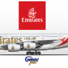
Emirates A380 800in 1:400 Scale model recreations
I think what you mean to say if you'd like to try using a dabble of decorum is: Thank you for your comment. I agree that the fuselage isn't quite right, but this series intentionally recreates the models I own as they appear. In this case, as has unfortunately been the case a few times, the model is not entirely accurate. Good eyes though! |
|

|
|


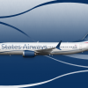
Flowing into the futurein States AirwaysAs a final evolution of this brand it's ok. I think the retreat to the cubes is an interesting way to do US Airways but be a little more interesting than US Airways. It just isn't great though it clashes with the flowy ribbons on the fuselage. This brand shows a lot of promise but I think could use a reevaluation top to bottom |
|

|
|


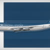
Jetting the 70sin States AirwaysI think that this is an interesting logo but I prefer the former one. The logo in this context ends up looking a little overly simple and un-iconic. I actually think this top shape is super cool it's very organic and unique but it's much more 90s/00s experimental than 70s. |
|

|
|


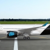
Pacific Airways | A350-900 | Hibiscus Liveryin Pacific AirwaysA) Correct the font is bad. Arial bold and italics is not a good look. 1001fonts.com is a good first source. B ) This is silly argument that is infinitely reductive. If no one can discuss/critique things outside of their personal lived experience then none of us can talk about real airplane liveries because we've never designed for an actual plane. Further, I can't say murder is bad because I have never committed nor have I been murdered. Less abstractly, someone can say something is unappealing without being able to design something of their own. Any other paradigm is self serving and absurd. Dearest RO, you have largely reduced yourself to a contrarian on the gallery waiting to contradict people who make what you perceive to be mistakes. I know that you can provide constructive feedback and do something more productive than picking silly, pointless fights so please do more of the former than the later. C) On top of the font, I also think the colours and overall brand identity is very underdeveloped it feels a bit like Hawaiian but with an atrocious colour scheme and less personality. A font will help but it also doesn't look like you quite got to a unique enough spot where the foliage goes from looking like clip art to something an airline is likely to use as a signature of their brand identity. |
|

|
|


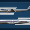
Into the Jet Agein States AirwaysThis is a pretty cool brand. Name is a little mid but the colour scheme is nice and particularly the Connie livery is great the arrow on the fuselage is an unusual but distinctive touch. I think the 707 livery is a good base but doesn't fit well on the fuselage particularly the lines over the windows don't look great, airlines were generally pretty careful to make sure the windows make some sense and don't interrupt/disturb the patterns of the livery. Additionally, the poster is super cool quite well done but I think the Jetting into tomorrow text is a little modern fontwise and the 707s direct text is too small. |
|

|
|


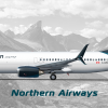
B737-800QCin Northern AirwaysThis has ended up quite nice. Tail is still looking great and the level of detail is great. Hope that we get something to this effect in real life |
|

|
|


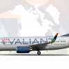
2023 - Boeing 737-700in Valiant Airways
woot woot triple woot looking forward to seeing what you cook up |
|

|

|


2023 - Boeing 737-700in Valiant Airways
The fuselage is grey That's all I have to say Hope you have a nice day. |
|

|
|


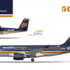
ME 50 Yearsin Maine AirwaysThis is a good look excited to hear more about the history of MAT |
|

|
|


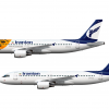
Iranian A320sin v3Transaero vibes are nice and cool |
|

|
|


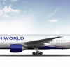
1997 | Boeing 777-236ER + New Yorkin British World AirwaysLove to see our big blue British friends. Tail looks great on the 777 |
|

|
|


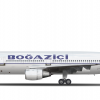
bosphorus air transport dc-10-10in real life and template creationsI feel like this has some real potential it is interesting but as is it is deeply unfinished and unrefined leaving it feeling empty and "weird". |
|

|
|


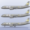
2007 - Airbus A320 - 'Support Our Naval Aviators' Specialsin Westwind
Thanks y'all |
|

|
|


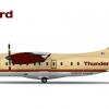
Thunderbird Airlines | Dornier 328-100in HorizonsLove the logo don't love the colours you ended up with I know it's a little overdone here but there's a reason that beige/brown tones and reddish orange are so popular here and it's because it just works. I think if you want the other direction the idea of the Thunderbird being you know a bird and so trying a light sky blue might be a cool look |
|

|
|


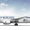
2022 | Samurai Blue 787-8in Nippon AirlinesEnjoy the blue raspberry bird |
|

|
|


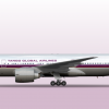
1991 - Boeing 777-200in Tempest
Thank you |
|

|

 Sign In
 Create Account

