Jump to content

Photo

Making a clean, crisp livery.


  • Please log in to reply
84 replies to this topic

#41
X-Wing @Aliciousness

X-Wing @Aliciousness

    I think you'll like them!

  • Member
  • 1,760 posts
  • Website:https://my.flightradar24.com/agremeister

Oceanic's livery is said to look nice without much detail. I tried the same with CAS but instead it was deemed too boring. What's the difference?


It's like asking why Air France's livery is good and why China Eastern's is bad: They're both simple, but one is good and one is terrible. It's almost as if good design has nothing to do with how simple or complicated a design is but instead is about aesthetics, conveying a message, and eliciting an emotional response in the viewer. Shocking, right?


Since this thread is about critique and understanding what makes something good and what makes something bad, I'll give my honest explanation of why I like and dislike some liveries and hopefully that gives others insight into what they can do to improve their work.


I'll start with Wright Brothers. I mean it when I say this is my honest opinion, and it has nothing to do with who designed it. I'm merely critiquing it based on what makes corporate identity successful or not.


gallery_104155_1776_2396.jpg


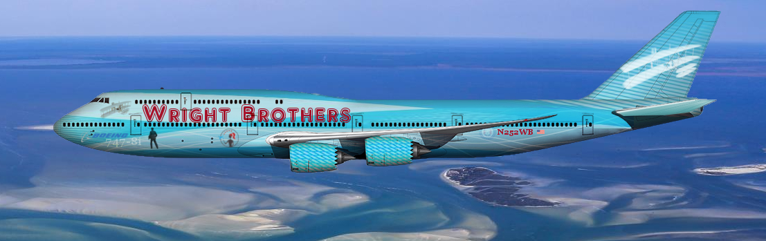
Lets start with what a livery should do: It needs to identify the company, elicit emotions in the viewer that the company would like to project, and be aesthetically pleasing, in that order.


First, we'll start with identifying the company. The livery is only mildly successful in this aspect, it's unique for sure and there's no way you're going to confuse it for a different airline's aircraft. However, the titling isn't exactly clear and from a distance it would be hard to read. Also, the logo is very complicated, and lacks contrast that would make it easily identifiable when scaled down or viewed from a distance. On top of this, the silhouettes and other images posted on the fuselage distract from the titling and compete for the viewers attention. If I showed a random person this plane for 1 second, I suspect many people would not be able to then tell me what airline this was. This also goes for the logo. If an average person only had 1 second to look at the tail of the plane and was then asked to draw the logo on it, they would have a lot of trouble with this.


Secondly, it needs to elicit the emotions in the viewer that the company would like to project. Traditionally for airlines this would be things like Safety, Confidence, Reliability, and other neutral feelings like that. In the case of this livery, the colors do not work well together. Dark red text on a light blue background is both hard to read and not aesthetically pleasing. Overall, I think the average person would look at this livery and be confused as to what it was trying to be, or otherwise would not know what to think.


Thirdly, it needs to be aesthetically pleasing. I've made my view clear on this, but I suppose it's a personal opinion. However, I can say with absolute certainty that no one in any design profession would rate this well.


Let's look at a more successful livery: Middle West. This was posted by N664US and I commented that I thought it was really quite successful, so I'd like to take a look at why.


gallery_85332_1769_20890.png


Firstly, identifying the company. The livery is a bit generic in terms of its absolute design. However, Green is a lesser used color in airline liveries and so that does help. The logo, however, is extremely successful. It's simple, the symbology is obvious, and if I showed it to a random person for one second, I suspect they'd do a pretty good job of drawing it. As well, it can easily scale up and down, and be depicted in monochrome or color and still be recognizable. The titling is also clear, easy to read, and there are no extraneous details distracting me from the important aspects on the image.


Secondly, it needs to elicit good feelings in the viewer. When I look at this plane, It looks like what I expect an airplane to look like. Silly, I know, but when people who don't fly often get on a plane, they don't want any surprises. It's a clean, simple, look and that projects calm, uncluttered emotions in the viewer, which in turn give them confidence that they're boarding an airplane owned by a company they can trust.


Thirdly, it needs to be aesthetically pleasing. Here, again, the livery is sucessful. The titling is clean, easy to read, and appealing. The logo is also nice, and I'd enjoy looking at it etched into a wine glass in first class, for example. The pattern of the wheat flower could also be used to create bespoke patterns that could be used on things from cabin dividers to linens to flatware, creating a total brand experience that delights the viewer and helps to reinforce the brand image at every point along the customers journey.


Branding is complicated, there's a reason companies pay millions of dollars for trained designers to create and manage their brand image. Customers opinions of a company are always changing, and being reinforced by every detail they interact with a brand. The more simple, pleasing, and delightful the experience, the more likely the customer will have a positive image of the company even if they have had bad experiences as well. On the other hand, unsuccessful branding can reinforce negative images of a company, and even if they have good experiences otherwise.


The accusation that I'm somehow "trolling" when I give my opinion or otherwise am not honestly stating what I think of people's work is, frankly, insulting, and I want to make it clear that when I offer my opinion, I'm offering it for the good of the designer. On the same token, I appreciate when others make honest and candid comments on my work so that I can improve it, and I truly do take those opinions to heart. 


UbxSbIt.png


#42
Zacca

Zacca

    AE nostalgic member

  • Member
  • 1,738 posts

Ladies and gentlemen, it's a video game. 


Realism is only important to a small group... an elite few.... "oldtimers"


You need to remember that it's okay to be nice to people who think different. I don't want my livery to be real. This isn't a doll house to me. What I choose to create has no bearing on my ability to create what I want.

Yeah but some people want their liveries to look real, they want realism. that's why we use Med's templates because they look real. when Sal Weedman asked for advice on making a clean, crisp livery and mentioned amateur Photoshop artists and the very talented artists he was looking for advice from the very talented artists. and do you know who are very talented artists? Agre, Vision, Stevphfeniey, Oggey, Brad, Med and so others. Because they put a real effort on their work, an effort that you can't see in some real liveries; they design their own logo, sometimes create their own fonts, they develop concepts, take care of small details, they know what they do and they do it well. And if you don't want all this realism, that's okay, it's your life and your liveries and you can do what you want. But please, don't come up saying that someone's livery is easy to be done and you could do it in five minutes because yeah, you could re-create Oceanic's livery in less than five minutes, yeah that's easy, but before that, come up with a original idea that can fit a real airplane, with a good name, a good logo and a good font, all created by yourself. Once you do that, then you'll be the king of AE.


#43
Avelo

Avelo

    ae4ever

  • Member
  • 1,328 posts

User's Awards

5    2   

How long you have been a member.


*Drop's mike and goes back to actually playing*

Since December 26, 2012.

#44
Stevphfeniey

Stevphfeniey

    Bad m*****f*****

  • Member
  • 4,249 posts
  • Website:http://stevphfeniey.tumblr.com/

Oceanic's livery is said to look nice without much detail. I tried the same with CAS but instead it was deemed too boring. What's the difference?


I gotta say I like CAS quite a bit for just the sheer persistence you've put into making it go from something not so good to something that's becoming quite excellent. Like going from the kinda stereotypical Canadian leaf design to a ****ing flying reindeer is one of the more impressive things I've seen in the livery making community here. 

Is it professional quality? No. But nothing here is, but you lend credence to some of the advice given in this thread that all it takes is time, patience, and a willingness to evolve a design for the better. 


Quit hanging your head down, CAS is fine and can only get better if you keep at it. 


please don't kill us we're just the aquabats


The Best Discord Server


#45
X-Wing @Aliciousness

X-Wing @Aliciousness

    I think you'll like them!

  • Member
  • 1,760 posts
  • Website:https://my.flightradar24.com/agremeister

I'd like to echo what Steve said, CAS has come a long way and you have really shown a lot of improvement in your design.


I'd also like to offer up an interesting way to approach designing a livery, or really any piece of corporate design:


Imagine 3 people: One person will look at your design for 1 second. Imagine a child watching one of your planes taxi by, or someone walking past your check in counters at the airport. How do you grab their attention and make sure they see the necessary information? This would most likely be a company name and logo, but this could different depending on the case. Either way, the goal is to make the necessary information clear, easy to read, and the first place the viewer's eye goes when they look at your work.


The next person will look at your design for 10 minutes. In the case of an airline, imagine this is someone who is flying your airline for the first time, but isn't a frequent flyer or otherwise isn't going to pay attention to something unless you give them a reason to. How can you reinforce your brand identity? This is where the quality of your design work starts to make a difference. Aesthetically pleasing things will draw their attention, and a successful designer will make use of this attention to help reinforce the image the brand wants to be associated with.


The next is someone who will use your product every day. In the case of an airline, this would be a top tier frequent flyer for example. How can you continue to delight them? In what ways can you get them to keep their attention focused on you, the airline, and prevent them from becoming bored or otherwise longing for a new experience? Small touches make the difference here, from bespoke patterns as mentioned above to customer experiences beyond the ordinary or expected.


Keeping these three people in mind will really help you to focus in on what is necessary in your designs, and to help eliminate the fluff that doesn't help you to succeed in the goals I mentioned earlier.


UbxSbIt.png


#46
FearofFlying

FearofFlying

    AE Luver

  • Member
  • 275 posts

nope... nobody would ever recognize this...


2001-50-state-quarters-coin-north-caroli


#47
Hans.

Hans.

    I just really like airplanes

  • Member
  • 188 posts

User's Awards

   3   

Something I've noticed about the gallery is the extreme variation between amateur Photoshop artists and the very talented artists. In my recent works, I've been unsatisfied in the overall look. It looks cheap and rough. I've wondered about what steps I can take to create a crisp and clean looking livery, whether it be brighter colors, layering, masks or etc. What are some ways I can make a livery look "real" or to just improve the overall quality?

So, I haven't been making liveries for very long, but basically the main thing is studying the major real-life brands and some of the good AE brands. Get a feel for what kind of airline you want and the image you want to portray. Try to replicate the feel that you get when you think of Lufthansa, KLM, British Airways, etc. Then refine it until its good. It doesn't have to be spectacular, but it should be reasonably like any real-life airline livery in its quality.


For example, when thinking of the feel you want, really bright colors are usually not a good idea (unless you're making a LCC). In that case, then you would want a similar feel to easyjet, jetBlue, Southwest, etc. Remember, it's not just about the livery, the brand itself is usually what makes the livery strong. Think about what the brand might look like on signs, printed materials, uniforms, etc. 


Also, make sure to properly use layering, masking, etc. It makes everything look much neater. There are some good posts on the forums about techniques and also videos online.


Happy designing!  :)


   uw_sig2.png


#48
X-Wing @Aliciousness

X-Wing @Aliciousness

    I think you'll like them!

  • Member
  • 1,760 posts
  • Website:https://my.flightradar24.com/agremeister

nope... nobody would ever recognize this...


I suspect the average person has no idea what the wright flyer looks like.


I don't really want to get into what makes a good logo, but the general rule of thumb is that if a child can draw it with a crayon and an adult could recognize it, it's a successful logo.


Also, you should read the rest of what I wrote. I think you'll find it constructive, and I put a lot of time into writing it so that you could improve your work.


UbxSbIt.png


#49
Zacca

Zacca

    AE nostalgic member

  • Member
  • 1,738 posts

nope... nobody would ever recognize this...


I wouldn't. I'm Brazilian. Actually, I have no idea of what that is. if you fly from Baton Rouge to Topeka people would easily recognize whatever that is, but it wouldn't work flying to Brazil or France, or Argentina, Uruguay or any other country that isn't the United States


#50
X-Wing @Aliciousness

X-Wing @Aliciousness

    I think you'll like them!

  • Member
  • 1,760 posts
  • Website:https://my.flightradar24.com/agremeister

I wouldn't. I'm Brazilian. Actually, I have no idea of what that is. if you fly from Baton Rouge to Topeka people would easily recognize whatever that is, but it wouldn't work flying to Brazil or France, or Argentina, Uruguay or any other country that isn't the United States


Even then I think people wouldn't know what it is. People know who the wright brothers were, and I'm sure some have seen the photo of them flying in a school textbook, but I suspect if you showed a picture of the wright flyer to the average american, they would have no idea what it was other than "it's an old airplane". Show them a silhouette of it, and I suspect they'd have no clue what it was.


I honestly think if you showed a random aviation enthusiast person this picture, they wouldn't know what it was, and even if they did, it would take them a few seconds to figure it out.


Sc0O4x7.png


This is even fairly easy, and these are the kind of conditions a logo needs to succeed under. Imagine this embroidered on a polo shirt. Is there any way you'd be able to tell what it was? it'd just be a blob.


UbxSbIt.png


#51
FearofFlying

FearofFlying

    AE Luver

  • Member
  • 275 posts

The point is you have a version of what you like, and you berate anyone who disagrees. 


gallery_85332_1769_20890.png

There are giant clouds running from the top of the first letter D all the way past the registry.


The middle bright green stripe is corrupted from where the rocky mountains used to be before it was over posterized.


The bottom has artifacts of trees and a field of grass, which overall have the textured appearance of a dirt road.


......


The detail on the hatch is pleasing to the eye as is the logo, but real life paint jobs are not green for good reason...


~Planes are white in real life or specific colors because bright sunlight fades them quickly.

~Control surfaces and areas exposed to direct sunlight are normally left white to keep the aircraft cool and safe.

~Radar domes in the front must be left natural or very lightly colored.Never black.


Listen up man.... you are like one in 1,000 people here trying to build some real life brand. I don't want to dream up napkins for a real company and make sure everything is perfectly sterile so the mechanics can find leaks and keep down operating costs. This isn't a fantasy for me, its just a video game....


I was the kid drawing race cars with tigers and f-16's on them because why not... each to there own... i like the wright brothers... so i made a kick ass plane to commemorate it... i should have put tanks on it also #merica  .... its a video game...


instead of appreciating it for what it is...  you try to make it into what it isnt... how long have you all been at this lmfao??? 


people like the green plane because it looks cool... simple as that...nobody but a smaaaaaal handful stop to think about brand recognition... weirdo...


#52
Stevphfeniey

Stevphfeniey

    Bad m*****f*****

  • Member
  • 4,249 posts
  • Website:http://stevphfeniey.tumblr.com/

how long have you all been at this lmfao??? 


Idk about Agre but I went to college for this sort of thing (which is weird because I actually ended up as an engineer and drafter for telco).


Anyway another recommendation I have, and I realize this might not be an option for some, is to print out things you create on the computer. I used to do this quite often because I used to work as a printer, and I found that it really helps you look at what you've created in a new light (quite literally) in a new medium. You know colors that look great on the screen might look like ass when taken out of that environment and put into a new one. 


please don't kill us we're just the aquabats


The Best Discord Server


#53
X-Wing @Aliciousness

X-Wing @Aliciousness

    I think you'll like them!

  • Member
  • 1,760 posts
  • Website:https://my.flightradar24.com/agremeister

This is a thread where someone asked how to make a good livery, and we're responding with our answers as to what makes a successful livery. 


Also I think it's important to state when it comes to successful or unsuccessful liveries is that the template doesn't matter. A successful design will be successful even without the template at all. A good logo is a good logo no matter what it's on. The only "benefit" of a good template is that it makes bad designs look okay, since they're easier to imagine on a real plane.


That's also why people like med's templates: they're photorealistic. The proportions are bang on, they reflect the environment around them like a real plane, and they have correct engines and other options. If the point of this game is to pretend to run a real airline, then it's not surprising people like having their airline's livery on a template that looks like a real plane :P


UbxSbIt.png


#54
FearofFlying

FearofFlying

    AE Luver

  • Member
  • 275 posts

 If the point of this game is to pretend to run a real airline, then it's not surprising people like having their airline's livery on a template that looks like a real plane :P


The point is to run a fantasy airline, not a real one. For me at least and the vast majority of people who actually play instead of rage here all day....


#55
X-Wing @Aliciousness

X-Wing @Aliciousness

    I think you'll like them!

  • Member
  • 1,760 posts
  • Website:https://my.flightradar24.com/agremeister

The point is to run a fantasy airline, not a real one. For me at least and the vast majority of people who actually play instead of rage here all day....


Then don't comment in a thread about making liveries better or more realistic, doesn't seem that hard?


UbxSbIt.png


#56
FearofFlying

FearofFlying

    AE Luver

  • Member
  • 275 posts

Then don't comment in a thread about making liveries better or more realistic, doesn't seem that hard?


I didn't. I commented in a thread about making liveries "clean" and "crisp" ... which is why I suggested not using templates with unclean and uncrisp artifacts.


You are the one projecting your own values of realism and equating it with better or higher quality. Pretentious AE 1% at it's finest.


#57
FearofFlying

FearofFlying

    AE Luver

  • Member
  • 275 posts

Idk about Agre but I went to college for this sort of thing (which is weird because I actually ended up as an engineer and drafter for telco).


Anyway another recommendation I have, and I realize this might not be an option for some, is to print out things you create on the computer. I used to do this quite often because I used to work as a printer, and I found that it really helps you look at what you've created in a new light (quite literally) in a new medium. You know colors that look great on the screen might look like ass when taken out of that environment and put into a new one. 


One of the first things they teach you in designing things is the difference in RGB and CYMK....  maybe you are just acting like you know something or maybe you actually do... but saying things like this make me wonder....


#58
Stevphfeniey

Stevphfeniey

    Bad m*****f*****

  • Member
  • 4,249 posts
  • Website:http://stevphfeniey.tumblr.com/

Oh this is coming from practical experience. I remember I learned the hard way of rushing, making a nice presentation board in Illustrator (which by the way is set to a CMYK color environment by default if I remember right), not doing a test print of it on our nice large format plotters a few days beforehand to make sure that the final color I ended up with wasn't piss yellow/green, which it was. Or at my old printing job whenever we'd come out with a new color for our products we'd always run some print tests on various paper stock even if we were 100% certain it was going to be fine.


The point I've been trying to make this entire time until we got sidetracked is just take your time, use the tools at your disposal (including just a Google search for precedent and inspiration), if you're not sure about an idea you've got ask somebody, and when the time comes pull a Bob Ross and let paint hit the canvas until you're satisfied with your result. That last bit might mean scrapping your work a dozen times until you're happy.


Oh on the subject of color. If you're designing a logo completely from scratch (which I'll recommend you do 100% of the time), make sure to do it in black and white first then add in color later. It helps with getting the form down, which in the end I think matters more than what color it is.


please don't kill us we're just the aquabats


The Best Discord Server


#59
FearofFlying

FearofFlying

    AE Luver

  • Member
  • 275 posts

Oh this is coming from practical experience. I remember I learned the hard way of rushing, making a nice presentation board in Illustrator (which by the way is set to a CMYK color environment by default if I remember right), not doing a test print of it on our nice large format plotters a few days beforehand to make sure that the final color I ended up with wasn't piss yellow/green, which it was. Or at my old printing job whenever we'd come out with a new color for our products we'd always run some print tests on various paper stock even if we were 100% certain it was going to be fine.


The point I've been trying to make this entire time until we got sidetracked is just take your time, use the tools at your disposal (including just a Google search for precedent and inspiration), if you're not sure about an idea you've got ask somebody, and when the time comes pull a Bob Ross and let paint hit the canvas until you're satisfied with your result. That last bit might mean scrapping your work a dozen times until you're happy.


Oh on the subject of color. If you're designing a logo completely from scratch (which I'll recommend you do 100% of the time), make sure to do it in black and white first then add in color later. It helps with getting the form down, which in the end I think matters more than what color it is.


+1  ....I remember my first plotter pre-internet running on a tandy...


I agree with all of this except for the logo part... I'm okay with using things i find here and there....if its just for fun... but yea if your designing from scratch do it in b&w


#60
FearofFlying

FearofFlying

    AE Luver

  • Member
  • 275 posts

To the OP -


I liked your "Mountaineer"  brand... its not plain white but its not full blown crazy like i prefer...  so I tried to spend a few hours making a version i think describes what crisp and clean looks like.


To the peanut gallery... sure the image on the tail is highly unrealistic.... but if you can move beyond that and look at the shading ect... its a fun concept...  no it wont be competing with delta for brand recognition... its just fun... and thats what we are here for... fun...


Attached Files


0 user(s) are reading this topic

0 members, 0 guests, 0 anonymous users