
 Sign In
 Create Account

Something I've noticed about the gallery is the extreme variation between amateur Photoshop artists and the very talented artists. In my recent works, I've been unsatisfied in the overall look. It looks cheap and rough. I've wondered about what steps I can take to create a crisp and clean looking livery, whether it be brighter colors, layering, masks or etc. What are some ways I can make a livery look "real" or to just improve the overall quality?
Making a clean, crisp livery.
Started by EthansInControl, Mar 05 2018 11:10 PM
#1

 Posted 05 March 2018 - 11:10 PM
 Back to top
#2
Posted 05 March 2018 - 11:17 PM
N664US
-
- Member
-

- 93 posts
Taking a break.
Could you provide an example of your works? It's much easier to try and fix things when you can see what can be improved.

#3
Posted 05 March 2018 - 11:22 PM
recent few I've been ok with
Attached Files
-
 AUSJET A330.jpg 21.67KB
0 downloads
AUSJET A330.jpg 21.67KB
0 downloads
-
Air Pacific A350.jpg 27.98KB
0 downloads
-
Freedomnew.jpg 24.98KB
0 downloads
-
mountaineer 2.jpg 74.46KB
0 downloads
#4
Guest_Adam0896_*
Posted 05 March 2018 - 11:25 PM
Guest_Adam0896_*
Guest_Adam0896_*
-

- Guests
Something I've noticed about the gallery is the extreme variation between amateur Photoshop artists and the very talented artists. In my recent works, I've been unsatisfied in the overall look. It looks cheap and rough. I've wondered about what steps I can take to create a crisp and clean looking livery, whether it be brighter colors, layering, masks or etc. What are some ways I can make a livery look "real" or to just improve the overall quality?
As I've stated many times before, one of the keys to a clean, crisp livery is patience. What almost all new players seem to do is whip up something quickly that they think looks good and then spam it onto the gallery. Well, I hate to break it to everybody but that method only works maybe 2% of the time.
All of AE's most recognizable brands (for example, The Majors) weren't just thought up and conceived to perfection in a week's time. These were brands that have gone through constant critique and revision over a long period of time. Brands like Oceanic, Vanguard, NAA, VOL, Columbia, MidAmerican, NEA, Aerostar, Internederland, Southeastern, and many more, they were all crafted over a long period of time in order to become the brands they are now. That's because the designer behind each and every one of the brands mentioned had patience.
Simply put, if you're able to master the art of patience, you'll be able to create something amazing.
#5
Posted 06 March 2018 - 03:34 AM

#6
Posted 06 March 2018 - 03:45 AM
Stevphfeniey
-

- Member
-

- 4,249 posts
Bad m*****f*****
- Website:http://stevphfeniey.tumblr.com/
My number one piece of advice is to start with a pen and paper, then move into the digital space.
Personally I find that if I write or sketch things out by hand, I have lot easier time working through a wide variety of ideas faster than if I was sitting in front of a computer screen.
#7
Posted 06 March 2018 - 03:47 AM
Stevphfeniey
-
- Member
-
- 4,249 posts
Bad m*****f*****
- Website:http://stevphfeniey.tumblr.com/
Additionally take a little time not creating, but just researching precedent. It's a great way to come up with some inspiration and ideas if you've got a writer's block.
#8
Posted 06 March 2018 - 03:54 AM
FearofFlying
-

- Member
-

- 275 posts
AE Luver
For me, and I understand that my opinion is not in the majority here, the use of a template that has visual artifacts such as clouds, trees, and mountains bleeding through is the root of the issue. No professional work has such things.

#9
Posted 06 March 2018 - 05:16 AM
N664US
-
- Member
-
- 93 posts
Taking a break.
I have to agree with Vision on this one. I remember that about a year ago I had the same resources and templates that I had now, but with a lot less patience to get things done. I eventually began pushing out liveries, but they were jagged, rough, and downright ugly things (I guess the same could also be said for my current gallery). Only when I reformed my livery creation process did I get satisfactory results.
First and foremost: think about the brand first. A livery is meant to be a large vizualization of a brand and what it stands for. AusJet doesn’t really look like much, aside from a kangaroo. From looking at it, I can’t tell if it wants to be an LCC, legacy, flag carrier, or hybrid airline. Air Pacific, on the other hand, is a good example of thinking about the brand first. You can tell precisely what you’re trying to represent and what the brand is all about. Having a set brand allows you to “tune in” on what you want to put in the livery, making it crispier. If you look at Internederland or Oceanic, for example, you find that the refined and minute qualities they have, along with the careful and concise use of colour put off an air of authority and premiumness, exactly what you’d look for in a flag carrier or major airline.
Second: think about originality. AusJet (a mix of Qantas and.JetStar) and Mountaineer (a toned-down Frontier) both lack the originality needed to really make the livery shine. Otherwise, you’re just going to fidn yourself “boxed in” to what the real-life livery looks like. Once again, I look at Air Pacific, agruably the most “original” livery you’ve presented. It’s got a set message that you’ve created for yourself and that you can allow to stretch any way you want. Creativity and originality are key in making a crisp livery; otherwise, you just have a knock-off. Names like Vanguard and Columbia were original, never-before seen ideas, allowing the corporate identity (and livery) to prosper.
Third: look at colours. One of the key ways to get attention and to make your liveries stand out is using colours — sometimes, like with Spirit Airlines or Air Asia, this means using bright yellows and reds. But it doesn’t always have to be that way. Looking at Mountaineer, I mainly see one colour: green. It doesn’t really pop out or contrast with other colours, and it’s kind of dull on its own, preventing the eyes from fully absorbing the livery. Freedom Airlines, on the other hand, is beginning to get there. Multiple distinct colours with high contrast make the eyes wander and absorb. It does, however, have a case of the “eurowhites” — just like modern liveries (lookin’ at Air France and the new Lufthansa), having too much white makes your liveries dull and boring. Staring at a mostly blank sheet of paper has the same effect, not because the colour white itself is boring but because there’s nothing interesting going on. If you look at the tail of Freedom, the stripes allow the eyes to look up and down, then focus on the logo and extraneous details. You want that, but for the entire livery. The crispiest liveries are always ones that never bore you —look at the bright colours of Amstelair or the soothing tones of New England’s blues next to each other as an example.
Fourth: Take time. Make some rough sketches first before you even reach for the computer so you can quickly run through dozens of ideas instead of handcrafting a few logos and giving up. Before you move on to a different step (making the logo, thinking of names, changing the time period, changing the class of service or country), make sure that your previous work is the best it can be. Rushing leads to mistakes, and mistakes leads to sloppiness and blandness. If you look at brands like Midamerican or NAA, you find that they don’t release new things very often, and are some of the oldest galleries here. The actual time and effort used in crafting liveries perfectly means that, although you won’t be pumping out liveries at the speed of light and may not be on the first page of the gallery all the time, you will get a better, crisper, and cleaner result.
Finally: look for inspiration. If you are really stuck, try looking up similar airlines or ones from roughly the same time period to get an idea of wha tou want to make. You obviously can’t take their idea pixel-for-pixel, but you can take the ideas, concepts, and brainstorms from earlier sessions and combine them with these insiprations to make something new. There’s no such thing as a completely original idea — everythinf is borrowed at least a little bit from somewhere else.
I sincerely hope this helps you!
#10
Posted 06 March 2018 - 06:01 AM
SUJETO
 4
4
 2
2

-

- Member
-
- 295 posts
Proud Virtual Airliner since 1989
- Website:https://www.youtube.com/user/CarlosSUJETO
User's Awards
4
2
mmmm
__________________
__________________++
__________________.Eo
___________________zEE;_________________________:
____________________EEEn_____________________:oS;
_____________________EEEE:__:-_____-lcneEg+.*EE--
_____________________*EEOEOEEEEEEEEEEEEEEEEEE-oOEV
____________:;;--+++-oEEOEEEEEEEEEEEEEEEEEEEEEE
__.:::::::.______::::__*CEEEEEEEEEEEEEEEEEEglCS
_.:-+++++++oEECgr**ll*VEECCJJogOEEE::EE__:E
____________;nEE:_______+*El+E-.
Carlos "SUJETO" Vargas Sánchez.
#11
Posted 06 March 2018 - 12:16 PM

I'd say a huge flaw in many liveries today is they absolutely lack any individuality; there's a difference between a bland, realistic looking AE eurowhite and an ordinary bland terrible looking eurowhite. People misuse the way airlines normally create liveries on here to the point that they look like what a toy company would smack on a toy plane.
I'd say the main difference between a bland eurowhite that looks bad contra a good eurowhite here on AE is individuality. A symbol you have either created yourself from scratch or something you have altered heavily is almost a must to me. Free clipart can work in rare cases sure but in general that's almost the first thing I see. There's simply no clipart that can be tailor-made to the point it fits better than something you created.
Secondly is fonts, if you look at how many airlines in the world who use Impact, Arial etc. Basically you'll find quite a few.It doesn't have to be a 300 dollar font, there's a bunch of decent free alternatives. Look at real airlines and go scavange. Secondly is the colours. I see a lot of people using very bright yellows, bright greens etc. These can work as complimentary colours but from a branding point of view, where it's all about exposing the brand and making it clearly visible. A bright green on white just clashes and a bright yellow on white is not visible. Find out what colours go together and which colours don't. If you find this difficult https://coolors.co/is a good tool to explore.
Never create the livery before the logo itself. Remember that the logo is the centerpiece of the brand. The livery is just an aspect of it.
Lastly as mentioned; time and patience. Also a reminder that many of the 'veteran' designers on AE has done this for a few years already. You'll improve by creating.

#12
Posted 07 March 2018 - 08:01 PM
FearofFlying
-
- Member
-
- 275 posts
AE Luver
... there's a difference between a bland, realistic looking AE eurowhite and an ordinary bland terrible looking eurowhite. People misuse the way airlines normally create liveries on here to the point that they look like what a toy company would smack on a toy plane.
All of the liveries that have a shiny plastic look with clouds "AE eurowhite" are terrible looking.
I cannot honesty understand how anyone thinks seeing trees, grass, mountains, and puffy clouds looks good at all. It blows my mind. It screams fake and since 99.99% of everyone uses the exact same one, it makes the entire gallery look cartoonish.
Sure my designs will not be gracing the covers of aviation weekly, but at least I tried instead of using a fake toy looking template with cartoon qualities, bleeding artifacts, and the same "AE eurowhite" look as everyone else.
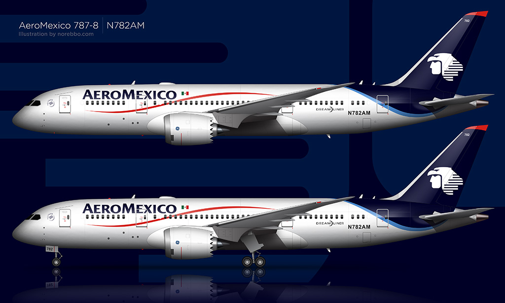
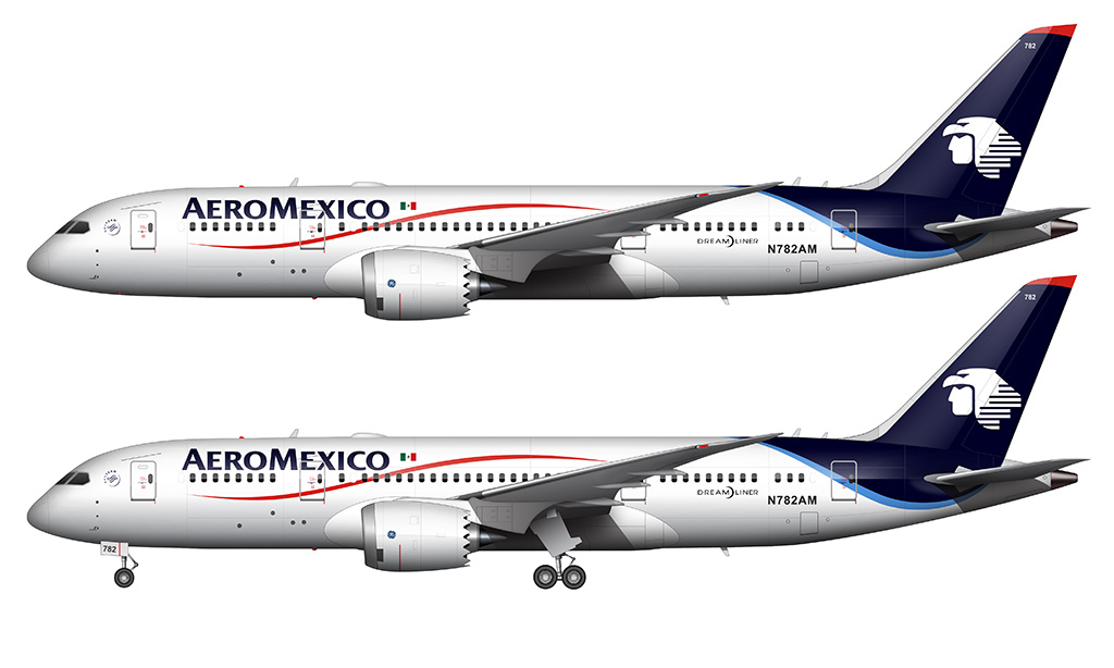
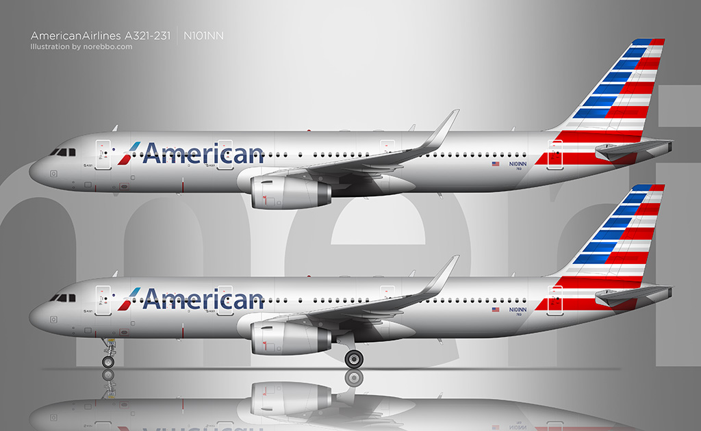
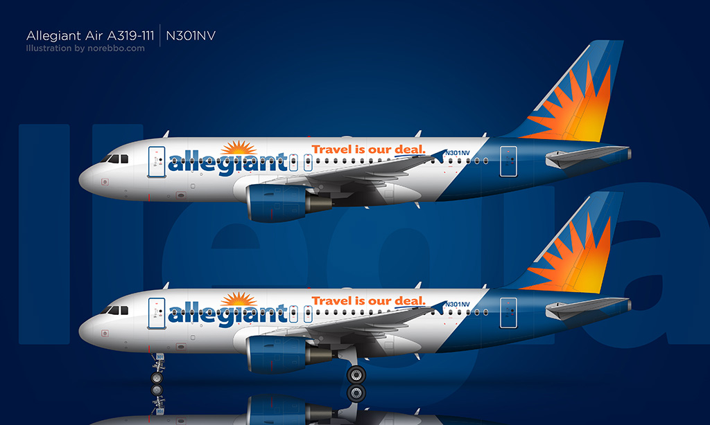
I will leave some inspirational designs below. These are the looks we should be trying to reproduce in my opinion.


#13
Posted 07 March 2018 - 10:09 PM
X-Wing @Aliciousness
-

- Member
-

- 1,760 posts
I think you'll like them!
- Website:https://my.flightradar24.com/agremeister
All of the liveries that have a shiny plastic look with clouds "AE eurowhite" are terrible looking.
I cannot honesty understand how anyone thinks seeing trees, grass, mountains, and puffy clouds looks good at all. It blows my mind. It screams fake and since 99.99% of everyone uses the exact same one, it makes the entire gallery look cartoonish.
Sure my designs will not be gracing the covers of aviation weekly, but at least I tried instead of using a fake toy looking template with cartoon qualities, bleeding artifacts, and the same "AE eurowhite" look as everyone else.
I will leave some inspirational designs below. These are the looks we should be trying to reproduce in my opinion.
Those templates are way worse than Med's, I'll be honest with you.
This template especially is worse than the Jetabout stuff we used to use.
But hey, it's fun to throw around insults to Med's templates, when he's put hundreds of hours of work into incredibly well designed, consistent, and easy to use templates and asked nothing in return. Especially when the person throwing those insults uploads garbage like this to the gallery:

#14
Guest_Adam0896_*
Posted 07 March 2018 - 10:11 PM
Guest_Adam0896_*
Guest_Adam0896_*
-
- Guests
Med's template are far, far better than everything posted above.
#15
Posted 07 March 2018 - 10:17 PM
Stevphfeniey
-
- Member
-
- 4,249 posts
Bad m*****f*****
- Website:http://stevphfeniey.tumblr.com/
Would now be the time to point out to the guy complaining about clouds and things on templates that half the images he posted have clouds in the background?
#16
Posted 07 March 2018 - 10:20 PM
FearofFlying
-
- Member
-
- 275 posts
AE Luver
Med's templates are great for someone wanting to spend 5 minutes and pop something out that is "AE Eurowhite"
But they produce toy looking garbage. Facts are facts and I don't care how many of you use them they look awful. I could make the same templates in 5 minutes. They do not look "crisp" or "clean".
And for you to insult my logo work is absurd.... make it personal if you want.... I suggest you return to the subject, "Making a clean, crisp livery" and send me a pm if you want to continue your personal attack.
Attached Files
-
25w1jl.jpg 88.56KB
0 downloads
#17
Posted 07 March 2018 - 10:25 PM
Stevphfeniey
-
- Member
-
- 4,249 posts
Bad m*****f*****
- Website:http://stevphfeniey.tumblr.com/
But they produce toy looking garbage. Facts are facts and I don't care how many of you use them they look awful. I could make the same templates in 5 minutes. They do not look "crisp" or "clean".
Okay then. Prove it.
Also if you visit a person's profile on the left hand side there should be a tab labelled "Gallery". All their stuff in the AE gallery should come up.
#18
Posted 07 March 2018 - 10:36 PM
X-Wing @Aliciousness
-
- Member
-
- 1,760 posts
I think you'll like them!
- Website:https://my.flightradar24.com/agremeister
recent few I've been ok with
To be honest Sal those liveries are pretty good, and I wouldn't worry too much about your skill level. As others have said it's all about patience, research, and knowing when to step away and let a design age for a day or two before returning to it to see it from a fresher perspective.
I think what really separates good from great liveries is an understanding of design from a wider perspective than just aviation. One of the things that people often "screw up" is typefaces, and knowledge of the messages conveyed by different typefaces as well as proper spacing and best practices when it comes to wordmarks is another thing that can really make or break a livery.
In the end, design is about conveying information and emotion, and the rules that apply to livery design apply to all types of graphic design. Looking at, dissecting, and building a base of designs that you like and styles you want to emulate across varying industries can really help you in creating beautiful, unique, and enjoyable work.
#19
Posted 07 March 2018 - 10:38 PM
FearofFlying
-
- Member
-
- 275 posts
AE Luver
Okay then. Prove it.
Also if you visit a person's profile on the left hand side there should be a tab labelled "Gallery". All their stuff in the AE gallery should come up.
I am aware of where the gallery is.
This isn't about me making templates. I don't make templates.
This is about using a template that looks terrible over and over because some overbearing trolls badgered others into loving it.... If you don't use a glorified plastic looking piece of garbage, everyone will treat you badly here.
Would now be the time to point out to the guy complaining about clouds and things on templates that half the images he posted have clouds in the background?
The clouds in my stuff doesn't come through the art... and no... its not a template by med...

#20
Posted 07 March 2018 - 10:47 PM
FearofFlying
-
- Member
-
- 275 posts
AE Luver
The funny part is I have had airlines in just about all these worlds recently.... most of you people don't even play... most of you don't realize that the vast majority of people who do use this website dont make their own livery....
Making livery connects you to your airline... but you people are downright hostile to everyone... and you dont even play... LMFAO... you make it so others wouldnt dare attempt at making something different because of how incredibly hostile the reaction always is.
You people are so incredibly out of touch with the average player here... probably should start a new alliance and call yourselves the 1%... make it private and sit around and tell each how awesome you are.


0 user(s) are reading this topic
0 members, 0 guests, 0 anonymous users

