Sign In
 Create Account
So this is my final result for my airline, China International. Any ways of improving it ?

So your airline's symbol is a dragon breathing fire down upon everybody and everything below it? That's.... lovely
Needs work


Bad m*****f*****

So this is my final result for my airline, China International. Any ways of improving it ?
So your airline's symbol is a dragon breathing fire down upon everybody and everything below it? That's.... lovely
Needs work
So your airline's symbol is a dragon breathing fire down upon everybody and everything below it? That's.... lovely
Needs work
Bad m*****f*****
Pretty much. So first of all I'm going to change the font. Looking at it, I find the tail a bit weird looking with the red and white. I'll try to change that. Any other advice ?
Yeah. Don't have your airline livery be a dragon breathing fire down onto everything below it.
I would only add one thin red stripe just above the green at the bottom

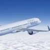
This is a livery concept I created for an LCC in R4. What are your thoughts about it?
 Airbus A320.png 115.24KB
1 downloads
Airbus A320.png 115.24KB
1 downloads
This is a livery concept I created for an LCC in R4. What are your thoughts about it?
It's alright. Like the new version, though.
New Member

These are some retro liveries for my airline in R0.
 Douglas DC-8-43 Osaka.jpg 32.58KB
0 downloads
Douglas DC-8-43 Osaka.jpg 32.58KB
0 downloads
Boeing 707-320B JPA.jpg 37.42KB
0 downloads
Boeing Is Better
They look nice, but I’m afraid they’re too modern with the tail and the font.
they could work actually although it would never really go down onto the fusalage. Move the logo just onto the tail. Keep the font the font is fine.


AE Luver


![]()

![]()
Nothings original. Google image searches. Photoshop copy paste a little work here and there. Any tips to help improve are welcome.

Las Vegas one is a no, it's just a blatant rip off of Air France. But the bottom I actually thought the titles were on a real plane!
Venture Co-Owner | Aloft Staff | Ex-Polaris Member | Unitedwings Co-Owner | Dynasty World Alliance Member
This retro livery is part of an album I'm doing for my airline in R2 and R6, even though the album won't be ready for the gallery yet. How does it look?
Douglas DC-4.png 135.71KB
4 downloads
AE Luver
Las Vegas one is a no, it's just a blatant rip off of Air France. But the bottom I actually thought the titles were on a real plane!
It was a real plane... just not a real airline..

AE Luver

Like I stated... nothings original... I'm not claiming credit... just looking for tips to help improve my photoshop hack.
AE Luver
This retro livery is part of an album I'm doing for my airline in R2 and R6, even though the album won't be ready for the gallery yet. How does it look?
This is reaaaalllly good. One of the best I've seen here.
Love the flying reindeer, huh?This is reaaaalllly good. One of the best I've seen here.
AE Luver
If you are looking for suggestions... not saying its better for sure ... but perhaps the reindeer logo could use a dark border to give it some depth. Like a small dropshadow effect combined with a thin almost black border. But really.. I had to look hard for a suggestion... its really good!


0 members, 1 guests, 0 anonymous users
 Back to top