Jump to content

FearofFlying's Content

There have been 232 items by FearofFlying (Search limited from 01-May 23)


Sort by                Order  

#265791 Let me rephrase things...

Posted by FearofFlying on 10 March 2018 - 02:54 PM in Logo / Livery Requests

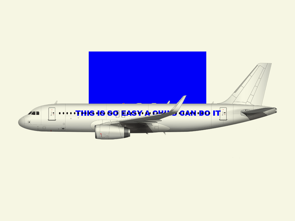
It's not the entire med "template" that is an issue. I just used a med "template".... parts of it... the little do dads and what nots are actually really good... and the overall size is much higher resolution that you can get most places.


I guess the issue is how he decided to make these templates.... let me try to explain....


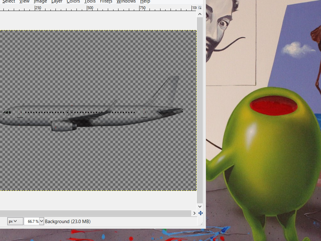
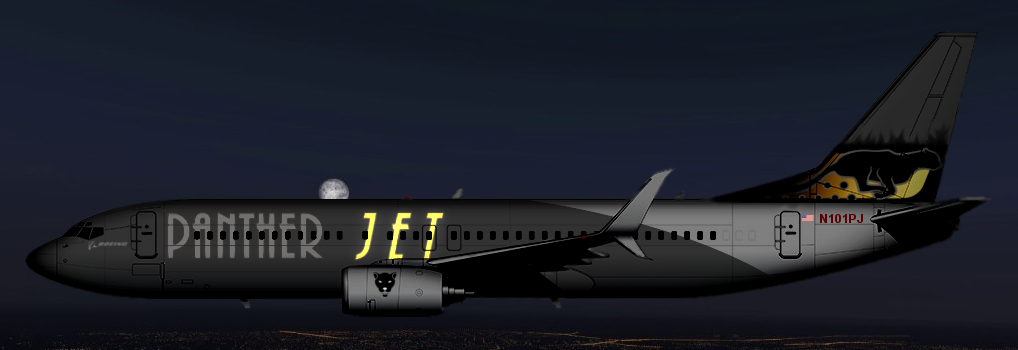
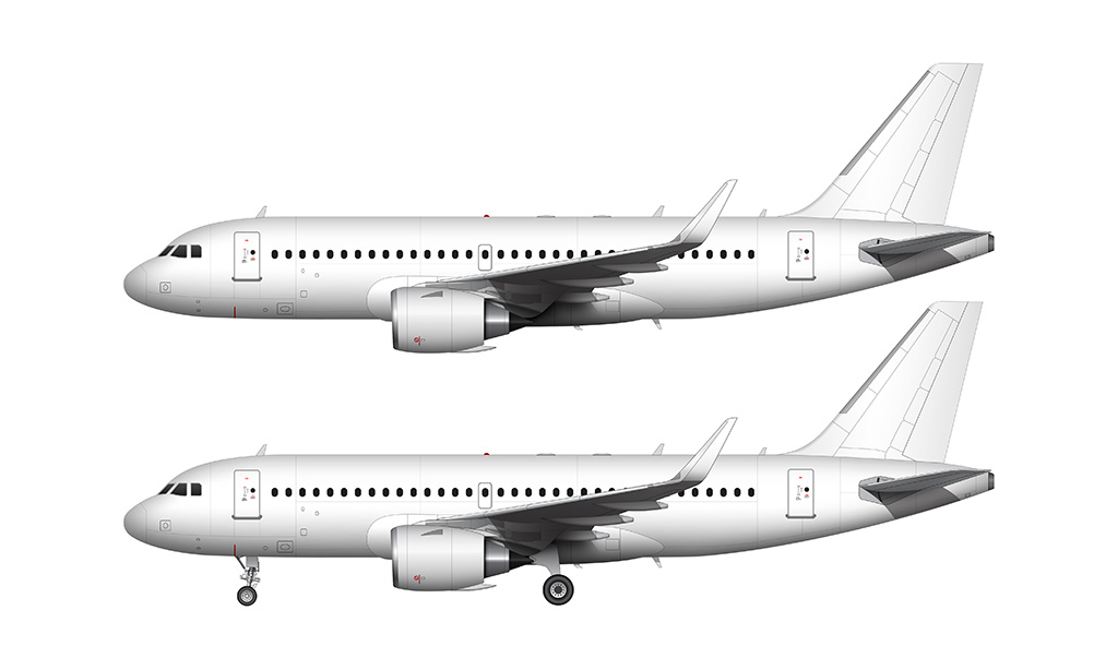
The main fuselage in Med's templates are stripped of its outline on purpose, which makes it challenging to use these templates with non-destructive editing techniques. Now I must ask why, when he gives multiple options for so many do-dads, would he make it so that you practically must use his overlay. Seem's there is really only one possible answer, he want's them all to look the same. Perhaps for the status it brings, perhaps for some other reason... I really don't want to infer why. But he certainly didn't need to take extra time to make things actually harder to edit, but he did. 


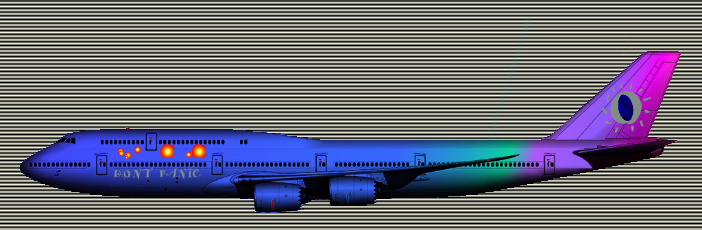
Now some may say they look better with a landscape bleeding through... and while I, and any other professional would disagree for reasons I have already gone through, to each their own. But if this is really the truth, why would you go out of your way to prevent people from taking it off?  Hmm... 


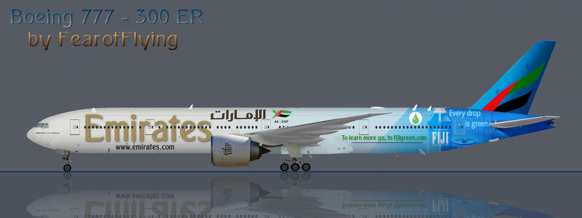
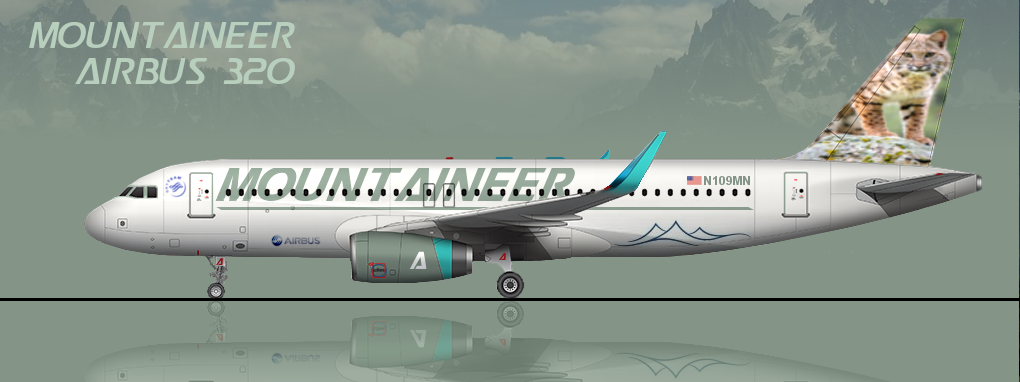
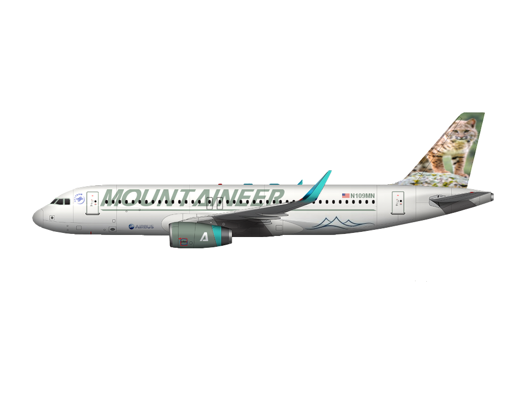
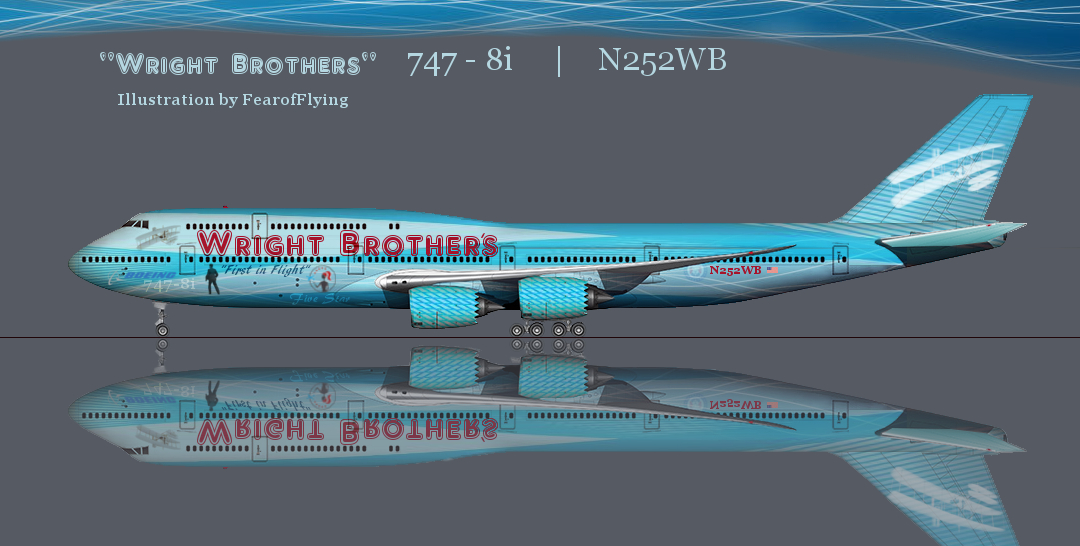
Anyways...  it took some effort to rip it apart and redo it the way it should be done. But the results really do speak for themselves using the higher resolution vs the low quality free stuff. But I still give credit where credit is due, the original creator of this wire frame model crafted in Maya. www.norebbo.com ... Not the person who added an antenna and a bad wrapping. The concept for this aircraft came from an www.infinite-flight.com member, and judging by how nice people are to each other there, my new hangout spot where I will be donating my time.

Attached Thumbnails

  • fiji.png


#265741 Making a clean, crisp livery.

Posted by FearofFlying on 09 March 2018 - 06:52 PM in Logo / Livery Requests

just stopping by to drop off the last version for posterity... anyone with half a decent sense of style and taste will recognize this as being far superior to the vast vast majority of everything you losers have ever made.


but instead of being supportive, you decide to attack what makes you look bad... you cant do this kind of thing... you need someone to make layers for you and give you all the tools in a kit....


the only reason i came here was to make livery... i didnt even like the game that much... i joined this community for the sole purpose of giving my time to others... and now im leaving. I hope that those clouds and dirt road haunt you forever... like that one spot on the wall that you always see.....


I curse you trolls so that every time you look at a AE eurowhite livery... your eyes will see those ugly clouds dead center first. You will always know that what you make would never make it on any real airline's website. It was garbage from the moment you loaded up a cartoon looking template.... might as well paint Bob the Builder trucks for fun.


Signing off for good.... sayonara


Attached Thumbnails

  • Mountaineer.png


#265689 Making a clean, crisp livery.

Posted by FearofFlying on 08 March 2018 - 11:28 PM in Logo / Livery Requests

I'm gonna wrap this up... in summary-


I replied to the original poster who asked, "In my recent works, I've been unsatisfied in the overall look. It looks cheap and rough. I've wondered about what steps I can take to create a crisp and clean looking livery, whether it be brighter colors, layering, masks or etc. What are some ways I can make a livery look "real" or to just improve the overall quality?"


My original responses were on topic. I was and still am highly critical of a template this community uses which is highly unprofessional looking. I was concise and specific in terms of why they were bad looking. I also provided dozens of professional real world examples as evidence. 


Some of the examples you so quickly trashed as inferior, are actually used in print and on the web and are projects paid for and approved by the manufactures. It goes to show how far your socially conditioned bias has gone when you elevate a friends refrigerator class artwork above the level of professional work that graces the websites of these brands today. One thing all professional work has in common, and that is none of them have the deficiencies I laid out that is inherent in the final product when using a med template. 


If you want to support your friend and their hard work, I support you doing it.


If you want to recommend Med templates to people because they are easy and are perfect for the average user, by all means.


When you go so far as to downgrade anything not done by a Med template, berating, abusing, flaming, trolling, to the point that it becomes an issue. It crosses a line. There are hundreds if not thousands of people who come here who would never speak up because of very small 1% of you act so superior to everyone else. 


When some of you act like professionals and say things like print your artwork to check the color, or you cant layer without burning, it shows how personal this has become. Apparently this little click of yours has made it a point to argue with me on everything, even going so far as to make false statements in support of false beliefs. 


You all don't even play the game. Between all of you, if planes were stock, my shares would be more than all off the respondents in this thread combined. You are a 1%AE ultra elite click of salty ass trolls. with terrible taste in livery. 


Keep on keeping on with your gravel road look... I challenge all of you... I showed DOZENS of professional designs... by all means... please show me a single example... anywhere... of a med template being used on a commercial website...


here is a tip... don't hold your breath while you look....  lol


*cue angry responses from the 1%*


Don't worry... I'm over this site...  i let all my airlines orders run out... you have succeeded in running another person off. No reason for me to donate time and effort in a community made up from the likes of you people.


Have fun with your doll house.


#265687 Making a clean, crisp livery.

Posted by FearofFlying on 08 March 2018 - 10:48 PM in Logo / Livery Requests

Let's get one thing crystal clear.... I don't give 2 poops about what you think about me. You are the 1%


And if the 1% on this site don't like me I really don't care. I will continue to stick up for myself and I will continue to refuse to act like you want me to act. We can fight every day if you want to ... keep it up.


#265685 Making a clean, crisp livery.

Posted by FearofFlying on 08 March 2018 - 10:37 PM in Logo / Livery Requests

I'm sorry, but if you can't see the difference between the templates you post and med's, then there's no more discussion to be had. Being purposefully obtuse is only fueling the criticism you get. Same story with your liveries, and the earlier spat with your logos.


I don't know why you're being so narcissistic, but refusing to take any criticism whatsoever and redirecting it to Med/Me/Steve/others is only making you look like a child in the eyes of the rest of us.


Take a break, read your posts from the perspectives of their intended audience and maybe you can reflect on why people aren't treating you the way you hope they would.


Amateurs

Attached Thumbnails

  • Untitled.jpg
  • 1337.png


#265678 Making a clean, crisp livery.

Posted by FearofFlying on 08 March 2018 - 09:50 PM in Logo / Livery Requests

The problem with the templates you're advocating for is that they're not layered like Med's are. In that the base fuselage isn't separate from all the nice artistic effects. On Med's those are separate, so you're able to put a full color livery in between them.


For example on your Mountaineer deal you just did, the billboard titling up front either has to have its opacity turned up, or you have to use a Photoshop effect like Multiply to get the windows and other details behind it to show up. Which in turn in this case has lead to them looking faded with the color being off in addition to a few additional steps.


You are just flat wrong... coloring to alpha is very simple trick...  now i know for sure you are full of **** ... there is no way you work with photoshop for a living.


I have the base fuselage on its own in a layer with 1 click of the mouse, and i can layer anything "under" without using any multiply or burn effect. This is the kind of thing that separates my work from yours, and why I don't need to use a template with layering done for me. 


You like meds template because it makes it easy ... cool i get it... easy is good for some people...  it still looks terrible...


The reason everyone uses it is because when someone doesn't, they are badgered and told how terrible their work is. There is no respect here for anyone who doesnt dance to the beat of the med template drum. Im old enough not to need approval or worry about why you dont like me... and im wise enough to know that this mountineer plane i just made puts the vast majority of everything ever done with a med template to shame.


Indeed it would be good to hear from med... considering how much you elevate him to Photoshop god...  I would love to hear how he drew these by hand.... his inspirational template story.... maybe he can teach me a thing or two about building wire frame models in maya....  or perhaps he would tell you all what he did was use the exact same template as i did and wrap a single image onto so you noobs didnt have shading issues...

Attached Thumbnails

  • DUMB.png


#265647 Making a clean, crisp livery.

Posted by FearofFlying on 08 March 2018 - 03:46 PM in Logo / Livery Requests

To the OP -


I liked your "Mountaineer"  brand... its not plain white but its not full blown crazy like i prefer...  so I tried to spend a few hours making a version i think describes what crisp and clean looks like.


To the peanut gallery... sure the image on the tail is highly unrealistic.... but if you can move beyond that and look at the shading ect... its a fun concept...  no it wont be competing with delta for brand recognition... its just fun... and thats what we are here for... fun...


Attached Thumbnails

  • update2.png
  • bk1.jpg


#265644 Making a clean, crisp livery.

Posted by FearofFlying on 08 March 2018 - 03:36 PM in Logo / Livery Requests

Oh this is coming from practical experience. I remember I learned the hard way of rushing, making a nice presentation board in Illustrator (which by the way is set to a CMYK color environment by default if I remember right), not doing a test print of it on our nice large format plotters a few days beforehand to make sure that the final color I ended up with wasn't piss yellow/green, which it was. Or at my old printing job whenever we'd come out with a new color for our products we'd always run some print tests on various paper stock even if we were 100% certain it was going to be fine.


The point I've been trying to make this entire time until we got sidetracked is just take your time, use the tools at your disposal (including just a Google search for precedent and inspiration), if you're not sure about an idea you've got ask somebody, and when the time comes pull a Bob Ross and let paint hit the canvas until you're satisfied with your result. That last bit might mean scrapping your work a dozen times until you're happy.


Oh on the subject of color. If you're designing a logo completely from scratch (which I'll recommend you do 100% of the time), make sure to do it in black and white first then add in color later. It helps with getting the form down, which in the end I think matters more than what color it is.


+1  ....I remember my first plotter pre-internet running on a tandy...


I agree with all of this except for the logo part... I'm okay with using things i find here and there....if its just for fun... but yea if your designing from scratch do it in b&w


#265625 Making a clean, crisp livery.

Posted by FearofFlying on 08 March 2018 - 08:33 AM in Logo / Livery Requests

Idk about Agre but I went to college for this sort of thing (which is weird because I actually ended up as an engineer and drafter for telco).


Anyway another recommendation I have, and I realize this might not be an option for some, is to print out things you create on the computer. I used to do this quite often because I used to work as a printer, and I found that it really helps you look at what you've created in a new light (quite literally) in a new medium. You know colors that look great on the screen might look like ass when taken out of that environment and put into a new one. 


One of the first things they teach you in designing things is the difference in RGB and CYMK....  maybe you are just acting like you know something or maybe you actually do... but saying things like this make me wonder....


#265624 Making a clean, crisp livery.

Posted by FearofFlying on 08 March 2018 - 08:20 AM in Logo / Livery Requests

Then don't comment in a thread about making liveries better or more realistic, doesn't seem that hard?


I didn't. I commented in a thread about making liveries "clean" and "crisp" ... which is why I suggested not using templates with unclean and uncrisp artifacts.


You are the one projecting your own values of realism and equating it with better or higher quality. Pretentious AE 1% at it's finest.


#265618 The Five Minute Template Challenge

Posted by FearofFlying on 08 March 2018 - 05:31 AM in Logo / Livery Requests

This is a template challenge...


It was a template under most of your definitions... see look what i made from it..


new challenge... 5 minute livery contest from your 5 minute template.... go....

Attached Thumbnails

  • 1337.png


#265615 Making a clean, crisp livery.

Posted by FearofFlying on 08 March 2018 - 05:17 AM in Logo / Livery Requests

 If the point of this game is to pretend to run a real airline, then it's not surprising people like having their airline's livery on a template that looks like a real plane :P


The point is to run a fantasy airline, not a real one. For me at least and the vast majority of people who actually play instead of rage here all day....


#265610 Making a clean, crisp livery.

Posted by FearofFlying on 08 March 2018 - 04:17 AM in Logo / Livery Requests

The point is you have a version of what you like, and you berate anyone who disagrees. 


gallery_85332_1769_20890.png

There are giant clouds running from the top of the first letter D all the way past the registry.


The middle bright green stripe is corrupted from where the rocky mountains used to be before it was over posterized.


The bottom has artifacts of trees and a field of grass, which overall have the textured appearance of a dirt road.


......


The detail on the hatch is pleasing to the eye as is the logo, but real life paint jobs are not green for good reason...


~Planes are white in real life or specific colors because bright sunlight fades them quickly.

~Control surfaces and areas exposed to direct sunlight are normally left white to keep the aircraft cool and safe.

~Radar domes in the front must be left natural or very lightly colored.Never black.


Listen up man.... you are like one in 1,000 people here trying to build some real life brand. I don't want to dream up napkins for a real company and make sure everything is perfectly sterile so the mechanics can find leaks and keep down operating costs. This isn't a fantasy for me, its just a video game....


I was the kid drawing race cars with tigers and f-16's on them because why not... each to there own... i like the wright brothers... so i made a kick ass plane to commemorate it... i should have put tanks on it also #merica  .... its a video game...


instead of appreciating it for what it is...  you try to make it into what it isnt... how long have you all been at this lmfao??? 


people like the green plane because it looks cool... simple as that...nobody but a smaaaaaal handful stop to think about brand recognition... weirdo...


#265605 Making a clean, crisp livery.

Posted by FearofFlying on 08 March 2018 - 03:53 AM in Logo / Livery Requests

nope... nobody would ever recognize this...


2001-50-state-quarters-coin-north-caroli


#265598 The Five Minute Template Challenge

Posted by FearofFlying on 08 March 2018 - 03:30 AM in Logo / Livery Requests

5 minutes:


Attached Thumbnails

  • DONTPANIC.png


#265586 Making a clean, crisp livery.

Posted by FearofFlying on 08 March 2018 - 02:53 AM in Logo / Livery Requests

Oceanic's livery is said to look nice without much detail. I tried the same with CAS but instead it was deemed too boring. What's the difference?


How long you have been a member.


*Drop's mike and goes back to actually playing*


#265581 Making a clean, crisp livery.

Posted by FearofFlying on 08 March 2018 - 02:24 AM in Logo / Livery Requests

Ladies and gentlemen, it's a video game. 


Realism is only important to a small group... an elite few.... "oldtimers"


You need to remember that it's okay to be nice to people who think different. I don't want my livery to be real. This isn't a doll house to me. What I choose to create has no bearing on my ability to create what I want.

Attached Thumbnails

  • pjlogodraft.png
  • PantherJetfinalpic2.png


#265580 Wright Brothers

Posted by FearofFlying on 08 March 2018 - 02:11 AM in Logo / Livery Requests

the basic fuselage design actually isn't all that bad :lol:


It's better than that... it's really good.... with a bunch of tacky stuff added on to piss you off....  be happy I don't make one with salt shakers and troll heads... I am trying somewhat to play nice....


it takes a big person to step across the isle and just say the truth with no social bias... props to n664us for being an adult.... and...


you I guess... *hurts me to say*...


#265579 Wright Brothers

Posted by FearofFlying on 08 March 2018 - 01:57 AM in Logo / Livery Requests

1&2 are basically the same... i agree... and i had already made the same determination with self critique.... so you have my attention... i was hoping for rational discussion like this before... my drive to make it better would have still been alive...


3.

First in Flight is the company slogan

Five Star is the name of the alliance I run and the associated logo. Think Skyteam or OneWorld.


I'm open to suggestions on better placement, part of the problem was making it legible at pc viewing resolution, whereas in real life it could be smaller. 


I have no desire to make templates.... I used the free version of this


https://www.shopnore...747-8i-template


747-8i_white_thumb_b4382c3f-4c5f-42e6-9b


I also never claimed I could draw this.... This was made with Maya I think... but I could very easily wrap a single image onto it....


#265577 Wright Brothers

Posted by FearofFlying on 08 March 2018 - 01:40 AM in Logo / Livery Requests

*reserved for rest of response*


#265576 Wright Brothers

Posted by FearofFlying on 08 March 2018 - 01:40 AM in Logo / Livery Requests

I'm going to try and make a few suggestions, and I'm hoping they're "constructive" enough.


1. The blue: yes, blue and red lettering has won awards (and North Carolina's license plate is pretty great), but there's too much going on. From the waves at the bottom of the fuselage, to the stripes on the tail, to the jagged pattern on the engines, and the odd light blue on the top deck of the 747, it looks cluttered. If you have just one or two of them, it's fine. But having so many things going on at one time makes the eyes strain.


2. The font: Red provides a nice contrast. But, if you're going for a large airline (especially one that operates 747s and is #1 on S1), then you're going to need a different font. Writing "Wright Brothers" (especially with the apostrophe) with that font looks cartoonish and unprofessional. I'd recommend https://www.dafont.com/ and http://www.1001fonts.com/ for a new font: it's free, and you can make sure your text looks good before you download it.


3. All the characters: If I'm counting correctly, I see two airplanes, one man, a Boeing logo, your profile picture, and a bunch of text ("First in Flight," "Five Sins," "747-8i") smattered haphazardly onto the fuselage. If you're going to have the Wright Flyer as your logo, then so be it. But using actual images and then pasting them on isn't going to do it — that's unprofessional and messy. Same goes for everything else you've added — there's certainly a place and size for all of them, but they can't just be cropped images that have been pasted onto the plane. You need some organization in order to improve clarity and visibility. Otherwise, it looks amateur.


You're off and running in the world of template making. But before you keep going, you need to slow down, take some time off from the templates, and then come back to them with fresh eyes to see what needs work (and no, bashing Med's templates does not count as taking time off). Just like Rome wasn't built in a day, neither was the perfect livery. I see some promise in this, it just needs some... improvements.


1. The font is something I've thought of changing... I was working on a color correction as well as redoing the top line... adding a different engine cover .... making it more "realistic"   but once i realized how mean people were i decided to leave it as is... 


its offensive and i kinda like it that way...

Attached Thumbnails

  • redo.png


#265574 Making a clean, crisp livery.

Posted by FearofFlying on 08 March 2018 - 01:06 AM in Logo / Livery Requests

here comes the bandwagon.... 


ive made my point... crisp and clean livery do not have artifacts bleeding through..... you all have made your point... you are hostile to anyone who does not believe as yourselves.... keep on giving each other  +1... doesnt hurt me or anyone else... 


just a harmless little ae eurowhite lie....   XD


#265565 Making a clean, crisp livery.

Posted by FearofFlying on 08 March 2018 - 12:48 AM in Logo / Livery Requests

Okay then. Prove it.


You can choose to believe it or not. I choose not to waste my time proving it. If you are not incapable of looking at what I have done and determining this for yourself that's on you.


It's a practically blank airplane. Not a single layer or mask of any kind. I guess your just trying to be a friend... but thats how everyone ended up with crap livery...  not being honest with each other and attacking anyone who points out the truth.


#265558 Making a clean, crisp livery.

Posted by FearofFlying on 08 March 2018 - 12:21 AM in Logo / Livery Requests

Well, I designed my own logo, and my own typeface for the airline. Since you're such an "expert" in design you should know that adding stuff for the sake of adding stuff doesn't make a design better. 


As others have said, you can go see my gallery and see what I've posted. If you want to continue this asinine dickwaving contest I encourage you to do it in a different thread :P


Also I see you've disabled comments on your gallery. Funny that you dole it out, but apparently you can't take the criticism yourself.


Now you may not like my personal tastes, you may hate the idea of everything I created... but there is not a question of who applied more effort, and technique... 


hate all you want... there are things ive done here you simply cannot do even if you wanted to... and i promise... reproducing yours would be cake for me...


yes i turned my comments off... trolls like you have no taste... but feel free to trash me here.

Attached Thumbnails

  • presentationWBliv.jpg


#265552 Making a clean, crisp livery.

Posted by FearofFlying on 08 March 2018 - 12:09 AM in Logo / Livery Requests

Also here you go. I saw your comment at 6:39 and I finished this at 6:47 so it took me 8 minutes.


S04hbjD.png


Also if you'd like to read the tail number, here's the full size version of that 727:


fAMQzg1.png


the top one is decent... the larger bottom one just enhances the dirt road on the bottom...


but seriously... what exactly did you do? What effects did you apply to make the top one so great? Why didn't you do a pinstripe? Can you do a pinstripe? LOL... people are just nice to you because you are friendly and have been here forever.


Fact is you added the same logo... in two spots... typed the registry number + oceanic and called it a day...

A319_NEO_CFM_LEAP_white_sm.jpg