
 Sign In
 Create Account
Wright Brother's is going to be my new brand... hopefully... this is the first go at the livery... comments welcome!
Attached Files
-
 wbtest.jpg 161.04KB
0 downloads
wbtest.jpg 161.04KB
0 downloads


AE Luver
Wright Brother's is going to be my new brand... hopefully... this is the first go at the livery... comments welcome!
wbtest.jpg 161.04KB
0 downloads
Fortnite is cancer lol
Windows 7 is superior, change my mind
AE Luver

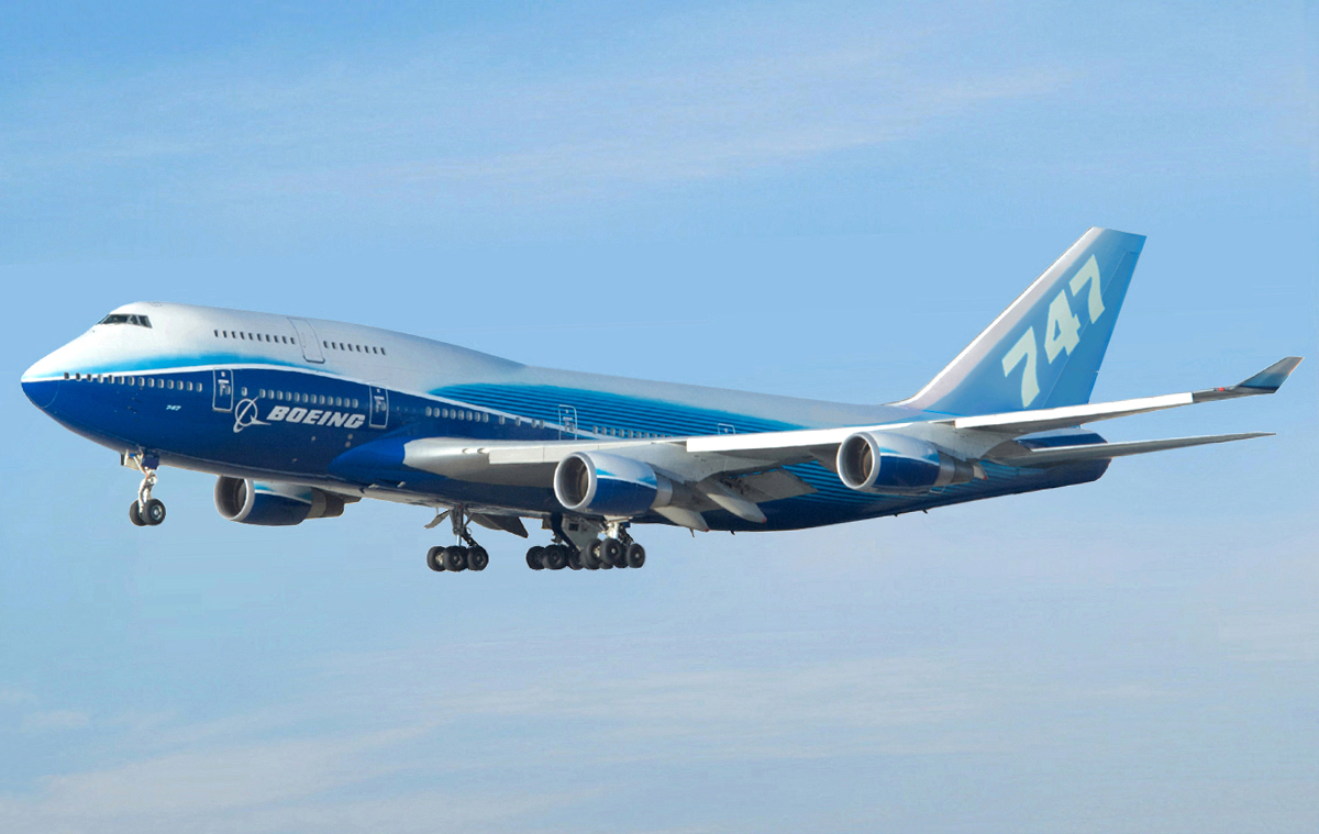
You mean change the background? ... I was tinkering around with something like this... it isnt polished yet though... if you are referring to the color scheme... well... these colors are traditional carolina blue with red lettering... which have won numerous awards for design on the Wright Brothers theme licence plates. Airforce one... heck even Boeings 747 is blue...
Look I can make a white airplane... I can even use one that has clouds and trees bleeding though the paintjob... I'm not going to. If you don't like it I don't care. If you have a constructive suggestion to make I am here to listen... otherwise... hate on someone else somewhere else.

Bad m*****f*****

AE Luver
I haven't quite got the hang of perspective yet...

What does Oh lawdy no mean?
Taking a break.
I'm going to try and make a few suggestions, and I'm hoping they're "constructive" enough.
1. The blue: yes, blue and red lettering has won awards (and North Carolina's license plate is pretty great), but there's too much going on. From the waves at the bottom of the fuselage, to the stripes on the tail, to the jagged pattern on the engines, and the odd light blue on the top deck of the 747, it looks cluttered. If you have just one or two of them, it's fine. But having so many things going on at one time makes the eyes strain.
2. The font: Red provides a nice contrast. But, if you're going for a large airline (especially one that operates 747s and is #1 on S1), then you're going to need a different font. Writing "Wright Brothers" (especially with the apostrophe) with that font looks cartoonish and unprofessional. I'd recommend https://www.dafont.com/ and http://www.1001fonts.com/ for a new font: it's free, and you can make sure your text looks good before you download it.
3. All the characters: If I'm counting correctly, I see two airplanes, one man, a Boeing logo, your profile picture, and a bunch of text ("First in Flight," "Five Sins," "747-8i") smattered haphazardly onto the fuselage. If you're going to have the Wright Flyer as your logo, then so be it. But using actual images and then pasting them on isn't going to do it — that's unprofessional and messy. Same goes for everything else you've added — there's certainly a place and size for all of them, but they can't just be cropped images that have been pasted onto the plane. You need some organization in order to improve clarity and visibility. Otherwise, it looks amateur.
You're off and running in the world of template making. But before you keep going, you need to slow down, take some time off from the templates, and then come back to them with fresh eyes to see what needs work (and no, bashing Med's templates does not count as taking time off). Just like Rome wasn't built in a day, neither was the perfect livery. I see some promise in this, it just needs some... improvements.

AE Luver
I'm going to try and make a few suggestions, and I'm hoping they're "constructive" enough.
1. The blue: yes, blue and red lettering has won awards (and North Carolina's license plate is pretty great), but there's too much going on. From the waves at the bottom of the fuselage, to the stripes on the tail, to the jagged pattern on the engines, and the odd light blue on the top deck of the 747, it looks cluttered. If you have just one or two of them, it's fine. But having so many things going on at one time makes the eyes strain.
2. The font: Red provides a nice contrast. But, if you're going for a large airline (especially one that operates 747s and is #1 on S1), then you're going to need a different font. Writing "Wright Brothers" (especially with the apostrophe) with that font looks cartoonish and unprofessional. I'd recommend https://www.dafont.com/ and http://www.1001fonts.com/ for a new font: it's free, and you can make sure your text looks good before you download it.
3. All the characters: If I'm counting correctly, I see two airplanes, one man, a Boeing logo, your profile picture, and a bunch of text ("First in Flight," "Five Sins," "747-8i") smattered haphazardly onto the fuselage. If you're going to have the Wright Flyer as your logo, then so be it. But using actual images and then pasting them on isn't going to do it — that's unprofessional and messy. Same goes for everything else you've added — there's certainly a place and size for all of them, but they can't just be cropped images that have been pasted onto the plane. You need some organization in order to improve clarity and visibility. Otherwise, it looks amateur.
You're off and running in the world of template making. But before you keep going, you need to slow down, take some time off from the templates, and then come back to them with fresh eyes to see what needs work (and no, bashing Med's templates does not count as taking time off). Just like Rome wasn't built in a day, neither was the perfect livery. I see some promise in this, it just needs some... improvements.
1. The font is something I've thought of changing... I was working on a color correction as well as redoing the top line... adding a different engine cover .... making it more "realistic" but once i realized how mean people were i decided to leave it as is...
its offensive and i kinda like it that way...
 redo.png 147.32KB
0 downloads
redo.png 147.32KB
0 downloads
AE Luver
*reserved for rest of response*
OMGZ I LUUUUV AE!!!

AE Luver
1&2 are basically the same... i agree... and i had already made the same determination with self critique.... so you have my attention... i was hoping for rational discussion like this before... my drive to make it better would have still been alive...
3.
First in Flight is the company slogan
Five Star is the name of the alliance I run and the associated logo. Think Skyteam or OneWorld.
I'm open to suggestions on better placement, part of the problem was making it legible at pc viewing resolution, whereas in real life it could be smaller.
I have no desire to make templates.... I used the free version of this
https://www.shopnore...747-8i-template

I also never claimed I could draw this.... This was made with Maya I think... but I could very easily wrap a single image onto it....
AE Luver
the basic fuselage design actually isn't all that bad
It's better than that... it's really good.... with a bunch of tacky stuff added on to piss you off.... be happy I don't make one with salt shakers and troll heads... I am trying somewhat to play nice....
it takes a big person to step across the isle and just say the truth with no social bias... props to n664us for being an adult.... and...
you I guess... *hurts me to say*...
something soon.

be happy I don't make one with salt shakers and troll heads...
please make one
™
SKYWORLD ALLIANCE™ | Founder & Former CEO
UW | Former Member


0 members, 0 guests, 0 anonymous users
 Back to top


