
 Sign In
 Create Account
http://www.aa.com/ne...wamerican.html#
So what do you all think?

American Airlines New Look
Started by NilsOlavThePenguin, Jan 17 2013 03:08 PM
 Back to top


#4

 Posted 17 January 2013 - 04:34 PM


I can't say that i like it. The grey i like but the tail looks so out of place and the wierd flag-thingy right at the front is too much imo. 

#5
Posted 17 January 2013 - 04:39 PM


#6
Posted 17 January 2013 - 04:42 PM
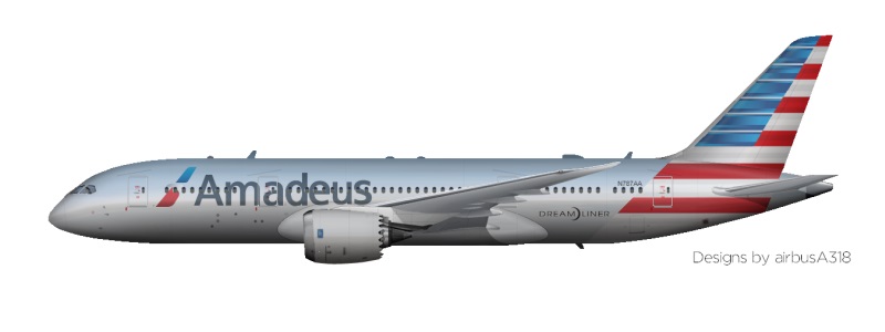
Amadeus Inc.
 6
6
 7
7
 10
10
 6
6
 2
2
-

- Member
-

- 355 posts
Group CEO, Amadeus Inc.
- Website:http://pilotamrik.blogspot.com
User's Awards
6
7
10
6
2
Might not be a fan on first look but it will grow on you. The logo is okay, but the tail looks like a piano keys, and nothing on the winglet. It looks good on 77W though, but maybe more because the awesomeness of the aircraft.

#7
Posted 17 January 2013 - 04:43 PM
El Cobrador
-

- Member
-

- 146 posts
AE Know It All
Yes to the fuse and no to the tail.
I agree.
#8
Posted 17 January 2013 - 04:49 PM

#9
Posted 17 January 2013 - 05:23 PM
M.F. Ensembleson
-

- Member
-

- 1,101 posts
N717YX
Agreed. Tail on the smaller jets is somewhat terrifying, as is the tail in general, but it would look much better if it was on a larger aircraft than a smaller one. The past American Airlines livery looked perfect on EVERYTHING.
"We do what we must, because we can."

Reintroducing Ensemble Holdings, commencing operations Summer 2014.
#10
Posted 17 January 2013 - 06:23 PM

I am a big fan of the new logo and livery. All I can say is thank goodness they have removed that absolutely hideous old livery that made me want to puke. Well done American Airlines, you have finally made a livery that is worth looking at.

#12
Posted 17 January 2013 - 09:01 PM
FlyingDutchman7
-

- Member
-

- 39 posts
AE Player
I like the look on the 777 (it would be amazing with bare metal finish, too bad that won't come), but I don't really like it on the (real) 737. That might be because of its small size and the strange, unique blob on its tail.
I actually like the tail design better than the fuselage.
But, do they really have the money for all this redesigning? This isn't AE...
I actually like the tail design better than the fuselage.
But, do they really have the money for all this redesigning? This isn't AE...
#13
Posted 17 January 2013 - 09:14 PM

Grey on the fuselage is a colour for an airforce, not an airline
#14
Posted 17 January 2013 - 10:08 PM
QK Flight Industries
-

- Member
-

- 2,135 posts
a Wandering Guide to AE and Beyond
Strongly dislike the path they took with their rebrand. Their new "eagle" looks like a stripe from afar, with no other distinguishing features. The tail of their livery, while representing the American culture, is also something I'd expect to find on a LCC and not a legacy carrier. However, it was carried off well, so it's currently a love hate situation. About the only thing I do like is the new font that they've chosen, and the fact that they are trying to stay close to their heritage by mimicking a bare aluminum surface with silver paint.
Overall... it's just a major, major disappointment.


It's really me, now. #backtoAE
#15
Posted 17 January 2013 - 10:23 PM
Concagh98
-

- Member
-
- 145 posts
CEO of BUA Group
I fear a backlash on the scale of BA's awful "International" liveries. The old one was a classic, went on every aircraft.
Perhaps following the path of United, which merged with Continental and had to take their garish logo.
Perhaps following the path of United, which merged with Continental and had to take their garish logo.

#16
Posted 17 January 2013 - 10:24 PM
M4matthew
-

- Member
-

- 673 posts
M4Matthew
I've had to take leave of my hiatus to comment on this - I personally find this a far more interesting story than some fiery plastic pig.
I, for one, love the whole livery and slogan; "We're proud to bare the name American". Those tails, although look slightly out of place on their own, when placed side-by-side at a gate (where most passengers actually see them) look absolutely stunning. I was blown away by the AA CGI mock-up.
It'll be sad to see the old polished aluminium go - I always did love it, but I feel justice has been done to the new composite airframes.
I can't wait to fly on the new AA 77W this summer! 
In reply to the Flying Dutchman, this is all part of their restructuring - the regulators wouldn't let AA spend any money they thought was unjustified.
#17
Posted 18 January 2013 - 01:00 AM

Strongly dislike the path they took with their rebrand. Their new "eagle" looks like a stripe from afar, with no other distinguishing features. The tail of their livery, while representing the American culture, is also something I'd expect to find on a LCC and not a legacy carrier. However, it was carried off well, so it's currently a love hate situation. About the only thing I do like is the new font that they've chosen, and the fact that they are trying to stay close to their heritage by mimicking a bare aluminum surface with silver paint.
Overall... it's just a major, major disappointment.
Completely agree. I kind of really hate this livery, just keep the old one so every time I take AA to some random place in the US, my eyes don't hurt. 

#18
Posted 18 January 2013 - 02:56 AM
ContinentalAirlines
-

- Member
-
- 49 posts
AE Player
My inital reaction: "NOOO!!!!!!! Why are they changing it!!"
After I saw th CGI's: "This is actually really nice."
Overall, they did a good job with the livery and logo. It'll take some time to get used to but it really looks nice. I especially the tail. Imagine being at a american airlines hub and just looking outside to row of tails with that livery on it, that would look amazing!!

An  lite Alliance member
#19
Posted 18 January 2013 - 03:40 AM
Stevphfeniey
-

- Member
-
- 4,249 posts
Bad m*****f*****
- Website:http://stevphfeniey.tumblr.com/

#20
Posted 18 January 2013 - 02:18 PM
LLC
-

- Member
-
- 461 posts
AE Luver
This is short term until US Airways can buy them out (The 'American' name will not survive)
Put a fork in American, they are done as a independent airline !
Take a Look at American Airlines' New Colors
business-news.thestreet.com dallas morning news story take a look at american airlines new-colors

Carolina Hurricanes Boston Red Sox New England Patriots Boston Celtics Coast to Coast AM
^ on Facebook ^ on Facebook ^ on Facebook ^ on Facebook ^ on Facebook
Grooveshark Playlist "001 - Favorites v1 (Rock)"
Grooveshark Playlist "001 - Favorites v2 (Rock)"
Grooveshark Playlist "001 - Favorites v5 (90s)"
Grooveshark Playlist "001 - Favorites v6 (Rap Etc)"
Grooveshark Playlist "001 - Favorites v7 (Pop)"
Grooveshark Playlist "001 - Favorites v8 (Pop)"
My Tunegenie playlists
My Personal Facebook Profile
My Facebook Page "Interesting Info"
My Facebook Page "Flashing Yellow Left Arrow Traffic Signal"
Trainz Discussion Forums Google Translate Hulu.com
My Airline Empires Airlines: "LLC"
Simtropolis.com Simtropolis Forums
Clearwire 4G WiMAX Internet Access


0 user(s) are reading this topic
0 members, 0 guests, 0 anonymous users

