
I do not understand how is this is a brand that you created (except the name) "original" this is basically Air New Zealand you just did a few minor changes and called it Zealandic. But Aotearoan is a elegant looking airline that is not copied from another airline.
In my opinion the tail logo can be changed. The font looks okay but should be moved up just a little.
It was my feedback, this thread is meant to be critical, and like I did, I gave it critique. My Zealandic brand was intentional to mirror Air New Zealand, as that was my intention when designing this airline. Not all liveries have to be original, many AE designers base liveries off real life carriers. Does that make them any less of a good brand? No, it doesn't. If you would like to see more 'original' designs by me instead of picking a brand I designed months ago, you can refer to my gallery in the correct section 
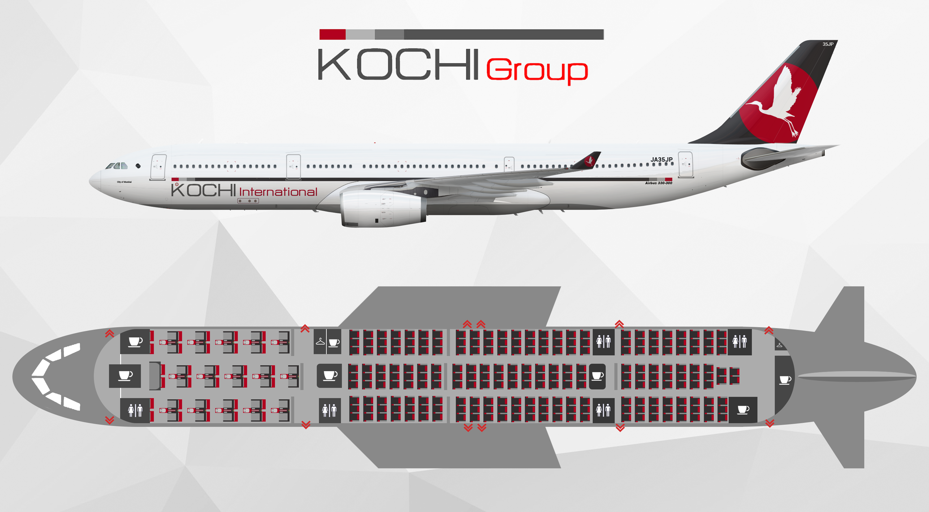
Before you try come back with something I suggest you look at yourself before making any critiques on my 'originality'. Your airline has 0 theme, it's a google image looking bird with a red circle and a grey paint on the tail and a few lines on the fuselage. Adding the word 'Kochi' to a Japanese carrier and not making the carrier in anyway resemble anything Japanese whatsoever doesn't make the airline better, in fact it makes it worse. Speaking of originality again, you've copied your alliance logo from globe which is outspokenly obvious to a point where I was contemplating on mentioning it here.
Despite this, I do not wish to create drama on this thread as I was merely giving critiques, so if you would like to take this further I would be more than happy to debate this with you in Private Messages.
Au revoir,

 Sign In
 Create Account


 Screen Shot 2017-08-11 at 2.40.00 PM.png 266.5KB
1 downloads
Screen Shot 2017-08-11 at 2.40.00 PM.png 266.5KB
1 downloads
 Back to top


 )
)


