
 Sign In
 Create Account


Agremeister's Logos and Liveries
Started by X-Wing @Aliciousness, Aug 19 2011 12:47 AM
#101

 Posted 02 January 2012 - 12:16 AM
X-Wing @Aliciousness
-
- Member
-

- 1,760 posts
I think you'll like them!
- Website:https://my.flightradar24.com/agremeister
 Back to top
#102
Posted 02 January 2012 - 02:35 AM
Stevphfeniey
-

- Member
-

- 4,249 posts
Bad m*****f*****
- Website:http://stevphfeniey.tumblr.com/
#103
Guest_Speed Bird_*
Posted 02 January 2012 - 12:19 PM
Guest_Speed Bird_*
Guest_Speed Bird_*
-

- Guests
Simple, stylish, modern. Amazing

I've always known that the minds of those here aren't exactly fine tuned to spot artistic excellence, nor have the ability to appreciate art in any meaningful way, but this is ridiculous. No offence, Agremeister, it's nicely done in the sense it's neat and tidy, but how on earth Royen can come out with that about is beyond me.
I mean, Agre, what's it trying to show? Where's the identity? I can see you have that flag like thing next to the text, which I must say resembles the Cuban flag somewhat, which is hardly a good image for what I assume is a US based carrier. Either way, that 'logo' just doesn't say anything to me. It has no ability to stand out and portray the brand. It's simply generic, and when placed on the tail it doesn't do itself any more favours. It's boring and uninspired. The tail is the largest flat surface on an aircraft that is visible by people. You need to express the brand! It doesn't have to be a logo, but something memorable, iconic, spectacular.
Moving back to my original point, I can't believe some of the responses on this forum. Half the time I don't know why I bother trying to design something different, a little bit out of the ordinary and something that has artistic meaning whilst portraying the airline's brand in a purposeful way, when those viewing it have no idea how to appreciate it.
#104
Guest_Speed Bird_*
Posted 02 January 2012 - 12:24 PM
Guest_Speed Bird_*
Guest_Speed Bird_*
-
- Guests
Silly speedbird, its not about "Brand" or "Identity", its about how much eurowhite you can put on a livery that makes it stylish and modern
Look at real airlines for examples.
No i am not bloody serious.
Thanks Foxy, proving my point exactly.
Eurowhite if used properly can indeed be 'stylish' and 'modern'. Minimalism is indeed art, but it has to be executed properly to work.
#105
Posted 02 January 2012 - 03:40 PM
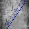
Air Scotland
-
- Member
-

- 633 posts
Random Scot set on destroying the earth
i also notice how the flag next to the name although looking nothing like the real thing, reminds me of cuban flag for some reason  although tbh im complete opposite to foxy and SB(nothing new there) so well done
although tbh im complete opposite to foxy and SB(nothing new there) so well done
International Airlines Group

![]()
#106
Posted 02 January 2012 - 03:49 PM
X-Wing @Aliciousness
-
- Member
-
- 1,760 posts
I think you'll like them!
- Website:https://my.flightradar24.com/agremeister
I've always known that the minds of those here aren't exactly fine tuned to spot artistic excellence, nor have the ability to appreciate art in any meaningful way, but this is ridiculous. No offence, Agremeister, it's nicely done in the sense it's neat and tidy, but how on earth Royen can come out with that about is beyond me.
I mean, Agre, what's it trying to show? Where's the identity? I can see you have that flag like thing next to the text, which I must say resembles the Cuban flag somewhat, which is hardly a good image for what I assume is a US based carrier. Either way, that 'logo' just doesn't say anything to me. It has no ability to stand out and portray the brand. It's simply generic, and when placed on the tail it doesn't do itself any more favours. It's boring and uninspired. The tail is the largest flat surface on an aircraft that is visible by people. You need to express the brand! It doesn't have to be a logo, but something memorable, iconic, spectacular.
Moving back to my original point, I can't believe some of the responses on this forum. Half the time I don't know why I bother trying to design something different, a little bit out of the ordinary and something that has artistic meaning whilst portraying the airline's brand in a purposeful way, when those viewing it have no idea how to appreciate it.
Just because the general public knows nothing about art doesn't mean you can't cater to those tastes. I'm not saying that I am trying to, but I have really been idea deprived lately, I have to say


#107
Posted 02 January 2012 - 04:20 PM


Funny how SB also pointed out the flag looked particularly Cuban before you posted..i also notice how the flag next to the name although looking nothing like the real thing, reminds me of cuban flag for some reason

Administrator of UnitedSkies alliance
and also a member of some other ones, but they're 2vip4u
#108
Posted 02 January 2012 - 08:16 PM
Air Scotland
-
- Member
-
- 633 posts
Random Scot set on destroying the earth
you think i read all of his posts i fell asleep in the first line
International Airlines Group
![]()
#109
Guest_Speed Bird_*
Posted 02 January 2012 - 08:21 PM
Guest_Speed Bird_*
Guest_Speed Bird_*
-
- Guests
you think i read all of his posts i fell asleep in the first line
I'm assuming you therefore have a brain composed of mush... explains a lot I must say.
#110
Posted 02 January 2012 - 08:43 PM

Agre,
Is it possible to do the Ghana Air livery that you did for me earlier on a A319, E170, and E120 EMB?
Is it possible to do the Ghana Air livery that you did for me earlier on a A319, E170, and E120 EMB?
#111
Posted 02 January 2012 - 08:44 PM
Agre,
Is it possible to do the Ghana Air livery that you did for me earlier on a A319 (Yellow engines), E170 (green engine), and E120 EMB (green engine)?

Is it possible to do the Ghana Air livery that you did for me earlier on a A319 (Yellow engines), E170 (green engine), and E120 EMB (green engine)?
#112
Posted 02 January 2012 - 09:02 PM
Royen
-

- Member
-
- 1,566 posts
CEO Of Royen Airlines
- Website:http://royenairlines.tk
I've always known that the minds of those here aren't exactly fine tuned to spot artistic excellence, nor have the ability to appreciate art in any meaningful way, but this is ridiculous. No offence, Agremeister, it's nicely done in the sense it's neat and tidy, but how on earth Royen can come out with that about is beyond me.
I mean, Agre, what's it trying to show? Where's the identity? I can see you have that flag like thing next to the text, which I must say resembles the Cuban flag somewhat, which is hardly a good image for what I assume is a US based carrier. Either way, that 'logo' just doesn't say anything to me. It has no ability to stand out and portray the brand. It's simply generic, and when placed on the tail it doesn't do itself any more favours. It's boring and uninspired. The tail is the largest flat surface on an aircraft that is visible by people. You need to express the brand! It doesn't have to be a logo, but something memorable, iconic, spectacular.
Moving back to my original point, I can't believe some of the responses on this forum. Half the time I don't know why I bother trying to design something different, a little bit out of the ordinary and something that has artistic meaning whilst portraying the airline's brand in a purposeful way, when those viewing it have no idea how to appreciate it.
Oh, I'm sorry that I liked it! This livery may not be your taste, but I do really like. It is very simple and it is easy to recognize the airline with the livery. Yes, it may appear boring to you, but too others like me it appears simple and modern. It is my opinion and your opinion is obviously different but that doesn't mean that it is right.
Royen Airlines


#gogolden2015
#113
Guest_Speed Bird_*
Posted 02 January 2012 - 09:30 PM
Guest_Speed Bird_*
Guest_Speed Bird_*
-
- Guests
Oh, I'm sorry that I liked it! This livery may not be your taste, but I do really like. It is very simple and it is easy to recognize the airline with the livery. Yes, it may appear boring to you, but too others like me it appears simple and modern. It is my opinion and your opinion is obviously different but that doesn't mean that it is right.
Royen Airlines
If you would actually bother to read and interpret my post correctly, I wasn't slating your opinion, I was slating your lack of ability to interpret art correctly, and apparently, lack of ability to interpret the English language too. As I say, it's quite obvious from your opinion that you do indeed have no understanding of contemporary art and design.
I must ask though, even if you don't have any knowledge of graphic design or contemporary art, how on earth can you possibly say it's 'easy to recognize the airline'? The 'logo' looks like the bloody Cuban flag! How the devil are you supposed to link that to an airline known as 'North American', when the only other indication is some rather small titles on the fuselage?
#114
Posted 02 January 2012 - 09:35 PM
Moldova96
-
- AE Moderator / Data Collector
-

- 2,024 posts
AE Winner
- Website:http://www.eurovoix.com
Not meaning to be rude but it is the the Old United livery with a new name and a Cuban flag esque thing on it.
http://upload.wikime...hol_Airport.jpg
http://upload.wikime...hol_Airport.jpg

#115
Guest_Speed Bird_*
Posted 02 January 2012 - 09:43 PM
Guest_Speed Bird_*
Guest_Speed Bird_*
-
- Guests
Out of interest, How do you define art, it seems somewhat strange that "Art" Must meet Specific checklists as if it was an aircraft, as opposed to being about creativity like...well.....Art?
I'm not denying there's a lot of theory beside art, but Surely Some of it is just "You made a pretty painting on the side of that jet" ?
Not Denying you know far more about art, livery design, Branding, Everything else that would qualify you're judgement over mine, Mind.
And thank you, once again, for proving my point. Because art must be a 'pretty painting'? Hell no. Art and design is all around you. The point is to create something that expresses the feelings and motives of one self, or in the case of livery design, the identity of the airline. The point is that it's supposed to express something, a meaning behind it. There's no point making a 'pretty painting' if it doesn't mean anything. That's not art. And unfortunately, nobody here seems to understand that. Which is why I feel it's pointless showcasing work to you all if you aren't going to appreciate it correctly, or at least appreciate it one's own meaningful way.
#116
Guest_Speed Bird_*
Posted 02 January 2012 - 10:04 PM
Guest_Speed Bird_*
Guest_Speed Bird_*
-
- Guests
I don't know why I'm bothering to argue, Foxy. The 'meaning' doesn't have to be the heart felt soppy crap, in the case of livery design, as I've stated, it is to portray the brand in a way that gives the best indication of what the airline has to offer. You showing 'what your airline has to offer' is art in graphic design terms. You saying there that because it looks ' cheap' it isn't art is completely untrue.
#117
Guest_Speed Bird_*
Posted 02 January 2012 - 10:14 PM
Guest_Speed Bird_*
Guest_Speed Bird_*
-
- Guests
Seeing as I can't be bothered to argue any further with someone who doesn't have a clue what they're on about now, and like you say, were getting quite off topic, I'm going to leave it there.
#118
Posted 03 January 2012 - 12:33 AM
Royen
-
- Member
-
- 1,566 posts
CEO Of Royen Airlines
- Website:http://royenairlines.tk
If you would actually bother to read and interpret my post correctly, I wasn't slating your opinion, I was slating your lack of ability to interpret art correctly, and apparently, lack of ability to interpret the English language too. As I say, it's quite obvious from your opinion that you do indeed have no understanding of contemporary art and design.
I must ask though, even if you don't have any knowledge of graphic design or contemporary art, how on earth can you possibly say it's 'easy to recognize the airline'? The 'logo' looks like the bloody Cuban flag! How the devil are you supposed to link that to an airline known as 'North American', when the only other indication is some rather small titles on the fuselage?
I liked the livery, and obviously you didn't, but I was expressing my personal opinion!

#gogolden2015
#119
Guest_Speed Bird_*
Posted 03 January 2012 - 12:46 AM
Guest_Speed Bird_*
Guest_Speed Bird_*
-
- Guests
I liked the livery, and obviously you didn't, but I was expressing my personal opinion!
Which you have stated, but like I have said on two occasions now, I wasn't referring to your 'personal opinion'.
#120
Posted 03 January 2012 - 01:24 AM
Rodney
-

- Member
-

- 25 posts
AE Player
Anyway, here is Jin Air (In Chinese of course)

Amazing!!!


0 user(s) are reading this topic
0 members, 0 guests, 0 anonymous users

