
 Sign In
 Create Account


- Owner: ThePessimist (View all images and albums)
- Uploaded: Jul 19 2021 06:23 AM
- Views: 1,527
- Album Nihon Air System

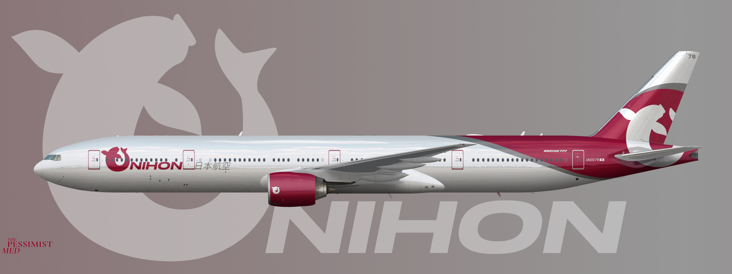
Nihon Air System (stylized as Nihon) is the premier international carrier of the Japanese Isles. It operates a majority widebody fleet. Since the retirement of the 747-400 and until the 777-9 finally enters service, the 777-300 is the flagship of the fleet. Despite thier relatively old age (Nihon was the launch operator of the 777-300 and this airframe was the second delivered to the line in 1998) the 777-300s hold their role as flagships in part thanks to their recently updated cabins. The livery featured on this airframe has been the standard since 2014 and features the line's iconic Koi logo.
So this is going to be my entry for the 2021 East Asian Design contest. I guess it's the answer to what if JAL actually decided to paint their aircraft but still on a budget. This one has been sitting around in my head and then on my computer for some time but the competition provides a good time to push it out. I'm pretty happy with the logo and the tail swoop is simple but I think I like it and I'm slightly less sold on the font but it's not bad I don't think so let me know what y'all think.
[Edit: We have Japanese text now and some grey]
[Edit: Less grey, moved some text]


Make sure to upload your submission onto the competition thread here!
Please note that only submissions posted onto the linked thread will be considered.
My plan is to do that soon - I was putting this up here to see if anybody would have thoughts on how to improve it before submitting

Alright, well, here's my thoughts:
Firstly, I don't think the grey part should be that big on the vertical stabiliser, it looks kinda weird with half the tail being grey.
Also, I'm not sure if the logo on the engine is necessary. Either keep the logo on the engine or the text, but not both.
Also, I'd move the Japanese back, so that half of it isn't on the door.
And finally, maybe add the registration to the underside of the wing, as it seems a popular thing to do in Japan.
Thank you! I had thought about making the grey a stripe with white above but I had worried about it looking a little plain but JAL is my muse so it's all cool. I sort of liked the engine logo but on smaller planes it really would look redundant so I cut the text. I'll split the Japanese text with the door and it's kind of a cool look


Make sure to upload your submission onto the competition thread here!
Please note that only submissions posted onto the linked thread will be considered.