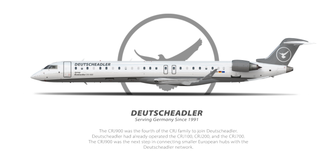
Deutscheadler | Bombardier CRJ-900 | Livery Concept 2007-2014
- Owner: Zac23 (View all images and albums)
- Uploaded: May 18 2021 08:02 PM
- Views: 1,201
- Album Retired Brands
© Zac23 [You may NOT use, alter, sell, or distribute my work without EXPLICIT permission granted by Zac23 in writing] [Assistance - Makka] [Template - Med]

In the spring months of 2007, airline journalists commented on the continued 'grey' look of the aircraft fleet. Deutscheadler continued to use the grey palette, which did gain support from some. Upon the summer of 2007, Deutscheadler was sued by Delta Airlines Incorporated on the basis of 'use of a design copyrighted and currently used by Delta Airlines Incorporated'. After numerous court sessions, Deutscheadler won the case and claims were dismissed.
The company was inclined to change the livery slightly, with critics wanting a livery with darker shades. Deutscheadler has just launched the livery months before, so only small changes could be submitted. The branding department ended up changing a shade of the underbelly outline to a darker black, which in the end satisfied most critics over the topic. This would be the final livery change conducted by Deutscheadler until 2017 where the livery was further modernized.
I'm trying something out by incorporating the feedback in these comments into the lore. Love to hear your opinions on the livery update + the lore style.
I mean... it's something.
lol this brand is not my favorite anymore, pouring my time into avion which seems to have a lot better approval rating ![]()
lol this brand is not my favorite anymore, pouring my time into avion which seems to have a lot better approval rating
BECAUSE MY LIVERY IS BETTER SMH
BECAUSE MY LIVERY IS BETTER SMH
I literally made a livery very similar to yours and the approval rating was pretty low
I literally made a livery very similar to yours and the approval rating was pretty low
where
anyways this is a brand I'm probably leaving behind for a while since avion is doing well, no need to bring back up this treacherous album anymore
Ight so, as promised, here's my opinion/feedback on this:
The name is bad and generic. It's just 'German Eagle' but in German. I know American Eagle exists, but that's a regional subsidiary. It wouldn't work that well for a German mainline carrier, and the name itself feels pretty meaningless and uninspired.
The livery is extremely dull. There is literally no color in here; nothing to make it stand out. It would literally blend in with the airport terminal it was parked at. Furthermore, the overall design is generic and also uninspired.
The font is also generic. Italicizing a font does not make it nicer or spice it up, and that's the only even remotely 'spicy' thing going on with this livery.
The logo also feels generic and uninspired (gee there sure is a trend here with this brand!) All you've done is traced an eagle and added a circle around it (this applies to your French brand, Avion, as well, with the only difference being the type of bird). There was zero attempt at stylizing it or making it recognizable.
This brand it SO generic... and going through your lore, you seem to acknowledge this and its lack of originality, which then begs the question, why even post it if you know it's not great?
Thanks G.J for the feedback. I can agree looking back this brand had serious issues regarding the branding / designs. I can fully understand the issue regarding the genericness (is that a word lol..?).
Regarding the Avion logo, it 100% needs to be reworked. I'm currently researching some better references and designs that can help with the creation of a new logo.
I really appreciate this, as I'm learning people like you really do help me improve my work. If you have any further feedback regarding either of the brands, feel free to shoot me over a PM and I'd love to hear it.

 Sign In
 Create Account


I mean... it's something.