Sign In
 Create Account
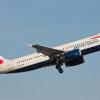
What do you think about it? I think it looks like very similar to the new Avianca livery


What do you think about it? I think it looks like very similar to the new Avianca livery

It looks horrible and cheap! The tail doesn't say nothing and the fuselage is just another eurowhite one. The colors aren't getting better either, but that may be the fault of the artist.
worse, by far, looks like an LCC, not a flag carrier, i mean why would you even put comic sans on an airplane? 

Bad m*****f*****

The person(s) who designed that, as well as the person(s) who approved it, should kill themselves. Now.
Whilst I was a big fan of the former IB livery, there was clearly a need for a new image to distance the airline from the 'old IB', or so to speak.
I personally don't think it's that bad; not exactly the most meaningful of liveries, but it looks smart my opinion and I certainly welcome the rest of the changes to the airline's brand identity (notably the website and aircraft interiors).
Bad m*****f*****
I find that the new brand carries no meaning for me, but I've found that branding has moved more towards that which has no feeling generated by it (at least, on a large corporate level). It appears to me that, like their counterparts with British Airways, Air France and American Airlines, that they were striving for a dynamic logo with a sense of movement. However, I find it looks just flat, yet bloated (which is actually kind of amazing that they pulled that off). I dunno, I like branding that evokes some kind of emotion in me, and this doesn't do it.
Group CEO, Amadeus Inc.

 6
6
 7
7
 10
10
 6
6
 2
2
did they want to make an LCC to complement BA? at least they can use italic font, can't they?

did they want to make an LCC to complement BA? at least they can use italic font, can't they?
That darling is called Vueling.
And LCCs complementing BA, through history they haven't done 'too well'
That darling is called Vueling.
And LCCs complementing BA, through history they haven't done 'too well'
While Vueling's livery is similarly nothing-saying (and usually dirty), the colors match better than new IB's and it isn't just a big areay on the tail painted in one color. If they're trying to use the colors of the spanish flag, they could've at least have used some more of it than just that. Look at SAA's or Swissair's livery to see some nice examples of doing so.
The O.G. Savage
 6
3
6
3
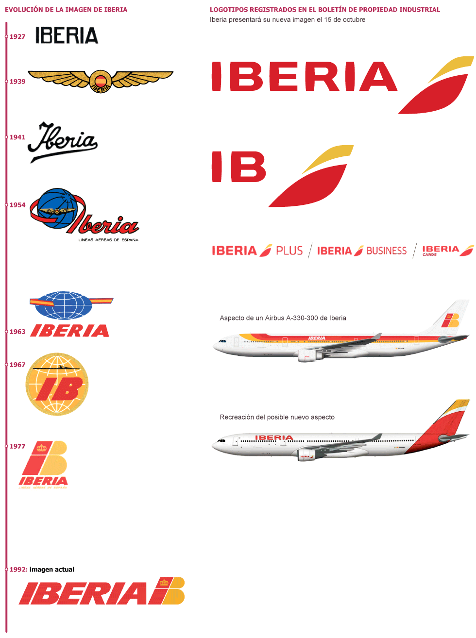
While I have to say it really isn't exactly one of the best liveries out there at the moment, especially for a flag carrier, Iberia was certainly in need of a major update to its brand/livery as the livery hadn't changed since 1977 (only beaten by American I think). Then again, I think they have gone along the same lines as American Airlines with the new brand, and I'm sure we'll grow to like it.
AE Know It All

They should have kept the old logo
AE Know It All
They should have added an layer of red on top then a crown in the yellow part to keep some national identity .
The person(s) who designed that, as well as the person(s) who approved it, should kill themselves. Now.
 I agree.


0 members, 1 guests, 0 anonymous users
 Back to top