
 Sign In
 Create Account

Rebranding | 2013
- Owner: POTKC (View all images and albums)
- Uploaded: May 17 2021 11:16 AM
- Views: 1,480
- Album Global Group
Templates by Med, FlyHighAviator, GJ, AviatorCJ, Blonde_Bird, Atsuk0. Liveries © POTKC 2021, reproduction or use not permitted without written and explicit consent.

(TOP)
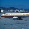
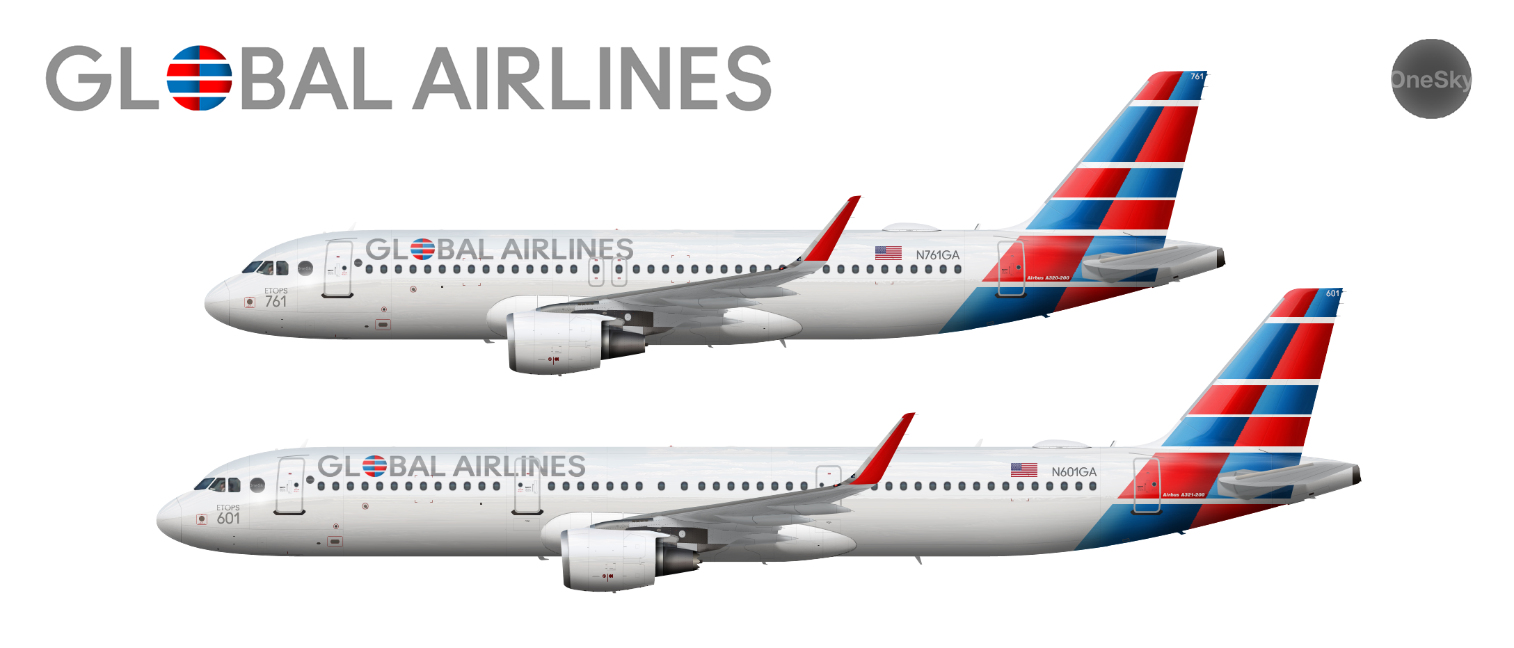
Airline - Global Airlines
Aircraft - Airbus A320-200 | N761GA
Delivered to Global Airlines, 2013
Stored at Pinal Airpark, 2016
Sold to Global Air Finance Co, 2016
Leased to JetUSA, 2017
Returned to Global Air Finance Co, 2020
Leased to New Yorkair, 2020
Livery - Standard 1994
Country - United States of America
(BOTTOM)
Airline - Global Airlines
Aircraft - Airbus A321-200 | N601GA
Delivered to Global Airlines, 2004
Stored at Las Vegas McCarran International Airport, 2016
Sold to Global Air Finance Co, 2016
Sold to ILFC, 2016
Leased to European, 2016
Livery - Standard 1994
Country - United States of America
In February 2013, Global Airlines revealed a new livery and brand identity on a newly-delivered A320, N761GA. This was the most radical change in the airline's history, doing away with all variants of the 'map' logo, and bringing the carrier's branding closer to the US flag colors to better represent its American origins. The brand presentation called the new livery "more patriotic" and "bringing American excellence to the globe".
N761GA was also the first of Global Airlines' narrowbody aircraft to be equipped with in-flight WiFi. All deliveries after it came with internet antennae already installed, and WiFi capability was quickly retrofitted to planes already in the fleet at the same time as they were repainted into the new livery (like N601GA, the A321 shown here also with retrofitted sharklets).


ngl I liked the old brand better, but decent job with execution

I actually don't like this all that much. It gives me AA vibes, but with a suboptimal color scheme that makes it seem... cheap.
I also don't think it'd make sense for this to replace the old one, which espoused sensations of luxury and modern design.
If anything, I think this design looks less modern than the old one.
All in all, while the new branding definitely manages to be more patriotic than anything that came before, it does so by doing away with most of the features and traits that I think made the former designs so great.

Tbh I liked the older version a whole lot more. It was easier on the eyes than the alternating blue and red and seemed more thought out. I think this is a major step backwards

Circular logo's also a bit Pan Ammy
If anything he could change the Blue to a Dark RedTbh I liked the older version a whole lot more. It was easier on the eyes than the alternating blue and red and seemed more thought out. I think this is a major step backwards
But IMO I think this is cool
Thanks for the comments everyone. I see there is a lot of variation in opinion, but it mostly boils down to two things: some of you dislike the radical shift from the previous branding, and there are a few comments about it looking like an LCC.
I'll address the LCC part first - I think what's making this look 'lcc-ish' is the use of bright colors and modernized and mostly abstract design. I'll concede that these attributes are ones that LCCs often use, but personally I don't find it too much of a problem...there are other airlines that do that as well. It's probably also a combination of the more abstract nature of the design with a jarring change from the previous design as well that makes people perceive it like that.
Regarding the big change from the previous designs, which were all centered around various shades of red and burgundy and used a more realistic globe logo (though to be honest the 2007 one was already getting more abstract, and prior to that people were saying it looked outdated). I totally get it - you're 100% right about the change being huge. However, that was kind of the point story-wise and in terms of the design itself. Here's the thing - this is something that I can see a real airline doing. Brand updates by major carriers have in the past been criticized for being too drastic, too abstract, even too LCC-ish. In some cases, the criticism was justified, and I do agree that to some extent it is here.
But my aim with this was to represent something that a major legacy carrier with a giant fleet and route network might have done in 2013: struggling to tread a fine line between modernizing and using its luxurious history for marketing purposes, and trying a little too hard to reinvent itself. And I have to say - personally, I'm happy with where this is going at the moment. The airline's shareholders won't be so happy a few years down the line (look at how I phrased 'trying a little too hard' for a hint), but that's coming in the future.
RIP globe design. You will be missed.


I like it but I feel like it looks kinda LCC