New content
By content type
By section
By time period
Gallery
|


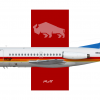
ntair Fokker F-28 Mk1000in pacificnational showcaseno |
|

|
|


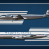
Into the Jet Agein States Airways
I see where you're coming from on the 707, I did kind of botch the chatline, might revisit it at some point... As for the "Direct from Cincinnati" text, it is supposed to be more fine print like by design, but it's true that it's on the smaller side. |
|

|
|


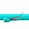
Kiwi | A321neoin My AirlinesJust let this one die honestly. Sometimes it's necessary to let go of old ideas to create new, better ones. |
|

|
|


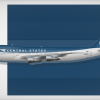
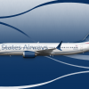
Jetting the 70sin States Airways
That's true, it does remind me a bit of Tui/Thompson in the end... |
|

|
|


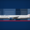
Flowing into the futurein States Airways
Thanks for the feedback! I did try the livery without the States text but it starts to look a bit too much like UAL, so I wanted to avoid that.. You're right about the interference though, I've photoshopped it onto several real images and it does indeed look a bit funny. I posted some on IG @statesairways so if you're interested, go take a look. |
|

|

|


Flowing into the futurein States AirwaysI think this would be better with a slightly bolder font. Personally I'd also remove the 'Airways' text because on the reverse side it'd place 'States' over the wing, obscuring it from below (relevant when the aircraft is taking off/landing from the perspective of viewers on the ground). Both of those are really small little personal preference things/suggestions though; overall I really like this |
|

|
|


A Corporate Lookin States AirwaysNeat! |
|

|

|


Into the Jet Agein States Airways
|
|

|

|


Into the Jet Agein States Airways
|
|

|
|


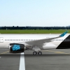
Pacific Airways | A350-900 | Hibiscus Liveryin Pacific Airways
lmfao classic pessimist moment
i love it |
|

|

|


Flowing into the futurein States AirwaysAs a final evolution of this brand it's ok. I think the retreat to the cubes is an interesting way to do US Airways but be a little more interesting than US Airways. It just isn't great though it clashes with the flowy ribbons on the fuselage. This brand shows a lot of promise but I think could use a reevaluation top to bottom |
|

|

|


Jetting the 70sin States AirwaysI think that this is an interesting logo but I prefer the former one. The logo in this context ends up looking a little overly simple and un-iconic. I actually think this top shape is super cool it's very organic and unique but it's much more 90s/00s experimental than 70s. |
|

|

|


Pacific Airways | A350-900 | Hibiscus Liveryin Pacific AirwaysA) Correct the font is bad. Arial bold and italics is not a good look. 1001fonts.com is a good first source. B ) This is silly argument that is infinitely reductive. If no one can discuss/critique things outside of their personal lived experience then none of us can talk about real airplane liveries because we've never designed for an actual plane. Further, I can't say murder is bad because I have never committed nor have I been murdered. Less abstractly, someone can say something is unappealing without being able to design something of their own. Any other paradigm is self serving and absurd. Dearest RO, you have largely reduced yourself to a contrarian on the gallery waiting to contradict people who make what you perceive to be mistakes. I know that you can provide constructive feedback and do something more productive than picking silly, pointless fights so please do more of the former than the later. C) On top of the font, I also think the colours and overall brand identity is very underdeveloped it feels a bit like Hawaiian but with an atrocious colour scheme and less personality. A font will help but it also doesn't look like you quite got to a unique enough spot where the foliage goes from looking like clip art to something an airline is likely to use as a signature of their brand identity. |
|

|

|


Into the Jet Agein States AirwaysThis is a pretty cool brand. Name is a little mid but the colour scheme is nice and particularly the Connie livery is great the arrow on the fuselage is an unusual but distinctive touch. I think the 707 livery is a good base but doesn't fit well on the fuselage particularly the lines over the windows don't look great, airlines were generally pretty careful to make sure the windows make some sense and don't interrupt/disturb the patterns of the livery. Additionally, the poster is super cool quite well done but I think the Jetting into tomorrow text is a little modern fontwise and the 707s direct text is too small. |
|

|
|


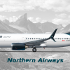
B737-800QCin Northern AirwaysThis has ended up quite nice. Tail is still looking great and the level of detail is great. Hope that we get something to this effect in real life |
|

|

|


Pacific Airways | A350-900 | Hibiscus Liveryin Pacific Airways
No, however, your comments add absolutely nothing most of the time I see them. Hence my comment.
That aside it would be nice to see what you can do, because judging by some of your better comments, you do seem to realize what works and what doesn't. |
|

|

|


Pacific Airways | A350-900 | Hibiscus Liveryin Pacific Airways
please drop dead. |
|

|

|


Pacific Airways | A350-900 | Hibiscus Liveryin Pacific Airways
Can I improve on the feedback side of things tho? |
|

|

|


Kiwi | A321neoin My AirlinesThe blue doesn't work on the whole fuselage neither does the Kiwi on the wingtip. It's missing the registration and the country flag. The part of gray underneath the horizontal stabilizer seems like you forgot to fill it with colour. Also there seems to be something wrong with the bandit mask, but i can't say what tho. I would suggest adding some sort of design pattern on the wing, removing all most all the blue on the fuselage and having a sort of a stripe coming down from the tail onto the fuselage. For the logo "Kiwi" I would suggest having a small kiwi on top off the first I to just add some character to the logo. This is my personal opinion tho. |
|

|

|


Pacific Airways | A350-900 | Hibiscus Liveryin Pacific Airways
Yeah, it is a bit hypocritical of me to judge other people's work without actually posting my own. I did post something long back bit it was quite s*** so i removed it and haven't bothered since. Probably I could try again but i don't have time. But is it compulsory to post something and then only be able to give feedback? |
|

|
|


Conquest B777Fin Just Another Album with a hint of IRLnice 777 |
|
|

|


Pacific Airways | Advertisment | 'We Have A Dream' (2012)in Pacific AirwaysMixing fonts like that rarely works - and it really doesn't work here because the font it switches to for the word you're trying to draw attention to is lighter and shorter than the font that precedes it. |
|

|
|


Ansett Australia | A340-600 (VH-ANS)in Livery dumpthanks to whoever gave this 5 stars. |
|

|

|


Pacific Airways | A350-900 | Hibiscus Liveryin Pacific Airways
to be fair that-airplane-guy tends to give out a lot of feedback but has nothing of their own to back it up i do want to see what hes capable of |
|

|

|


Pacific Airways | A350-900 | Hibiscus Liveryin Pacific Airwaysim sorry but this is the single most braindead thing ive ever seen you say. actual L take |
|

|

 Sign In
 Create Account

