
 Sign In
 Create Account

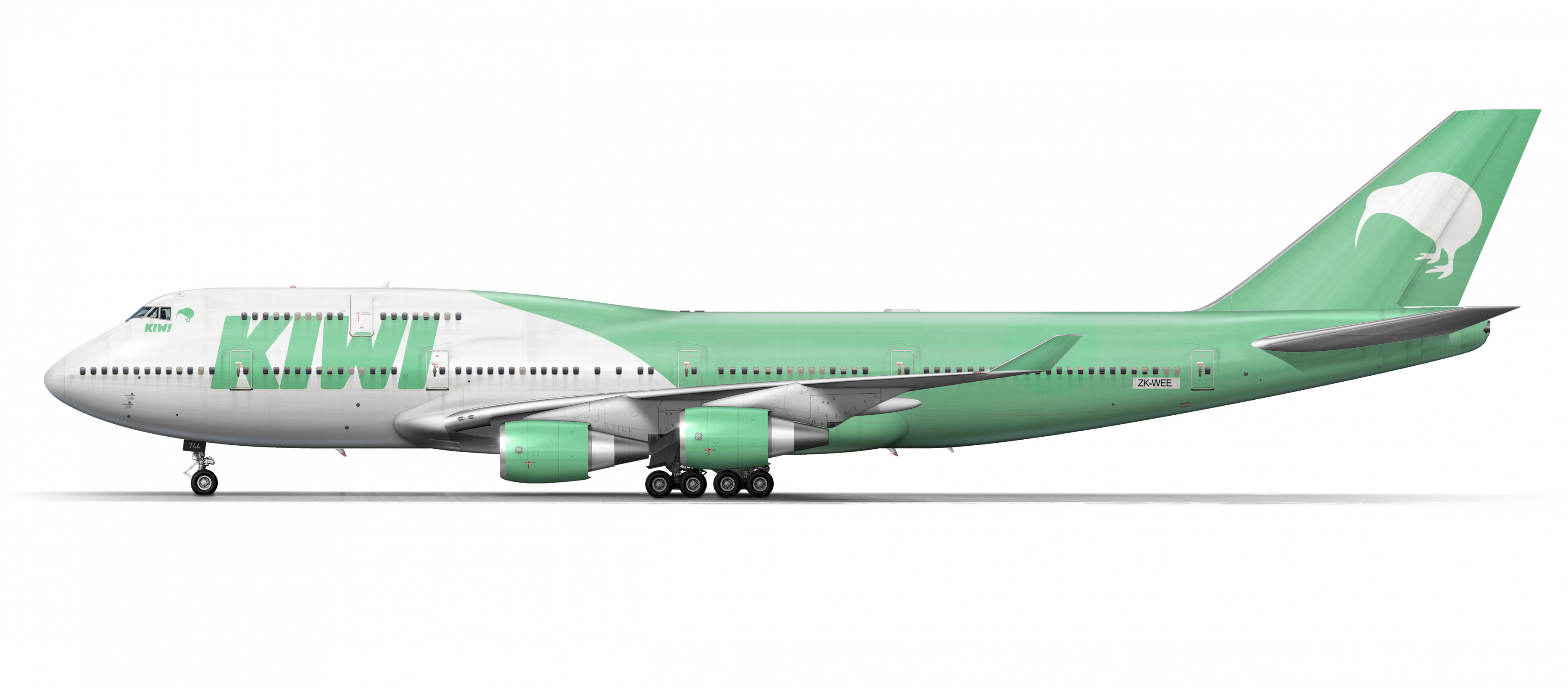
Kiwi 747-400
- Owner: RICspotter (View all images and albums)
- Uploaded: Oct 21 2021 12:32 PM
- Views: 704
- Album stuff

Kiwi Airways Boeing 747-400.


I have to say that I'm not a huge fan of this. It's very plain and the font seems very LCCy from like the 90s or 00s which doesn't fit well with the 744. Furthermore, the Kiwi outline is sort of cute and it's not a terrible concept but there's not even an attempt to stylize it and it's just sort of sitting in the middle of the tail it really doesn't look like a logo and certainly not one that a legacy carrier with a 747 in NZ would use

I used that same Kiwi bird for my first rendition until I developed this:

I don't like the color choice either

I have to say that I'm not a huge fan of this. It's very plain and the font seems very LCCy from like the 90s or 00s which doesn't fit well with the 744. Furthermore, the Kiwi outline is sort of cute and it's not a terrible concept but there's not even an attempt to stylize it and it's just sort of sitting in the middle of the tail it really doesn't look like a logo and certainly not one that a legacy carrier with a 747 in NZ would use
Yeah. also i dont like the pastelish green color, like what ginervra said, logo is too generic and it really just doesn't look like a full service airline


looking good!!