
 Sign In
 Create Account


- Owner: Dangelo (View all images and albums)
- Uploaded: Sep 30 2020 11:25 AM
- Taken: 2020:09:30 08:19:55
- Views: 1,196
- Album Meridiana

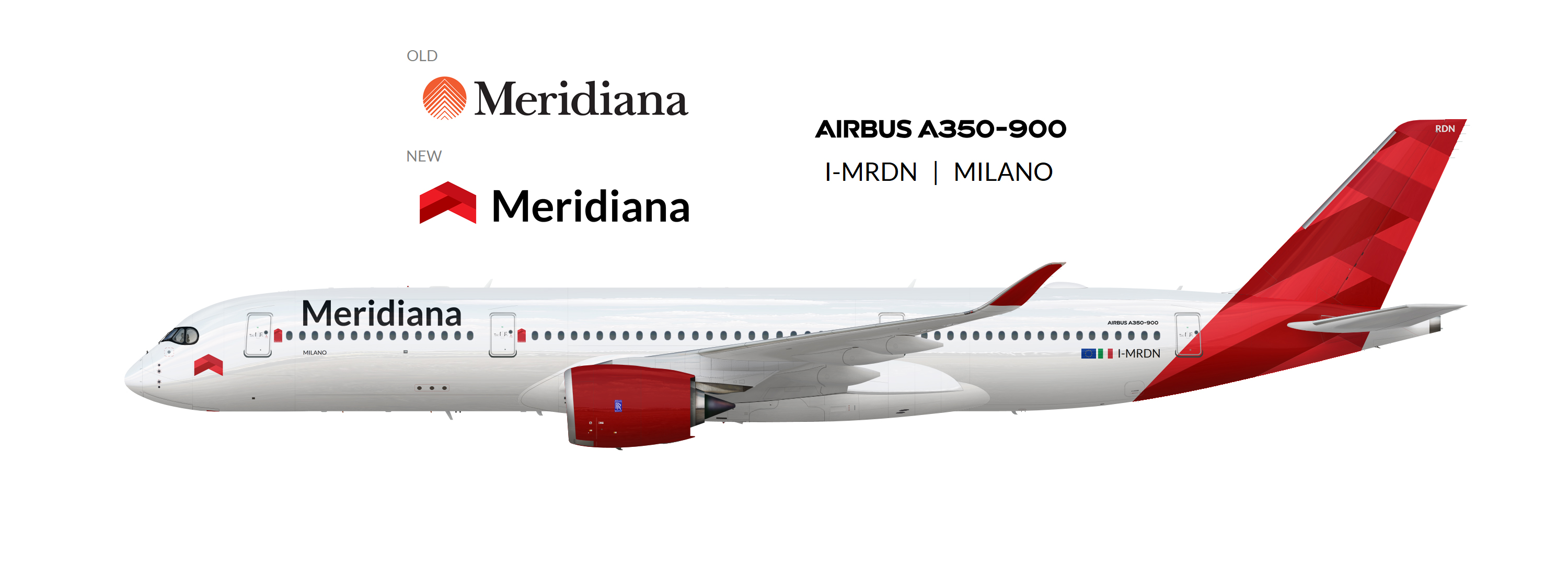
I've decided to bring to Meridiana, an italian defunct airline, a new look with a reviewed logo and a new livery. Here it is, hope you like.


It's not bad, but imo its a bit boring. Also I agree about the cockpit logo. Perhaps it would be better-placed behind the cockpit windows sorta like an alliance logo.

Agree with all the advice above, as well as that tail design has a bit more than a whiff of LATAM about it...

make a white version of the logo and put it on the tail

I’d put the logo next to the titles rather than on the nose, but that’s the only change I would make. I like this 

This is actually quite nice...not as interesting as Meridiana's original livery, but still quite good. Would be nice to see this being real.


not a big fan of the logo near the cockpit, seems out of place, but all in all, it's not bad