Jump to content

Photo

CaribbeanBlue Livery


  • Please log in to reply
16 replies to this topic

#1
Angus

Angus

  • Member
  • 454 posts

User's Awards

2   
Hi I was wondering if any livery designers would like to make a livery for my airline. I have designed a logo but if you don't want to use it and do your own thing go ahead.

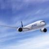
The aircraft can be anything from an ATR, DHC-8, to a wide-body, if you do choose a jet preferably an Airbus or BAE 146.
Posted Image
The font used in CaribbeanBlue is Harababa the slogan font is walkway semibold.

Thanks so much for the help if you have any questions just ask.

#2
Shredded

Shredded

    From the Downunder of Downunder

  • Member
  • 95 posts
I actually think that logo is pretty awesome. I would have a go but I'm a bit busy with exams. Maybe if I finish the current one i'm working on I might have a stab. I'm not the best but I'm not the worst either, I have some examples in the Livery Showcase thingo, my newer ones being the bettter ones :P

#3
Brando

Brando

  • Member
  • 499 posts
ill try also

#4
Angus

Angus

  • Member
  • 454 posts

User's Awards

2   
wow thank you so much both of you! Shreded take as much time as you need I understand you have other priorities.

#5
Shredded

Shredded

    From the Downunder of Downunder

  • Member
  • 95 posts
I had a horrible exam so I went and had a go at it to work off some tension. Here you go, let me know what you think, and if you want any changes.
Attached File  livery-cb.png   76.58KB   12 downloads
BAE 146-200 (I think it's a 200, it's some type of BAE146)

#6
Shredded

Shredded

    From the Downunder of Downunder

  • Member
  • 95 posts
Some alternate versions (subtle changes; smaller text, removal of the curved line, slogan removed):
Attached File  livery-cb.png   75.13KB   3 downloads
Attached File  livery-cb2.png   74.58KB   3 downloads
Attached File  livery-cb3.png   72.1KB   2 downloads
Attached File  livery-cb4.png   71.54KB   0 downloads

#7
Shredded

Shredded

    From the Downunder of Downunder

  • Member
  • 95 posts
oh darn the rego stuff up there. well if you like the versions without the stripe just reply and i'll fix the regos

#8
Angus

Angus

  • Member
  • 454 posts

User's Awards

2   

I had a horrible exam so I went and had a go at it to work off some tension. Here you go, let me know what you think, and if you want any changes.Attached File  livery-cb.png   76.58KB   12 downloadsBAE 146-200 (I think it's a 200, it's some type of BAE146)


I hear you about exams they just keep getting harder and harder. Anyways I really like this version above! You did an amazing job on all the liveries. Thanks for the help!

#9
bolli

bolli

    ae4ever

  • Member
  • 1,201 posts
I thought i'd give it a try... so:

Posted Image

I also did a quick touching up of your logo (it slightly smaller because i had to remove the white background and put it back again):
Posted Image

I can make any changes you want to it too :)

Porn in spoiler:

Spoiler


#10
Shredded

Shredded

    From the Downunder of Downunder

  • Member
  • 95 posts
Bolli you never cease to amaze me, that looks pretty awesome. :P

#11
Guest_Speed Bird_*

Guest_Speed Bird_*
  • Guests
Rather random design, is it not, Bolli? :P That said, the quality of the livery rather reflects that of the logo you were given...

#12
Angus

Angus

  • Member
  • 454 posts

User's Awards

2   

That said, the quality of the livery rather reflects that of the logo you were given...


should I take that as a compliment :P

#13
Guest_Speed Bird_*

Guest_Speed Bird_*
  • Guests
Take it how you wish...

#14
Angus

Angus

  • Member
  • 454 posts

User's Awards

2   
honestly what do you think of it? I want to improve my logo making so any tips/criticism is welcome.

#15
Shredded

Shredded

    From the Downunder of Downunder

  • Member
  • 95 posts
I like the logo. Speed Bird is being good old ambiguous Speed Bird, so who knows what he thinks of it.

#16
Guest_Speed Bird_*

Guest_Speed Bird_*
  • Guests
Tacky. I think that sums it up. What's going on with that random line going straight through it? The stylized C really doesn't work; the fact the lettering ends in with a straight edge is simply far too harsh. As far as I'm concerned, attempting to manipulate letters like that is a big no no. It's ridiculuoisly difficult to pull off. But overall though, you've got a mishmash of everything going on. Like I say, tacky is a good word to use. Everything is far too harsh to look at; you've got a decent colour scheme going at least, but you've ruined it really. Also, Harabara really isn't a brilliant font when you're dealing with longer names in a linear logo like this.

Difference is Shredded, I know what I'm doing ;)

#17
Shredded

Shredded

    From the Downunder of Downunder

  • Member
  • 95 posts
I don't claim to Speed Bird, I have a life. A very busy life, which involves attending university to become an allied health professional. This your forte. On the other hand I am a layperson, so I am representative of what some of the public will think :)


0 user(s) are reading this topic

0 members, 0 guests, 0 anonymous users