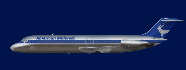
AMA DC 9 30
- Owner: Jeb (View all images and albums)
- Uploaded: Oct 05 2023 11:46 AM
- Views: 287
- Album Jebs Resterampe

I´ve tried m hand again in making a livery of an aircraft this time for a late 70´s early 80´s DC-9 for American Midwest Airlines which is HQ´ed in Detroit and used DC-9s and MD-80 for an aggresive expansion in the post deregulation era.
this is just meh. it's not great, nor is it terrible, it's just mediocre. Which if thats the vibe you're going for, you've hit it.
logo font is a bit generic though
I´m still quite inexperienced with paint.net and therefore i´m going with generic liveries before trying more complicated ones while with the font I still don´t know any super 80´s one yet.
Id do the opposite. You should try to do complicated liveries so as you gain more experience with them they will naturally start looking better.I´m still quite inexperienced with paint.net and therefore i´m going with generic liveries before trying more complicated ones while with the font I still don´t know any super 80´s one yet.
Id do the opposite. You should try to do complicated liveries so as you gain more experience with them they will naturally start looking better.
I dont think theres a wrong way to go about it. If you look at my older work, most of its super simple because I was still learning the basics of graphic design and my tools. Once I had the fundamentals down, I started moving on to more intricate designs.

 Sign In
 Create Account


this is just meh. it's not great, nor is it terrible, it's just mediocre. Which if thats the vibe you're going for, you've hit it.
logo font is a bit generic though