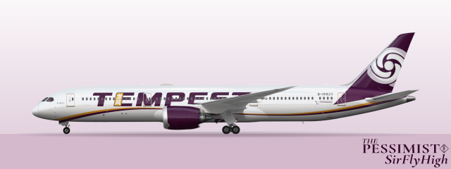
Boeing 787-9
- Owner: ThePessimist (View all images and albums)
- Uploaded: Sep 03 2023 03:34 AM
- Views: 413
- Album Tempest

At the onset of the Coronavirus pandemic TGC saw a prime opportunity to accelerate a long rumored rebranding effort to phase out the Tango Global Capital name and brand identity in favor of a fresh and slick new corporate identity. TGC had grown, even by the turn of the millennium, to such an extent that the conceit of the name of the company being a pun on the word mango and the founder's name was frankly absurd. In fact, by 2006, TGC spun off its dessert division which made the clunky name functionally obsolete. The problem was that TGC and its subsidiaries had brand reputation and that reputation was bound up in TGA's quad T swirl logo and deep purple. The immense cost of rebranding every bank outlet, website, aircraft, server, and all of TGC's other various physical assets combined with the potential to lose loyal customers was enough to ward off the company from pursuing a concrete rebrand. Certain global events though significantly lowered the opportunity cost of rebranding. With all of its assets closed or grounded, changing signs and repainting was a significantly easier endeavour. Unsure of exactly how long lockdowns were going to last and not wanting the waste the opportunity TGC opted to dust off a rebrand that had been developed as an academic affair in late 2010. Tango Global Capital would retain its signature purple but adopt a new wordmark and name that was slick and modern whilst reflecting the company's primary region in Asia. The Typhoon Group was envisioned as a sort of umbrella naming scheme under which many subdivisions could shake off the burdensome Tango Global branding. TGC's largest three divisions would all receive weather themed names that were slick and distinctive but obviously related. The mainline banking sector took on the name of the holding company as Typhoon Bank, Tango Global Technologies (formerly Tangophone) became Monsoon Technologies, and TGA became Tempest. Sadly, the underfunded 2010 report had not developed much for Tempest beyond a name. The name was simple and easy to remember in English and simplified from TGA's verbose Chinese name. Designers quickly put together a new brand that remained professional and reserved but could replace the practically Jurassic 1991 livery that had gone largely unchanged since its inception. With a name like Tempest, a storm logo was a natural choice but the shape of the logo cleverly mimicked the shape of the old quadruple T swirl. Colours were also largely similar except for the departure of accent teal. The rebrand was rushed and in some ways it shows on the modern Tempest livery which is a shame given that in the end the company actually had plenty of time before the world really reopened. Nevertheless, Tempest's fleet now proudly wear their new purple livery regardless of its quality and Tempest has become a name to remember on many Asia-Pacific region flights to and from Taiwan.

 Sign In
 Create Account


spam!