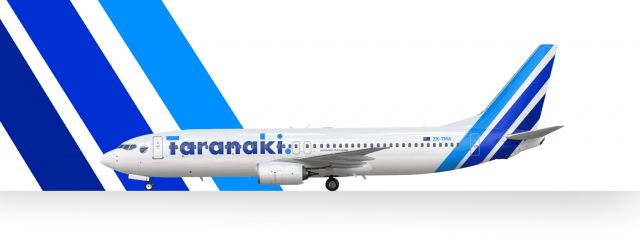
Taranaki 737-800 New Livery
- Owner: Liam_219 (View all images and albums)
- Uploaded: Jul 29 2023 12:52 AM
- Views: 1,266
- Album Virtual Airlines

In July 2023 Taranaki unveiled their new livery on a Boeing 737-800... this isn't the one, but it was the airlines first 737NG, and the second plane to receive this new livery and I just wanted to post a 737NG without winglets. Anyway, the livery follows simplicity, featuring a simple tri-colour stripe tail with different tones of blue, and a bolded sans serif font. The decision to ditch the iconic Islander tail logo was due to cultural appropriation. The CEO stated "the original logo was hand picked from Islander cultural symbols, and subsequent liveries were not designed by, in consultation with, or even considering the indigenous people of this nation, and their culture". Also a simpler livery fits better for a low cost airline
the fuselage titles are hard to read. The Rego is difficult to read from a distance which would probably cause it issues with CAA. The positioning of the fuselage titles are too high and overal the design is bland. I get it's a low cost airline and you were going for a simple livery, but there's a difference between a simple livery (ala Easyjet) and a bland, boring livery.
Yea I agree... I feel like the kiwis could do better
Gonna be honest man, my feedback here is pretty much the same as the MC-21.
This still feels rushed, there's still not that many small details, the tail still feels very uninspired, and overall it just feels like very little time and thought was put into this.
Gonna be honest man, my feedback here is pretty much the same as the MC-21.
This still feels rushed, there's still not that many small details, the tail still feels very uninspired, and overall it just feels like very little time and thought was put into this.
Small details like...?
Small details like...?

Small details like...?
Coloured door frames, rego digits on nose gear door, tourism logo (maybe), engine logo, that kinda thing.
"if you want me to explain my feedback you can just ask"
me: *asks*
you:
the fuselage titles are hard to read. The Rego is difficult to read from a distance which would probably cause it issues with CAA. The positioning of the fuselage titles are too high and overal the design is bland. I get it's a low cost airline and you were going for a simple livery, but there's a difference between a simple livery (ala Easyjet) and a bland, boring livery.
Feedback here, dipshit ![]()
Coloured door frames, rego digits on nose gear door, tourism logo (maybe), engine logo, that kinda thing.
I've never really considered a coloured door frame but that could work with the livery
"if you want me to explain my feedback you can just ask"
me: *asks*
you:
everyone else: posts high quality designs on the AE Galllery for others to enjoy.
liam:


 Sign In
 Create Account


the fuselage titles are hard to read. The Rego is difficult to read from a distance which would probably cause it issues with CAA. The positioning of the fuselage titles are too high and overal the design is bland. I get it's a low cost airline and you were going for a simple livery, but there's a difference between a simple livery (ala Easyjet) and a bland, boring livery.