Boeing 757 300 Grand Canyon Airlines
- Owner: Fabio M. (View all images and albums)
- Uploaded: Jul 09 2023 06:29 PM
- Views: 400
- Album Grand Canyon Airlines

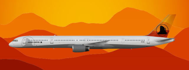
Introduced in 2000 the new livery of Grand Canyon Airlines called Round Table (due to the round logo) replaced the old Double Stripe livery, created in 1977.
While I think that the logo is an improvement over the previous iteration, I think the color choices could be better to really make it pop (I'm thinking of more saturated yellows, oranges, and reds for the background, and perhaps a dark blue-ish purple for the logo itself). I also think that the area that's not filled in at the bottom of the logo makes for a somewhat awkward, incomplete look. Additionally, I think the font choice could be better (perhaps something like Geometos would look nice).
Thank you for the feedback! I tried to make the livery look like other 2000s liveries, taking inspiration from nwa for the grey.
cute

 Sign In
 Create Account


While I think that the logo is an improvement over the previous iteration, I think the color choices could be better to really make it pop (I'm thinking of more saturated yellows, oranges, and reds for the background, and perhaps a dark blue-ish purple for the logo itself). I also think that the area that's not filled in at the bottom of the logo makes for a somewhat awkward, incomplete look. Additionally, I think the font choice could be better (perhaps something like Geometos would look nice).