
 Sign In
 Create Account


- Owner: jeromerss (View all images and albums)
- Uploaded: May 30 2023 08:42 AM
- Views: 974
- Album Flytroende
jeromerss
![Standard A321-200s [2021-present]](http://www.airline-empires.com/uploads/gallery/album_4307/med_gallery_304858_4307_220121.png "Standard A321-200s [2021-present]")
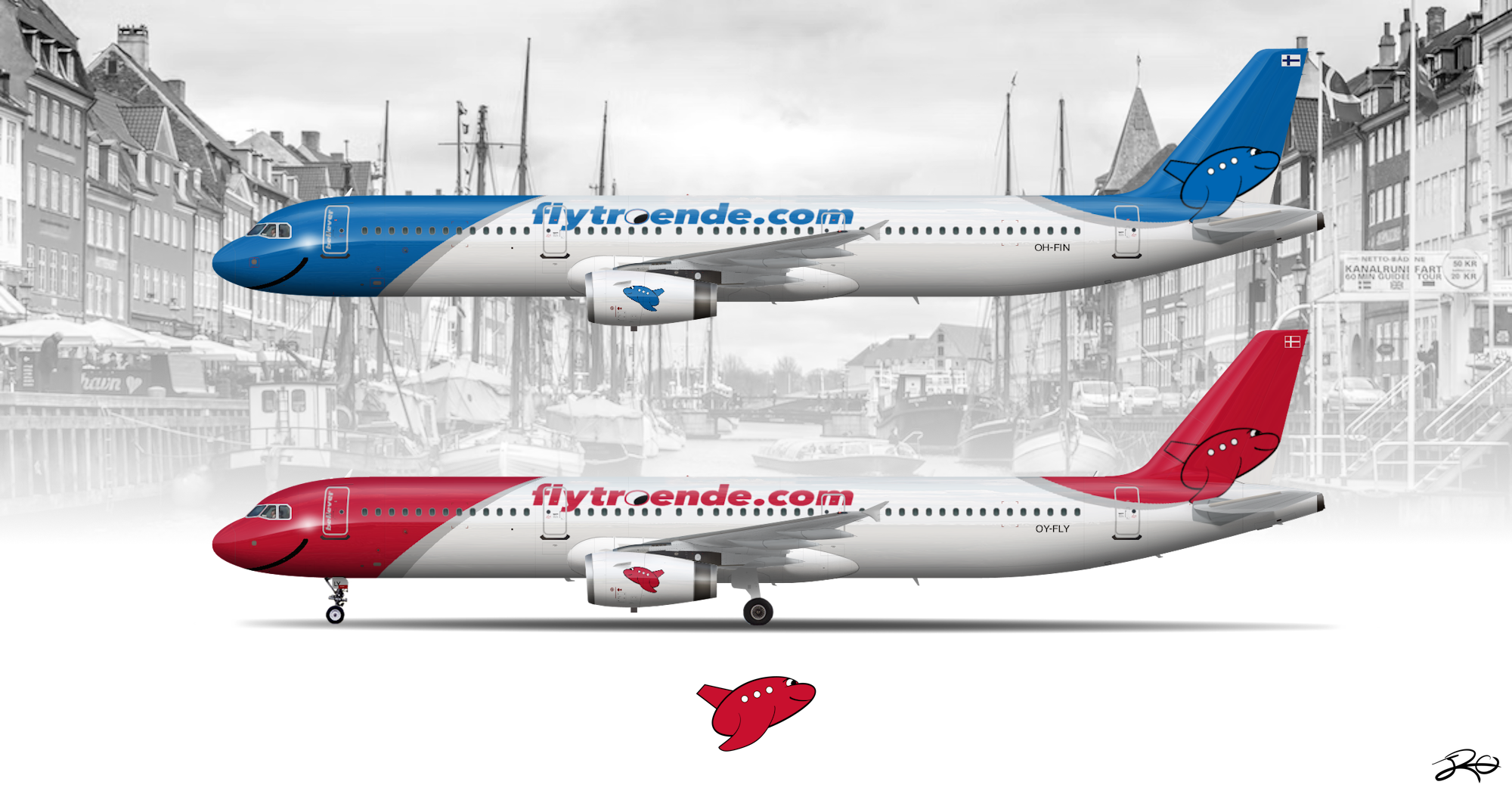
Flytroende, stylized as flytroende.com, is a European LCC based in Copenhagen, Denmark. Since 2008, the airline has become one of the biggest airlines to serve the Scandinavian region alongside its Finnish branch based in Helsinki.
The airline's name directly translates to "Fly Believer" in English, with the airline hoping its future customers would trust in its belief on providing quality service the airline strives for (but we all know what a European LCC is like sooo).
The airline since its inaugural in 2008 has grown to a fleet of more than 70 aircraft (including its Finnish branch), mainly comprised of Airbus narrowbodies. However, the airline looks to expand to North America with its newly-ordered A321XLRs, with plans to fly to New York City, Boston, and Toronto, starting in 2026.
The now-standard livery hasn't changed much from its former. It features the airline's beloved plane mascot, with it being designed like something you'd see from a toddler-rated aviation game from the Google Play Store. Many parts of the livery includes some features from it, such as the big smile at the front and the O in 'flytroende' replaced with an eye similar to the mascot's.
(livery revision due)


Cute!! Very charming
Thank you!! ^^

I think the logo is cute and the smiley at the front is a matching level of cute. I also think that the bright basic colours work well with the brand. I think the logo could be positioned on the tail in a way that its bigger and easier to see. Further, the text for the time period is quite dated I would say that this livery on an XLR would be quite cursed. Finally, I think the front and rear swooshes obviously gel in theory but in practice look a bit mindless and noncohesive so I might take another swing at that or really say this is an older livery from when the airline was founded because as is it could be primed for a serious glow up circa 2016
I think the logo is cute and the smiley at the front is a matching level of cute. I also think that the bright basic colours work well with the brand. I think the logo could be positioned on the tail in a way that its bigger and easier to see. Further, the text for the time period is quite dated I would say that this livery on an XLR would be quite cursed. Finally, I think the front and rear swooshes obviously gel in theory but in practice look a bit mindless and noncohesive so I might take another swing at that or really say this is an older livery from when the airline was founded because as is it could be primed for a serious glow up circa 2016
Really appreciate the feedback, will be looking into finding a more modern font that'll suit past 2000s and the positioning of the logo, possibly the gray streaks as well if I can find any good references  Thanks

