
 Sign In
 Create Account


- Owner: Liam_219 (View all images and albums)
- Uploaded: Oct 04 2022 09:25 AM
- Views: 1,258
- Album Virtual Airlines

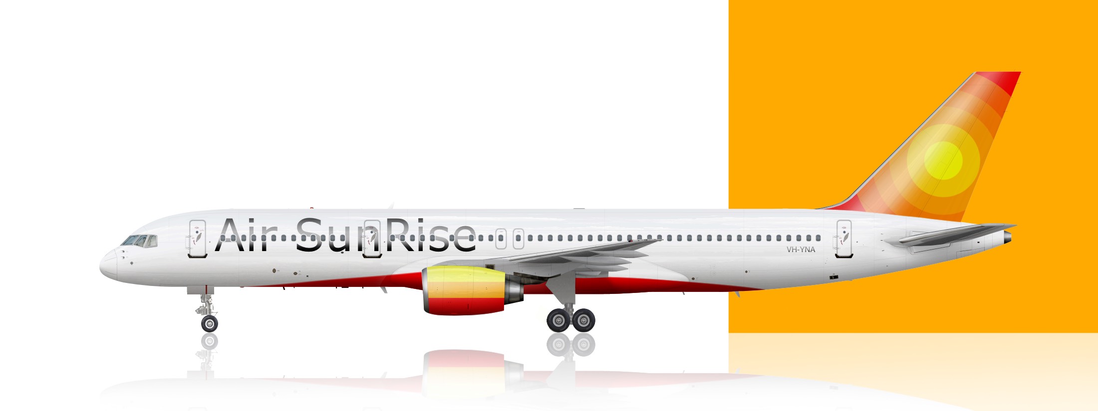
Air SunRise Boeing 757-200, wearing the 1985 livery, and featuring the wonderful classic RB211s


Disagree with the above. The font is basic in an unstylized way. When you say the font is supposed to be simple you probably actually mean that it’s supposed to be elegant and clean. The point being that your font isn’t that it looks like Arial bold which is a default font great for reading and not pretty in designs. It may be true that in some smaller details no one can make everyone content BUT on the issue of the font you’ve chosen I think anyone worth their salt would tell you that it doesn’t fit well and you should look for a different font. Certain people here are giving their general thoughts and treatises on the community as a whole and losing sight of the fact that this is discussion of the font you’ve chosen. If you don’t want feedback then you’re a bad person because you don’t want to take criticism that might make your work better but also you can just turn off the comments.
I don't think being annoyed at constant criticism makes me a bad person. I never said I don't want to take criticism, I just said it's annoying how ALL I ever get is criticism, and barely anyone giving any positive feedback even when I try hard

I don't think being annoyed at constant criticism makes me a bad person. I never said I don't want to take criticism, I just said it's annoying how ALL I ever get is criticism, and barely anyone giving any positive feedback even when I try hard
well keep trying.
http://www.airline-e...es-fokker-f100/
this is the first ever livery i uploaded and it's trash. You'll get better, we all do.

i dont hate this at all, i think this is a really good starting point for something fun. i agree with the others that the font seems a little basic and generic, but if you spend some time on that and also add in more subtle details on the fuselage and tail (maybe a pattern or sth for the center circle), i can see this being a really nice leisure brand.
also, not sure what you did to the effects, but it makes the template look almost cartoonishly shiny. if you're using airplano's templates, the stock effects are already really realistic, so i wouldn't mess around too much with it.
keep up the good work!
Good effort, nice tail but it could use a logo or something in the middle. The engine gradient is odd and doesn't seem necessary; try a solid red.
As for font, I like to browse font websites and look for fonts. I suggest looking at how the titles look like on other airlines and follow their design to get a better idea. See https://www.dafont.c...ext=Air Sunrise or https://www.dafont.com/stretch-pro.font?text=Air+Sunrise


Why didn't you say that in the first place? Very weird...
why don't you go be a moody **** somewhere else, huh 
Why didn't you say that in the first place? Very weird...
this is literally the first thing i said in like months...

