
 Sign In
 Create Account
G.1 Coastal Airlines | 2026 Fleet Vison Poster | 2014-Present
Uploaded by M31MK, Apr 21 2022 01:53 AM
- Owner: M31MK (View all images and albums)
- Uploaded: Apr 21 2022 01:53 AM
- Views: 1,199
- Album Coastal Airlines
Copyright
Med, ab, FlyHigh, M31MK


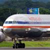
In the spirit of honestly and clearly articulating our feelings about other's liveries, I have some compliments and criticisms of this livery.
Compliments: This livery is very slick. I like the font and the logo, although in content perhaps objectionable, is executed beautifully with the shading on the gull
Criticisms: I don't like the logo very much. Like I said I really like the execution and honestly it's by far my favourite part of the livery but something about it does not say American major to me. It's hard to quantify and if you have questions about this I'd love to discuss. The name also seems weird for a national airline. The colours are frankly drab and the pattern on the tail is the only piece of interest other than the logo. The fuselage is without flare and lets down the potential of the tail.