
 Sign In
 Create Account

- Owner: Samoiamo (View all images and albums)
- Uploaded: Mar 14 2022 12:23 PM
- Views: 340
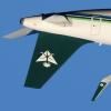
- Album Comoria Airways
Sam, Airplano21.

used for island hopping until retirement in 1998
perfect lore


This is a substantial improvement from your previous posts. I'm going to load a lot of criticism on it but it's because I think this could actually be good and I think it's worth improving.
This livery has very retro vibes in most places but sort of different vibes which makes it a little confusing: it's very 60s-50s at the front, 70s/80s on the fuselage, and then 80s/90s on the tail. The font is relatively modern looking as well. These elements (apart from the tail) all work in isolation but together they sort of look weird. Honestly the nose and the fuselage work together but then it doesn't look good when there's then the very geometric and straight and the font looks out of place.
It looks like you made the logo yourself which is a big step up from clipart, but I'm not sure what it is. I know it's the letter C but I also think it's supposed to look like something else. Is it a worm? As it is it sort of looks like a C with a big tumor on the end of it and in case you missed the tumor it has a star on it. Housing the round logo in a square box also has a weird clash to it sort of without regard for line flow.
I would suggest thinking about when you want this livery to be situated in terms of when it was designed and look at other liveries from that ear to determine what design elements look appropriate for that time and which do not. If this were something I had made I would have called this a 70s livery that lasted until the late 90s and kept the nose as it is, moved the fuselage stripes down so that the area between the two green lines runs down the centerline of the windows. I would maybe just make the logo the letter C integrated with a star and put it in white on a solid green shape that follows the shape of the green blob of the tail now (minus the stripes). I've also noticed that the white line between the grey belly and the black nose has an inconsistent width and I would correct this as well (I always find that just having the two colours really close to eachother and then painting a white stripe between then works best in this sort of case). Edit: I would make the engines the shade of grey instead of metal.
Essay done have a nice day.

absolutely lovely


good one