
 Sign In
 Create Account

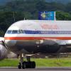
Deutscheadler | Boeing 757-300 | Livery Concept 2006-2014
- Owner: Zac23 (View all images and albums)
- Uploaded: May 18 2021 04:45 PM
- Views: 1,655
- Album Retired Brands
© Zac23 [You may NOT use, alter, sell, or distribute my work without EXPLICIT permission granted by Zac23 in writing] [Assistance - Makka] [Template - airplano21]

With a new logo came a new livery, so in the summer of 2006 teams got to work. The design featured a curved grey underbelly, continuing the use of the iconic grey palette of Deutscheadler. Deutscheadler continued to showcase a city it served on the front of the aircraft, along with the large DEUTSCHEADLER titles above. The engines featured an all grey design, with a small logo on the lower left of the shell.
Roughly 85% of the fleet still lacked winglets installed on the aircraft, so limited consideration was put in the initial designs. Months later it was agreed upon to showcase a grey winglet with a centered logo. The livery now featured the flag of the European Union next to the German flag. The tail used the white design of the new eagle logo, with the aircraft line number painted on the top rear of the tail.
D-AOCJ was the launch aircraft of the new livery. She was the last 757-300 delivered to Deutscheadler, and would stand the only 757-300 painted in the 'Eagle Grey' livery until 2015. D-AOCJ flew often to Manchester, Geneva, London, and Basel from Gothenburg.


The color scheme is pretty uninteresting and boring tbh. Feels kinda lazy.
I like the grey, not every airline needs to have big grand liveries.

Hmm I kinda like it, though, it could use black or another dark shade to help it be more appealing.
Hmm I kinda like it, though, it could use black or another dark shade to help it be more appealing.
Thanks 
I'll see what I can do about the darker shades.
I like the grey, not every airline needs to have big grand liveries.
Im a big advocate for minimalistic airline liveries, i've got nothing against them, but this just looks like a grey version of delta.
Im a big advocate for minimalistic airline liveries, i've got nothing against them, but this just looks like a grey version of delta.
Hmm, gotcha. I'll see what I can do with some shading and stuff.

I like the grey, not every airline needs to have big grand liveries.
But the problem is, there's too much grey.
Finding the right mix is hard, I try new styles and combos and nobody seems to like itBut the problem is, there's too much grey.

I agree with what others have said, it's kinda awkward that this is all basically 100% monochrome...

The monochrome color is an absolute let down from what could've been a decent livery.


The color scheme is pretty uninteresting and boring tbh. Feels kinda lazy.