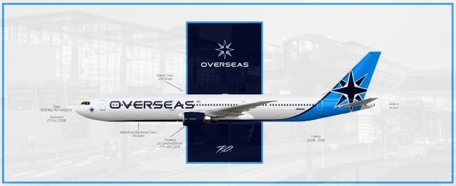
American Overseas Airways | Boeing 767-400ER
- Owner: Arianka (View all images and albums)
- Uploaded: May 05 2021 10:17 AM
- Views: 1,991
- Album Everything
Ro.

In 2008, with the delivery of the first 2 767-400ER's, the airline rebranded again and got rid of their abbreviation and went for a more simplified design. The windrose was updated to something more recognizable as well and the light blue was made a bit darker and applied on the tail section alone. On the belly of the plane, the Overseas text was added as well.
I came to realise that this is like Delta, but it isn't Delta, but...Delta...
~
Nice
Interesting
Even though it's my design, I think it is too. Because I never would expect a big premium/legacy airline to do this...but then you have Delta.
love the tail, but that font and placement makes it look way too lcc
Update: It looked like some charter airline lmao. I think you just have to look at it in a United kinda way. United did go billboard, but their design doesn't look like something you'd see on a legacy airline...atleast to me.
Update: It looked like some charter airline lmao. I think you just have to look at it in a United kinda way. United did go billboard, but their design doesn't look like something you'd see on a legacy airline...atleast to me.
Tbh United's livery doesn't look like it belongs on any airline... it looks like it belongs on the IFC. ![]()
Imo, this just seems to follow design trends on AE. Global and Vanguard seem to use a similar fuselage design (Tail transitions into belly), with the main difference in formula here being the billboard titles (which seems appropriate to me, even for a legacy... after all, United and Alaska both did just that). One might call it 'Ameriwhite'.
By no means is that a bad thing though, it's super interesting to see design trends evolve in a fictional universe! I also appreciate the cleanliness and simplicity of the livery, honestly IMO this is the best one so far from this brand. I can't wait to see what else you do with it! ![]()
Tbh United's livery doesn't look like it belongs on any airline... it looks like it belongs on the IFC.
Lmfaooo that's so true
Imo, this just seems to follow design trends on AE. Global and Vanguard seem to use a similar fuselage design (Tail transitions into belly), with the main difference in formula here being the billboard titles (which seems appropriate to me, even for a legacy... after all, United and Alaska both did just that). One might call it 'Ameriwhite'.
By no means is that a bad thing though, it's super interesting to see design trends evolve in a fictional universe! I also appreciate the cleanliness and simplicity of the livery, honestly IMO this is the best one so far from this brand. I can't wait to see what else you do with it!
I forgot about Vangaurd and Global, but I'm happy you pointed it out. They all do have similar designs in this fictional world.
As for the final livery, I'll post that later today or tomorrow with an ad, it's a bit more simplified. ![]()

 Sign In
 Create Account


