
 Sign In
 Create Account


- Owner: FlyPSAGuy (View all images and albums)
- Uploaded: May 02 2021 11:30 PM
- Taken: 2021:05:02 19:11:48
- Views: 441
- Album Western Sky

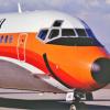
Used on transcontinental routes like San Diego to Chicago


It would've been better if you put these on one image. 
Other than that, these aren't too bad. I recommend taking inspiration and learn from aspects on other designs you see on this website and real world designs. It really will help you improve.

i know it's your first brand but this ain't it chief. name is generic and overused, font is atrocious and the size of the registration is outrageous. also limit your posts to 2 a day and don't flood the gallery.

i know it's your first post but this ain't it chief. name is generic and overused, font is atrocious and the size of the registration is outrageous. also limit your posts to 2 a day and don't flood the gallery.
Ok first, this is his first post:
http://www.airline-e...boeing-737-200/
Second, no need to be so negative.
Other than that, what Ro said. Pay attention to details like the flag of the country of origin, fleet number, aircraft name, etc.
For seemingly your first fictional brand though, this is pretty good, certainly better than my first 
Also, what editor do you use?

I'm sorry, but this isn't really that good. Aside from everything J.C said, the colours, particularly the orange, look extremely dull. Also, NEVER have text overlapping two different colours. Plus, it's missing a lot of details that would really make it pop.
But hey, it's your first fictional brand, and it certainly looks a LOT better than my first.

i know it's your first brand but this ain't it chief. name is generic and overused, font is atrocious and the size of the registration is outrageous. also limit your posts to 2 a day and don't flood the gallery.
Listen bud you need to pipe the **** down ok, I get you're giving feedback but relax.
Thank you for the feedback everyone! I'll try to make it better soon

just a little note to those who are having a go in the comments.
i swear to jebus half of you do the same s*** on other liveries so all of you pipe tf down.
the livery itself has good bones but needs a bit of refinement. I personally find the text hard to read but thats just me.
Other then that it just needs a few minor improvements but just research other liveries similar to what you're aiming for and use that as inspiration.
Good job regardless sir

