Post-Soviet beginnings
- Owner: Avelo (View all images and albums)
- Uploaded: Dec 01 2020 05:52 PM
- Views: 1,402
- Album Baltija Baltic Airlines

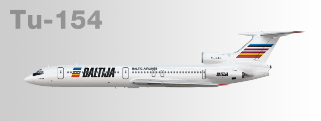
#4 in the 2020 "Russia Reborn" Livery Design Challenge (tied with ThePessimist)
Link to results: https://docs.google....yFAw/edit#gid=0
In the aftermath of the collapse of the Soviet Union, the once-mighty Aeroflot was dissolved with newly independent countries claiming ownership to the airline's former regional divisions, thus leading to the formation of "Babyflots." With the new governments of Estonia, Latvia, and Lithuania merging their own ex-Aeroflot divisions into a single multinational entity, Baltija Baltic Airlines was officially established on 20 September 1991. At its inception, Baltija aspired to become one of the leading airlines in Eastern Europe, but various hurdles remained along the way. Like other former Soviet states, capital was in short supply and the airline could not yet afford to buy Western-built planes to upgrade its fleet; hence, Baltivia had to make do with keeping antiquated Soviet-built planes in service until sufficient funds were made available.
In spite of these hardships, the airline embarked on a slow but steady expansion of its European route network, launching new services to major Western European destinations throughout the 1990s.
Registration: YL-LAB
Cool design
These parallel stripes and a no-nonsense font are SO nineties! Made me nostalgic...
One criticism: in the logo, the L and T (and to a lesser extent A and V) look a long way apart from each other due to their geometry - maybe squish them a bit closer together if you have a way to do that?
nice
Yeah I'm sorry to say this but the black text did work a lot better...this blue doesn't match the stripes on the logo at all. Also, didn't you have the titling below the windows before?
Yeah I'm sorry to say this but the black text did work a lot better...this blue doesn't match the stripes on the logo at all. Also, didn't you have the titling below the windows before?
Just changed the titles back to black. Made the main title billboard size because commenters said the original looked bland and unfinished.
Just changed the titles back to black. Made the main title billboard size because commenters said the original looked bland and unfinished.
But what did you think of the previous versions?
At first they appeared fine but I almost always follow what commenters think as advice to make improvements.But what did you think of the previous versions?

 Sign In
 Create Account


Nice!