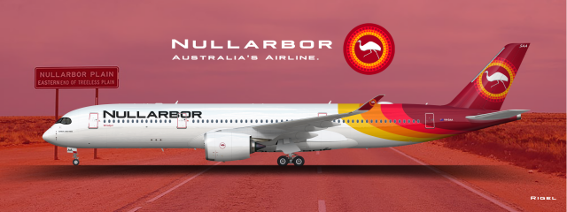
10.1. Airbus A350-900 Nullarbor Australian Air Lines
- Owner: Rigel (View all images and albums)
- Uploaded: Nov 16 2020 07:21 AM
- Views: 1,816
- Album ZYX - (OUTDATED) Nullarbor Australian Air Lines - The Gallery
Template by Med/FlyHigh. Logo and livery by Rigel

*Lore coming soon.*
Shown above is VH-SAA, Nullarbor Australian Air Lines' first Airbus A350-900, wearing the current livery introduced in 2015. The plane is configured with 30 Business Class, 27 Premium Economy Class and 254 Economy Class seats. The airline currently operates 9 A350-900s and 4 A350-1000s, with a further 6 of each on order to replace the A340s and older 777s. In addition, orders for the A350-1000ULR are on the cards to operate the long-dreamed-about nonstop Sydney to London/New York flights.
Leave feedback! Any and all feedback helps (but preferably constructive).
Eyyyy nice
Thank you Yuki!
Nice!
This is great. I love all the details, and the simplified logo (probably a heritage logo right?) on the engine is a nice touch. The only thing I'd change is removing the halftone on the tail...I feel like it's a little extraneous. Apart from that, it's obvious that you took a lot of the advice people gave you before, and spent a lot of time on this. Well done!
Nice!
Looks very nice! Good work
Thanks y'all! Means a lot!
This is great. I love all the details, and the simplified logo (probably a heritage logo right?) on the engine is a nice touch. The only thing I'd change is removing the halftone on the tail...I feel like it's a little extraneous. Apart from that, it's obvious that you took a lot of the advice people gave you before, and spent a lot of time on this. Well done!
Actually, that logo on the engine is just the current logo,I just didn't want to put the aboriginal pattern circle on the engine, as I felt it would draw too much attention to itself, and maybe distract from the main livery.
I could remove the halftone, but I think it looks good like this. The halftone was on G.J.'s Grand Theft Airline version, and I just moved it over to here...
Thank you nonetheless!
Actually, that logo on the engine is just the current logo,I just didn't want to put the aboriginal pattern circle on the engine, as I felt it would draw too much attention to itself, and maybe distract from the main livery.
No no I get the emu is the same, I just mean that removing the patterned circles around it and making it one solid color makes it look like a heritage logo. Kind of like Qantas' old kangaroo logo that they put on the nose on their new livery, or Air France's winged seahorse on the engines. It looks good!
No no I get the emu is the same, I just mean that removing the patterned circles around it and making it one solid color makes it look like a heritage logo. Kind of like Qantas' old kangaroo logo that they put on the nose on their new livery, or Air France's winged seahorse on the engines. It looks good!
Ohhhh I see what you mean now. Thank you!

 Sign In
 Create Account


Eyyyy nice