
 Sign In
 Create Account
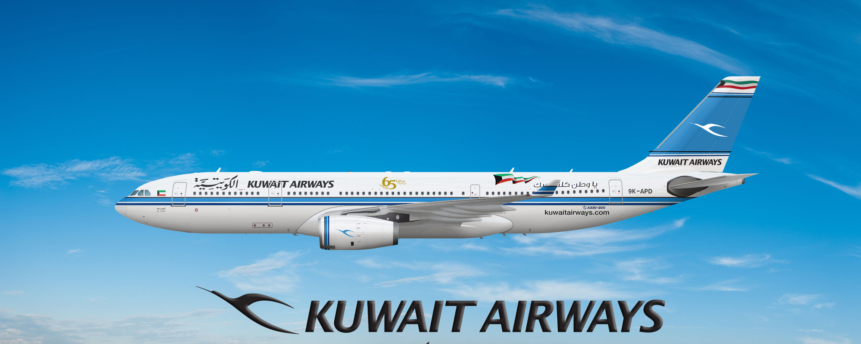
Airbus A330 200 Kuwait Airways
- Owner: mka1881 (View all images and albums)
- Uploaded: Sep 13 2020 02:49 PM
- Taken: 2020:09:13 17:48:30
- Views: 895
- Album mka1881's workshop

There is a mistake on the tail,l know it.I fixed it after sharing photo.


Wow! Great Job!
Thank you!

You've got the overall *vibe* of this livery kinda correct I guess, but a lot of the small details are wrong, and when you're trying to recreate a livery with this many small yet noticeable details, that really matters. Some that stand out to me are the little flag on the nose (size and positioning are wrong), the big flag on the fuselage (positioning is wrong), the cheatline (partially the wrong color, too fat), the engine (totally wrong, 'vertical stripes' should be angled forward to match the front of the nacelle and the bird logo looks too big), the tail (several of the design elements are escaping from the actual tail surface, both the color and positioning of the thin dark lines is wrong, text might be a bit too big), registration (wrong font), etc. It's a good effort, and well done for attempting it - but it really does need more work before it can be considered finished.
You've got the overall *vibe* of this livery kinda correct I guess, but a lot of the small details are wrong, and when you're trying to recreate a livery with this many small yet noticeable details, that really matters. Some that stand out to me are the little flag on the nose (size and positioning are wrong), the big flag on the fuselage (positioning is wrong), the cheatline (partially the wrong color, too fat), the engine (totally wrong, 'vertical stripes' should be angled forward to match the front of the nacelle and the bird logo looks too big), the tail (several of the design elements are escaping from the actual tail surface, both the color and positioning of the thin dark lines is wrong, text might be a bit too big), registration (wrong font), etc. It's a good effort, and well done for attempting it - but it really does need more work before it can be considered finished.
Hi,thank you for your return.Here,I share my "amateur" livery works here.I do liveries since about 1-1,5 months,so I improve myself day by day.In some mistakes l agree you (Motor lines,front flag and middle flag) but especially the plane reg is the most realistic part in this work,i used the real font on that.A part more which is I didnt understand about tail.Tail is okay for me with lines,logo and colors.I worked on that with a real tail photo,so the dimensions are original.Finally,can you tell me the wrong parts on tail exactly?
**REG PHOTO**
on the top is the original reg font from the plane (cropped)
the reg on the below is i used in this work.as you can see they 're nearly same.
The black lines should be thinner and closer to the edge of the big blue bit. The dark blue lines should be a bit thicker. Also, all the lines on the tail should be parallel...and the bottom black line isn't. Everything on the tail is also quite blurry. Finally, some of the elements (eg the black lines and the big wavy flag at the top) look like they're escaping from the tail.
And regarding the reg - even your cropped image shows that your version is noticeably taller than the original.
Okay, i am going to improve myself for future works.


Wow! Great Job!