
 Sign In
 Create Account


- Owner: Rigel (View all images and albums)
- Uploaded: Sep 09 2020 11:14 AM
- Taken: 2020:09:09 21:14:09
- Views: 1,444
- Album ZYX - Brands By Rigel
Template by Med. Logo and livery by Rigel

When Nullarbor Australian Air Lines placed its first order for the Boeing 747 in 1967, they were getting really excited about the new age of air travel. At the time, they also had orders for Concorde and the Boeing 2707 SSTs, and were looking forward to both major leaps in technology. However, while the enthusiasts and employees were getting super excited about the prospects to come with the new 747, management within the company was starting to see a potential problem with the 747.
Nullarbor management feared that the 747 would be too large to handle some of the airline's smaller Asian and African routes. These included destinations such as Hong Kong, Cape Town and other places around Asia, Africa and the Middle East. These destinations were popular, but not enough to warrant the huge capacity and relative inefficiency of the 747. Nullarbor therefore decided that the airline needed a smaller plane that could fly long range, but be more efficient than the 747.
It just so happened that in the United States, a similar requirement was spawning a new series of widebodies; Trijets. These planes, namely the McDonnell Douglas DC-10 and Lockheed L-1011 Tristar, were smaller and lighter than the 747, meaning they could fit into more airports. They also had three engines, which was more efficient than the four engines of the 747. These planes were exactly what Nullarbor was looking for, and they very quickly decided to order one of the two. The only problem was, they didn't know which plane to choose.
After a lot of negotiations, comparing stats and talks with the manufacturers, Nullarbor settled on the DC-10. Citing a quicker introduction and numerous delays plaguing the L-1011, Nullarbor ordered 20 DC-10-10s, with an option for another 10, on November 25th, 1967. The plane was marketed as the "JumboLite", as it had all the benefits of the Jumbo 747, but in a smaller package.
The first DC-10 arrived at Nullarbor's headquarters in Melbourne on 13th April, 1972, and made the first revenue flight to Auckland on the 20th. The plane was very successful at its mission, flying to destinations all across Asia, Africa and the Middle East, helping to replace the 707 and VC10 on those routes. The planes would be joined in these roles by the Boeing 747SP in 1977, and the two would fly together until both were retired in 2003.
In 1973, Nullarbor became the first foreign customer for the new McDonnell Douglas DC-10-30, with an extended range. These models were known as the "DC-10 Super 30", and bore that name on Engine #2, mounted in the tail. Nullabor would start receiving their DC-10s in a pattern, where one -10 would be delivered, then one -30 would be delivered, then another -10, and so on and so forth. The DC-10-30 would operate on pretty much the same routes as the basic DC-10-10s.
However, in 1974, the entire worldwide DC-10 fleet was grounded after two consecutive incidents involving cargo doors blowing off. Therefore, Nullarbor's DC-10 fleet sat grounded at airports around Australia for six weeks while McDonnell Douglas made the necessary fixes to the cargo doors. The airline was considering leasing L-1011s should the grounding have gone on longer, but the DC-10 was swiftly reintroduced to the fleet almost as soon as the fixes were implemented.
Shown above is VH-DCJ, the flagship of the Nullarbor DC-10 fleet ("J" is the 10th letter in the alphabet, so this registration represented the DC-10, and thus was the flagship), in the airline's 1971 livery introduced on the 747 the year before. The DC-10 would fly reliably and safely in the Nullarbor fleet until 2003, when it was replaced by the Airbus A340 and Boeing 777.
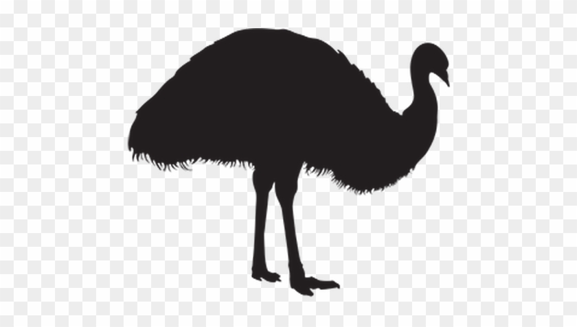
ARAIAT's got a new name! I also tweaked the logo for this one. Since the wings on the last livery on the 747 were the most criticised part of the livery, I decided to make them look like emu's wings. However, it turns out there aren't many reference photos of an emu with its wings open, and I thought this would make the logo look even worse, so I decided to omit the wings altogether. Does it look better now? And is the name better or not? The other posts will be updated soon.
Leave feedback! Any and all feedback helps (but preferably constructive).


The -10 series was a short-range aircraft designed initially for high-demand domestic routes in the US. Using your example of Melbourne, it wouldn't even be able to make it to Singapore, let alone Hong Kong or Cape Town (which even the DC-10-30 wouldn't reach...) so I'm not sure how much of this backstory is actually plausible. Apart from that, the logo looks too simple now, like it's just a clipart emu (which is probably is). Try looking at Qantas' 1940s and 1960s logo redesigns for inspiration on how to add more detail and make this logo more interesting (don't copy directly from it though, obviously).
I like this but I'm not sure about the emu this time. I understand that it's probably supposed to be feathers but it looks to be hairy. It looks messy and it becomes a more indistinct shape from afar. I like the way the legs are positioned though - it looks like it's trying to run which is quite appropriate.
Thank you! Yeah it does look a little hairy, but I was inspired by looking at emu silhouettes on the Internet, ones like these:
The -10 series was a short-range aircraft designed initially for high-demand domestic routes in the US. Using your example of Melbourne, it wouldn't even be able to make it to Singapore, let alone Hong Kong or Cape Town (which even the DC-10-30 wouldn't reach...) so I'm not sure how much of this backstory is actually plausible. Apart from that, the logo looks too simple now, like it's just a clipart emu (which is probably is). Try looking at Qantas' 1940s and 1960s logo redesigns for inspiration on how to add more detail and make this logo more interesting (don't copy directly from it though, obviously).
Okay, I'll change the -10 backstory, although, with a stopover in Darwin for refuelling, the DC-10-10 could make Singapore (the -10's range is 6,500 km, while Darwin to Singapore is 3,353 km). Alternately, the plane could have a stopover in Jakarta as well. Also, it seems that the DC-10-30 can reach Hong Kong from Melbourne (9,600 km range, 7,416 km distance), but it seems Cape Town, even with a stopover in Perth, is just out of reach. I'll change that.
Regarding the logo, no, it's not a clipart, this was drawn from scratch in Photoshop. What makes it look simple? Is it the lack of wings now?
Regarding the logo, no, it's not a clipart, this was drawn from scratch in Photoshop. What makes it look simple? Is it the lack of wings now?
No, just the fact that it's a big single-color silhouette with no other details. Looks like a clipart image instead of a logo because of that...as I said, try taking a look at the old logos Qantas used for examples of how to turn an animal silhouette into a pretty nice logo.
No, just the fact that it's a big single-color silhouette with no other details. Looks like a clipart image instead of a logo because of that...as I said, try taking a look at the old logos Qantas used for examples of how to turn an animal silhouette into a pretty nice logo.
Ahh, okay. So what should I do? Add another colour/shade to the logo, or a new feature entirely? I could bring the wings back, just a bit more "streamlined" than the wings on the 747 logo...


I like this but I'm not sure about the emu this time. I understand that it's probably supposed to be feathers but it looks to be hairy. It looks messy and it becomes a more indistinct shape from afar. I like the way the legs are positioned though - it looks like it's trying to run which is quite appropriate.