Jump to content
You currently have javascript disabled. Several functions may not work. Please re-enable javascript to access full functionality.
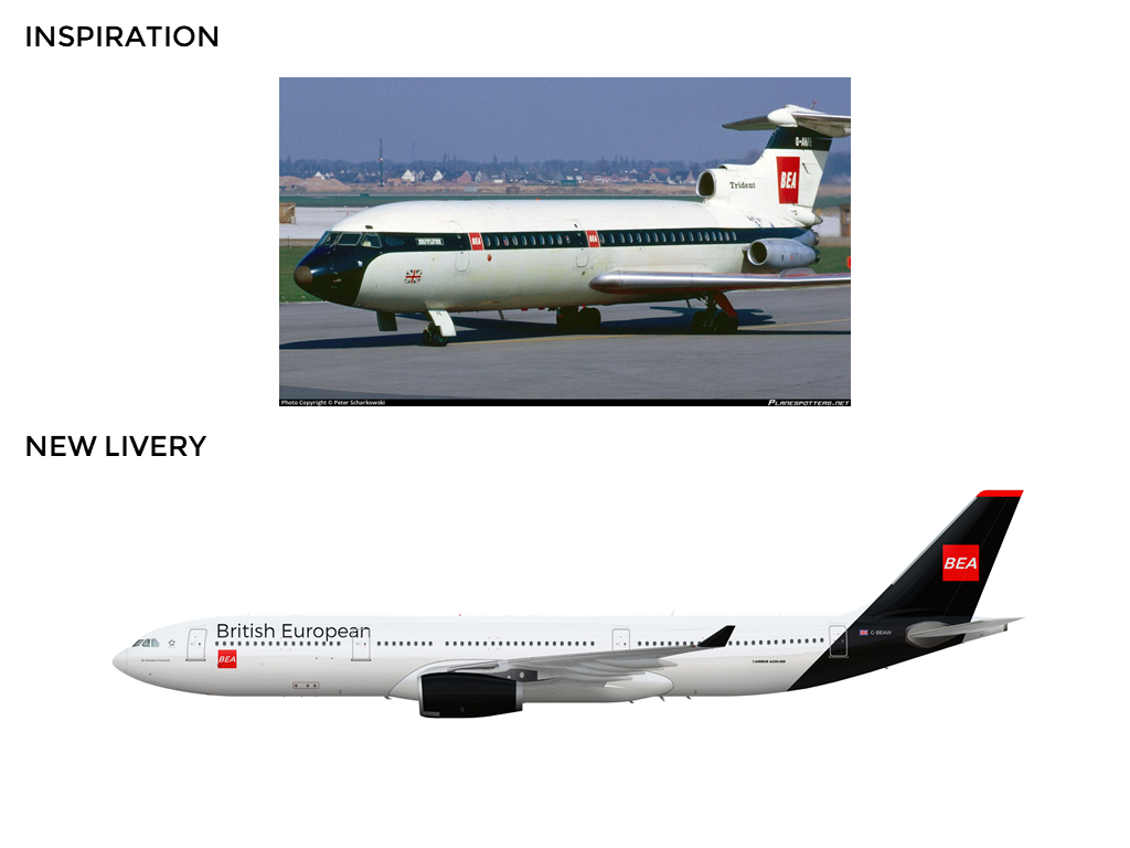
Add a bit more details and it will look nicer
I think this looks fine. Not very exciting, yes. But, not as bad as people are making it seem.
the font is frankly boring and uninspired. The only similarities between the original and your creation is the name and the fact you put BEA in a red square.
Direct link to this image file

 Sign In
 Create Account


Add a bit more details and it will look nicer