
 Sign In
 Create Account


- Owner: Rigel (View all images and albums)
- Uploaded: Jul 25 2020 12:05 PM
- Taken: 2020:07:25 22:02:11
- Views: 1,663
- Album ZYX - Brands By Rigel
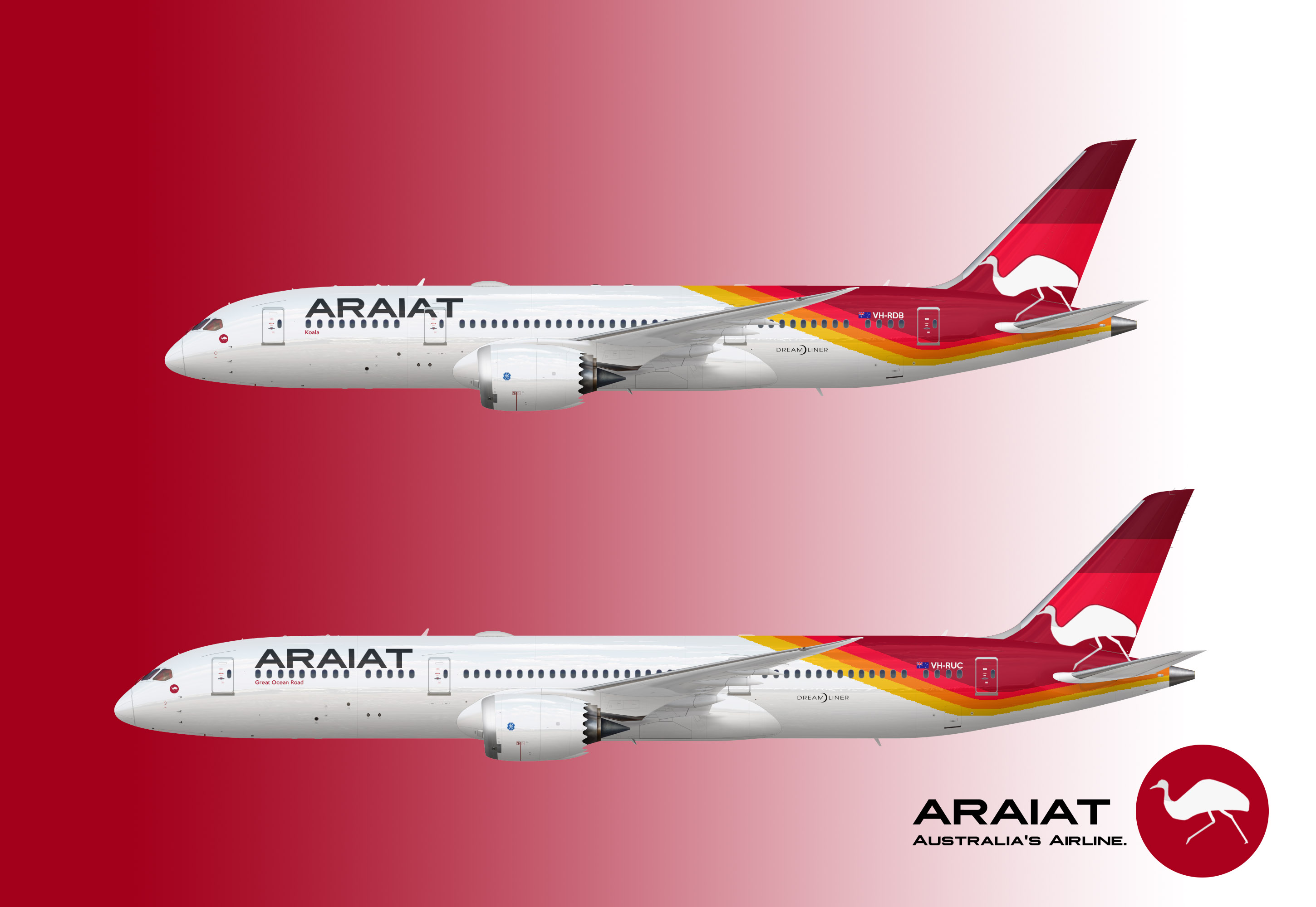
Templates by Med. Logo and liveries by Rigel

Australian Regional And International Aerial Transport, better known as ARAIAT, is the flag carrier of Australia. The airline was founded on October 26, 1920, making it one of the oldest airlines in the world, turning 100 years old this year.
The airline operates a fleet of 180 aircraft, flying them to around 110 destinations across the six inhabited continents. The airline's main competitor is East Australian Airlines.
The airline has used the "Soaring Emu" as its logo since 1937. This logo is one of the icons among aviation enthusiasts, and differentiates ARAIAT from all the other Australian large carriers which use the kangaroo.
In 2007, looking to replace its obsolete and rapidly-aging Airbus A330/A340 fleet, ARAIAT placed an order for 40 Boeing 787 aircraft, consisting of 20 787-8s and 20 787-9s. The airline received its first -8 in February 2015, and its first -9 in November 2017. With the new aircraft available, the airline started slowly retiring its Airbus A340 fleet, which had been in service since 1994.
ARAIAT currently operates 26 787-8s and 32 787-9s. The airline is considering the 787-10 as a possible replacement for aging 777s and A340-600s.
Sidenote: This used quite a bit of inspiration from East Australian Airlines and Californian Airways. If anyone thinks this airline is too similar to either of those brands, let me know, as well as what I can do to change it.
Also, leave feedback! Any and all feedback helps (but preferably constructive).


If you make the lines on the fuselage less pixelated and curved instead of how they are now I think this'll be pretty nice
I feel like the point is to have them look like that.
My issue with this is the tail. If it was a solid color it would balance out the entire design and maybe look for a new logo?
I feel like the point is to have them look like that.
My issue with this is the tail. If it was a solid color it would balance out the entire design and maybe look for a new logo?
So do you think I should get rid of the darker red parts on the v-stab and leave it the bright red that is going around the emu? And what do you suggest for a new logo? I chose the emu to be a bit different to all the other Australian carriers which use a kangaroo.
I feel like the point is to have them look like that.
Well yes, sort of.
My original plan for this airline was to have the back of the tail pattern follow the empennage, and I also wanted to have the curve be different for each aircraft type, for example on the 787 it would be curved, while on the 777 it would be straight. However, since I'm still very much an amateur at Photoshop, I couldn't get it how I wanted without making it look too messy, so I kept it straight.
This is quite nice
Thank you! It should be even better soon; I'm working with G.J. to smoothen out the kinks in the design...


If you make the lines on the fuselage less pixelated and curved instead of how they are now I think this'll be pretty nice