
 Sign In
 Create Account


- Owner: ThePessimist (View all images and albums)
- Uploaded: Jun 29 2020 03:48 AM
- Views: 3,710
- Album The Pessimist One Offs

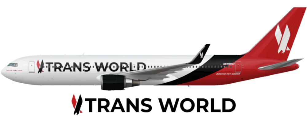
So TWA is a big one, but I thought they would be a good choice for tackling the Defunct American brands challenge. You'll notice the logo looks familiar but for the wrong airline... wait, before you comment, I can explain. I'll write more in my final version, but basically TWA didn't go bankrupt 3 times so when TWA and AA merged in late 2001, the company chose the TWA name for the post merger airline. The new livery combined the AA eagle logo and an evolution of TWA's 1995 livery colours. This livery is an evolution of that one and was adopted in 2017, it removed the gold from the colour scheme and updated the font, along with introducing a more dynamic, swooping livery. This 767-300ER (N691LF) was delivered to Condor in 1991 and then moved to TWA's fleet in 1994. After the merger, it was christened the City of Saint Louis and regularly served the JFK-LAX route. It has been stowed but not retired during the COVID-19 Pandemic.
On a more meta level, I'm sort of proud of this one. I know it's pretty simple but I think it doesn't look too bad and I like it. Tell me your thoughts, I appreciate them, I would love to improve this design.
Edit: Smaller text and logo repositioned.


The Trans World title and logo on the fuselage is driving me crazy. Why is it in front of door L1?
Besides that tho, not too shabby.
Thanks, I was trying to position the text before the middle exit doors but I realize it looks a bit scrunched up front. Do you think I should move just the text behind L1 or the text and the logo?
Thanks, I was trying to position the text before the middle exit doors but I realize it looks a bit scrunched up front. Do you think I should move just the text behind L1 or the text and the logo?
I would move both, or make both smaller, it would work better.
I would move both, or make both smaller, it would work better.
How does this look?


The Trans World title and logo on the fuselage is driving me crazy. Why is it in front of door L1?
Besides that tho, not too shabby.