
 Sign In
 Create Account


- Owner: ThePessimist (View all images and albums)
- Uploaded: May 24 2020 11:24 PM
- Views: 1,021
- Album Valiant Airways [Old]

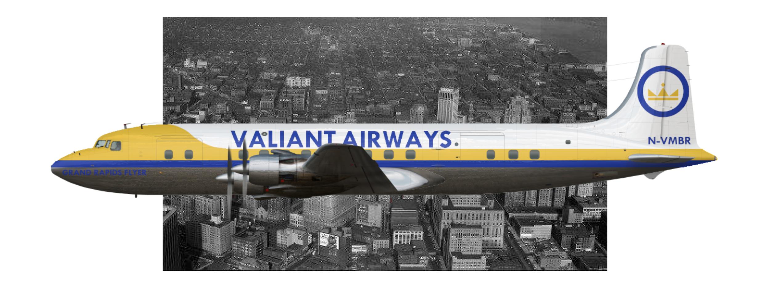
Here's the earliest livery for my R0 carrier based in America. I'm not really playing in the world in a completely realistic way, but I imagine Valiant in the "real world" started operations in Detroit and played a role in the 50s aviation scene as a major regional carrier in the Midwestern United States. This is a Valiant DC-6 named Grand Rapids Flyer and it served on the airline's staple route between DTW and ORD. More to come, comments and suggestions welcome.


Honestly, it's not a bad start for what appears to be your first upload. I'd recommend a better font (something more appropriate for the 50s), changing the logo a little so it's not so Swedish, and also changing the registration so it's in the right format for the US (should be Nxxxyy, where each x is a number and each y is either a letter or a number).
Thanks. I thought maybe the font was a bit Art Deco-ish but it's probably not suitable for the 50s. I used the crown logo because I have a good idea for a more simplified crown logo for later in the 60s/70s but I thought it would look out of place on the more ornate 50s designs, but I do see now that especially with the colour scheme, the crown I made gives off serious Swedish vibes. Thanks for the tip on the registration, for some reason I thought old American registrations were done in a different way but on second thought, that does seem a bit absurd.

Thanks. I thought maybe the font was a bit Art Deco-ish but it's probably not suitable for the 50s. I used the crown logo because I have a good idea for a more simplified crown logo for later in the 60s/70s but I thought it would look out of place on the more ornate 50s designs, but I do see now that especially with the colour scheme, the crown I made gives off serious Swedish vibes. Thanks for the tip on the registration, for some reason I thought old American registrations were done in a different way but on second thought, that does seem a bit absurd.
To be honest, there is nothing Art Deco about that font...
To be honest, there is nothing Art Deco about that font...
That's true. I struggle with fonts pretty frequently so sometimes I end up settling for a font that is less perfect and more just not visually offensive.


Honestly, it's not a bad start for what appears to be your first upload. I'd recommend a better font (something more appropriate for the 50s), changing the logo a little so it's not so Swedish, and also changing the registration so it's in the right format for the US (should be Nxxxyy, where each x is a number and each y is either a letter or a number).