
 Sign In
 Create Account


- Owner: ResidentEVO (View all images and albums)
- Uploaded: Apr 18 2020 01:39 PM
- Views: 1,376
- Album BahamAir

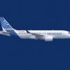
Bahamair's mainline narrowbody fleet consists of 4 Airbus A220-100, and 7 Sukhoi SSJ100 SuperJets.
The A220s were brought on to address the SSJ's lack of range, and lack of reliability. These aircraft serve destinations in North America, traveling up the east coast all the way to Montreal depending on the seasonal service. During peak season, these aircraft are supplemented by the two A330-200 aircraft bringing in tourists from Europe. The A220 is Bahamair's narrowbody future.
The SSJ is primarily constrained to Central American and some South American routes, with peak season service to Florida. The difficulty in obtaining parts has offset the value of buying the jets at a cheaper price than a new 737 or A319. When they fly, crews and passengers enjoy them, however as they approach 10 years old, the reliability is starting to become difficult to manage. With half the fleet parked for spare parts, the A220 cannot arrive fast enough.
These two jets are the first in Bahamair's new 2020 livery; featuring a splashier font, and new tail design. Darker blues with water highlights form a background for the palm trees, replacing Bahamair's bird logo. The A330 and DHC-6 fleet is due to be repainted this year, but with COVID-19 severely affecting finances, those plans may be pushed back.


cool!

Very Nice!


Way better, but I preffered the old font
True, the old one was nice and clean while this one's a bit hard to read, especially when its on top of the windows like this. I do really love the tail design, though!

Way better, but I preffered the old font
Eeehhh, the old one did not fit the brand imho. It was really tacky. This font really fits it and is well readable.
HOT
cool!
Very Nice!
Thanks guys! Appreciate it!
Way better, but I preffered the old font
Ehhh I think the old font now just looks bland. I wanted a splashier font like Caribbean Airlines.
True, the old one was nice and clean while this one's a bit hard to read, especially when its on top of the windows like this. I do really love the tail design, though!
Eeehhh, the old one did not fit the brand imho. It was really tacky. This font really fits it and is well readable.
Yeah I don’t really have a problem reading it either. It works well on the other aircraft in the fleet as well.

Good work!


HOT