
 Sign In
 Create Account


- Owner: Captain23 (View all images and albums)
- Uploaded: Apr 11 2020 02:55 AM
- Views: 1,674
- Album PEGAS
Cap.


Why is everyone going so hard on this?? Christ.

Why is everyone going so hard on this?? Christ.
nobody is going hard 
it's constructive criticism?
Has potential
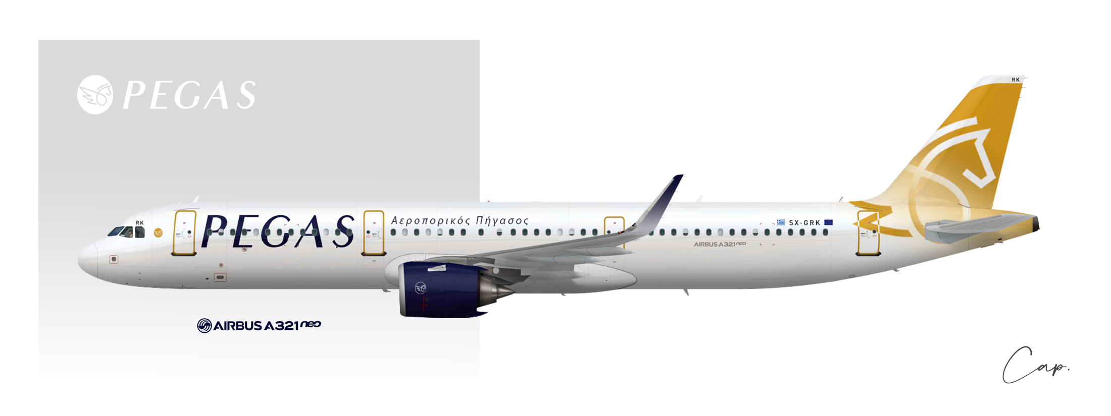
I'd face the logo forward though, and the way you did the gradient is creative, however I find it a bit odd.

this is quite good, but i agree with GJ, maybe turn the logo around so it faces forward.
Aside from the logo needing to face forward I agree that this is lovely
I tried to turn the logo around but I found it better looking like this.
Is this based off of the Russian airline Pegas? (I get it’s a Greek airline, but is that who you got your inspiration from) Not too bad, few tweaks to it could be great
Nope, I didn't know about this airline 
^^ I agree with everyone. It has lots of potential. Maybe tweak the logo, experiment with different line thickness and proportions of the shapes. Also, try drawing it several times on paper, see which ones look best.
Yes, I have to improve the logo. I don't really know how to do it but I'll find a way (my drawing skills are really bad ).
Bruh. I don't see you y'alls issues with this...
This is lovely!
Why is everyone going so hard on this?? Christ.
It's okay, it's not perfect. I need these feedbacks to improve it.
First of all; It is not generally preferred to have the symbols on the back of the aircraft (with a few exceptions), but it can be revised very simply.On the other hand, turning the logo design towards the front seems to cause different problems at this stage.I agree that there is a very serious potential in logo design.I have thoughts on exactly where the flag on the right side of the registration is aligned. Is there a closed windows? Otherwise its place remained a bit uncertain.Interesting point for me; I have never seen the usage of the European Union and the country flag being used separately in this way. Interesting...
Thank you for your help, I appreciate!
Thank you all for your constructive feedback. I don't think that my skills are good enough (I still have a lot to learn) to produce something really perfect but I'll try to improve it as much as I can! 

Why is everyone going so hard on this?? Christ.
Chill out dude. Brands are rarely, if ever, perfect on the first go around. You seem to think that constructive criticism counts as some kind of insult.
Thank you all for your constructive feedback. I don't think that my skills are good enough (I still have a lot to learn) to produce something really perfect but I'll try to improve it as much as I can!
Not much to say that hasn't been said already, but this is the right attitude! 
Keep at it and you'll improve. This has a lot of potential and I'm sure it'll be even better once you get the execution right.
nobody is going hard
it's constructive criticism?
^
Also, I'm suspecting this is just me but maybe decrease the kerning on the titles.

Also, I'm suspecting this is just me but maybe decrease the kerning on the titles.
Not just you
^
Also, I'm suspecting this is just me but maybe decrease the kerning on the titles.
Not just you
Noted!
Not a fan of winglet tbh. I like the font tho
Thanks. Yes, the winglet design is kind of unusual but I like it though.


A bit like everyone else, love the logo, not a big fan of the gradient nor the font, but good work nonetheless!