
 Sign In
 Create Account


- Owner: Fastball621 (View all images and albums)
- Uploaded: Mar 18 2020 07:09 AM
- Views: 1,387
- Album Fastball's Experimental Liveries
myself, med.

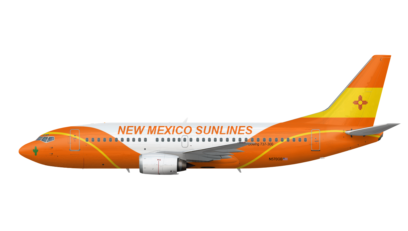
a livery made for my airline in R7. Some background, I have been toying with this idea for a few months right now, as it is my favorite idea for an airline I have had so far, and I have done several experimental iterations of this, in a number of styles, with influences from Southwest, and America West Airlines. This one is inspired by Sun Country Airlines. I feel as though if I want to make this better, I have to put it out an get some feedback!
for people who like lore: New Mexico Sunlines was founded in 1987 as the flag carrier of the great state of New Mexico, and now as of 1990 operates a all-boeing fleet, consisting mostly of 737-300's and a number of 757's. From any where in the southwest, If you want the best, "Fly the Santa Fe Trail"
(the line though the "slopes" is the motto-sake Santa Fe Trail)


I'd start with changing the logo, it seems like it's just the flag of new Mexico
Change the design, I'd think it looks better if the belly has that wavy thing rather than the entire plane,
And maybe a name change but that's up to you.
Here some feedback:
I'd start with changing the logo, it seems like it's just the flag of new Mexico
Change the design, I'd think it looks better if the belly has that wavy thing rather than the entire plane,
And maybe a name change but that's up to you.
Thanks!

I actually like this a lot. 5/5 for a unique livery design and originality. I've also been dying to see a livery from this airline when I first saw it in an old server Rainier Air was in awhile ago. I love seeing competitors that actually put effort into their airlines with lore, mission statement/business model, logo, and a livery. Combined with the lore, I'd say this livery, and what it represents, makes a lot of sense. I also like airlines that choose a unique livery style over the trend of modern billboard liveries (white fuselage with large lettering and only the tail is painted).
For feedback, you should enlarge the registration and make it bold. For the Boeing 737-300 text, I'd make it italic or bold, or a more stylish-yet-readable font. The current font for it looks really bland and boring. Everything else about the livery I love. Just a thought, but I wonder how the tail would look if you were to have the orange follow the "trail" yellow line, and then have the rest of the top of the tail be covered in a wavy NM flag.
Thanks, I will definitely take this into account when I revise this


Feedback Appreciated!