
 Sign In
 Create Account


- Owner: Theaviationspotter (View all images and albums)
- Uploaded: Sep 03 2019 07:09 PM
- Taken: 2019:09:04 08:18:31
- Views: 2,462
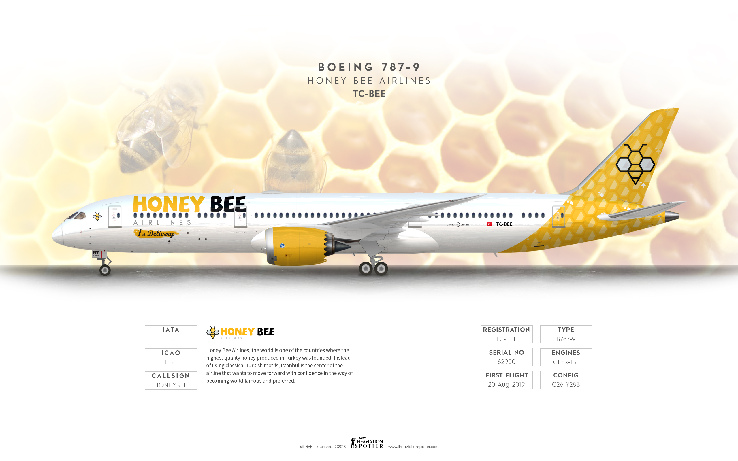
- Album Honey Bee Airlines


I find the concept of this airline very interesting however i really think that the font does not work in its favor.
i really think that the font does not work

I personally quite like this. The execution is good and, as your mission statement said, this is supposed to be an airline that breaks the norms.
Good work man! 
I like this! Great execution... agree with the font being a little smaller but otherwise its good.
I want to consider what so many people say in the comments. In this way, it is better to go with more organized design steps from the beginning.
I tried to find a way to enlarge because the title was a little short and I didn't want to put the "airlines" next to the logotype.
I think this way is much more beautiful


imo you should make the font a little bit smaller so it does not overlap with the windows otherwise nice!