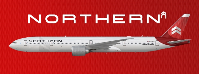
Northern Boeing 777-300ER 2019-present
- Owner: Boeing Flight Simmer (View all images and albums)
- Uploaded: Jul 31 2019 11:56 PM
- Taken: 2019:07:31 18:56:07
- Views: 1,428
- Album Northern Airlines
BFS/Med

As 2019 came around Northern started working to refresh the airlines look. After working hard to polish the interior and uniforms they turned to the planes themselves. The airline first had designers try to polish the livery they were currently using and push it into the future but instead they decided to completely start from scratch. The typeface was changed the the N from the current logo was removed in place of the airlines original Chevron style logo used up to early 2010. After that they removed most of the red from the fuselage in turn preferring a sleeker look with light and dark grey. The first plane to adorn this new livery was a new 777-300ER dubbed 'Spirit of Chicago' to honor the airlines long lasting hq and hub in the city of Chicago. Kept secret from the public until minutes before the boarding of the new jets first flight from Chicago to Los Angeles only giving little hints of the future for the airline.
Now THAT's how ya make a livery, folks! Absolutely fabulous!
Interesting design. I'd make the engine red and continue the pattern to the edge on the tail. But it is interesting, indeed.
Just tryna shake things up a bit with the engine. I could not find a red I liked without adding a gradient to match with the subtle effect on the engine and there are already two gradients on the plane. Thanks!
Now THAT's how ya make a livery, folks! Absolutely fabulous!
Thanks!
What bitofatit said, but I do like this ![]()
I love it! The only thing I really have to criticize about the livery is that the printed Chevrons seem to be a bit much for the engine.
What bitofatit said, but I do like this
Thanks ![]()
I love it! The only thing I really have to criticize about the livery is that the printed Chevrons seem to be a bit much for the engine.
Yea I agree. I will remove ![]()
I really like this, it's absolutely fantastic. Only one thing I'd change - as bitofatit suggested, I'd also say move the red pattern all the way to the top of the tail, and then move the chevron logo up a little bit to balance it out.
I really like this, it's absolutely fantastic. Only one thing I'd change - as bitofatit suggested, I'd also say move the red pattern all the way to the top of the tail, and then move the chevron logo up a little bit to balance it out.
Thank you. The grey is there for a reason. but thank you ![]()

 Sign In
 Create Account


Interesting design. I'd make the engine red and continue the pattern to the edge on the tail. But it is interesting, indeed.