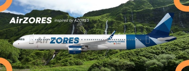
AirZORES A321
- Owner: oofitsnick (View all images and albums)
- Uploaded: Feb 13 2019 12:31 PM
- Views: 695
- Album My Liveries

An AirZORES A321-200 fitted with CFM engines. Based off of the Azores Airlines livery. Think of this as a, if i could fix the Azores Airlines A321, what would I do?
I don't think this comes from adequate planning. Can you explain the aspects of the livery?
Well the tail/winglet design really has the only "deeper meaning" part. They both, as you can see, have nine different "shapes." These nine shapes (or sections, whatever you want to call them) represent the nine islands of the Azores. Like I said, this livery is almost a redesign of the current SATA/Azores Airlines livery.
If I could fix the livery, I can tell you one thing, I wouldn't have done this.
But how do people know if they represent the nine islands? In my opinion, they don't look like anything, and I needed to actually count them to know there are nine shapes. Why not just put nine circles, or nine stars, or whatever, and people would be able to recognize the symbolism quickly. You probably need to learn about symbology. Last, be careful with the word 'redesign' because it means to make a modification of a design in order to improve it. This may be influenced or affected by SATA/Azores, but definitely not better. If I got to be honest, it's not even as good.
But the point of the symbolism (or whatever you want to call it) isn't supposed to be completely obvious. I put the last sentence "Like I said, this livery is almost a redesign of the current SATA/Azores livery" because on the current SATA/Azores livery the nine shapes have the same meaning there. I only knew this because of a quick google search.
Also, a redesign doesn't necessarily have to be better, as that's subject to one's own opinion. (and the word says it right there, RE-DESIGN. design again.) Take for example the redesigned Aer Lingus livery. Some may hate it, but that doesn't change the fact it is a redesign
Thanks for the criticism
If I could fix the livery, I can tell you one thing, I wouldn't have done this.
I'm glad to hear a (basically) professional at livery/graphic design wouldn't do the same thing as an amateur who makes liveries on a whim.
But the point of the symbolism (or whatever you want to call it) isn't supposed to be completely obvious. I put the last sentence "Like I said, this livery is almost a redesign of the current SATA/Azores livery" because on the current SATA/Azores livery the nine shapes have the same meaning there. I only knew this because of a quick google search.
Also, a redesign doesn't necessarily have to be better, as that's subject to one's own opinion. (and the word says it right there, RE-DESIGN. design again.) Take for example the redesigned Aer Lingus livery. Some may hate it, but that doesn't change the fact it is a redesign
Thanks for the criticism
In SATA/Azores, the shapes serve as parts of a logo. They have their meaning, but even when people don't get the idea behind those shapes, they can still see the bigger picture.
I still hold different perspective about your definition of a redesign, or almost redesign. Moreover, it seems that you just grab one element from a well-built brand concept, and develop it into.. nothing actually.

 Sign In
 Create Account


