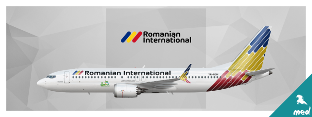
Romanian International Airlines Boeing 737 MAX 8
- Owner: S K Y (View all images and albums)
- Uploaded: Jan 16 2019 07:03 AM
- Views: 1,340
- Album SkySwimmer's Gallery of Confidently Eye-friendly Liveries
Livery design by SkySwimmer, Template by Medviation. Usage restricted without explicit permission from creator. © 2019

'Iași'
Model: Boeing 737 MAX 8
Airline: Romanian International Airlines
Livery:
Country: Romania
Here is my comments;
1. Although the font is very fashionable, the title logo is too big for that kind of small aircraft. I think it would look much nicer if it was a bit small.2. I would like to make a bit bigger logo stand out in front of the engine.3. Tail section is good except that the split scimitar winglet section looks soo complicated to me.4. The logo is used on engines are way to small to relalized that there were a logoAs a general, I honestly like that aircraft
Yep, agreed with all o that! Altough with those refinements, fork yes this is hawt
Here is my comments;
1. Although the font is very fashionable, the title logo is too big for that kind of small aircraft. I think it would look much nicer if it was a bit small.
2. I would like to make a bit bigger logo stand out in front of the engine.
3. Tail section is good except that the split scimitar winglet section looks soo complicated to me.
4. The logo is used on engines are way to small to relalized that there were a logo
As a general, I honestly like that aircraft
Thank you for the comments. Here is my reply:
1. The design is a bit heavy on the back, so I need something big on the front to balance it. Smaller title will make it look empty on the front.
2. The logo in front of the engine is sponsored, in this case Romanian Tourism Board. The size and placement is agreed with the sponsor, and here I just go with common practice.
3. According to my wife, I do like to complicate things.
4. You can't actually put multiple colours on LEAP engines. In fact, you need to keep it at monotone as possible for controlled heat distribution. The logo on engines is not for identification purpose, it's just to help mechanics know which engine to put on starboard and port side.
What I always love about your work is the effort to render as realistically as possible the paint on the planes' curves. The titles, pattern on the back of the fuselage and on the lower portion on the winglet do just that.
This is great.
I also really like this, but the Boeing 737 MAX decal should be moved... It's kinda just plopped there.
Thank you for the comments. Here is my reply: 1. The design is a bit heavy on the back, so I need something big on the front to balance it. Smaller title will make it look empty on the front. 2. The logo in front of the engine is sponsored, in this case Romanian Tourism Board. The size and placement is agreed with the sponsor, and here I just go with common practice. 3. According to my wife, I do like to complicate things. 4. You can't actually put multiple colours on LEAP engines. In fact, you need to keep it at monotone as possible for controlled heat distribution. The logo on engines is not for identification purpose, it's just to help mechanics know which engine to put on starboard and port side.
The thing about the MAX logo I also agree with, but srs, simplify the pattern on the scimitars and you've got a stunner...
Thank you all for the comments and suggestions. I appreciate them all.
I always try to get the most realistic look for my design, and that's including making it 'perfectly imperfect' just to give that subtle itchy-catchy feeling.
My concept is that if everything seems to be right, then the whole thing must be wrong.
It's a bit weird, I admit, but it's just me.
After considering it for a second time, I do think I need to tweak the winglet pattern a bit.
So I make it even more complicated.

 Sign In
 Create Account


Here is my comments;