
 Sign In
 Create Account


- Owner: POTKC (View all images and albums)
- Uploaded: Oct 02 2018 03:45 PM
- Views: 1,481
- Album Air Canadien | History
Template by Medviation, livery © POTKC 2018, reproduction or use not permitted without written and explicit consent.

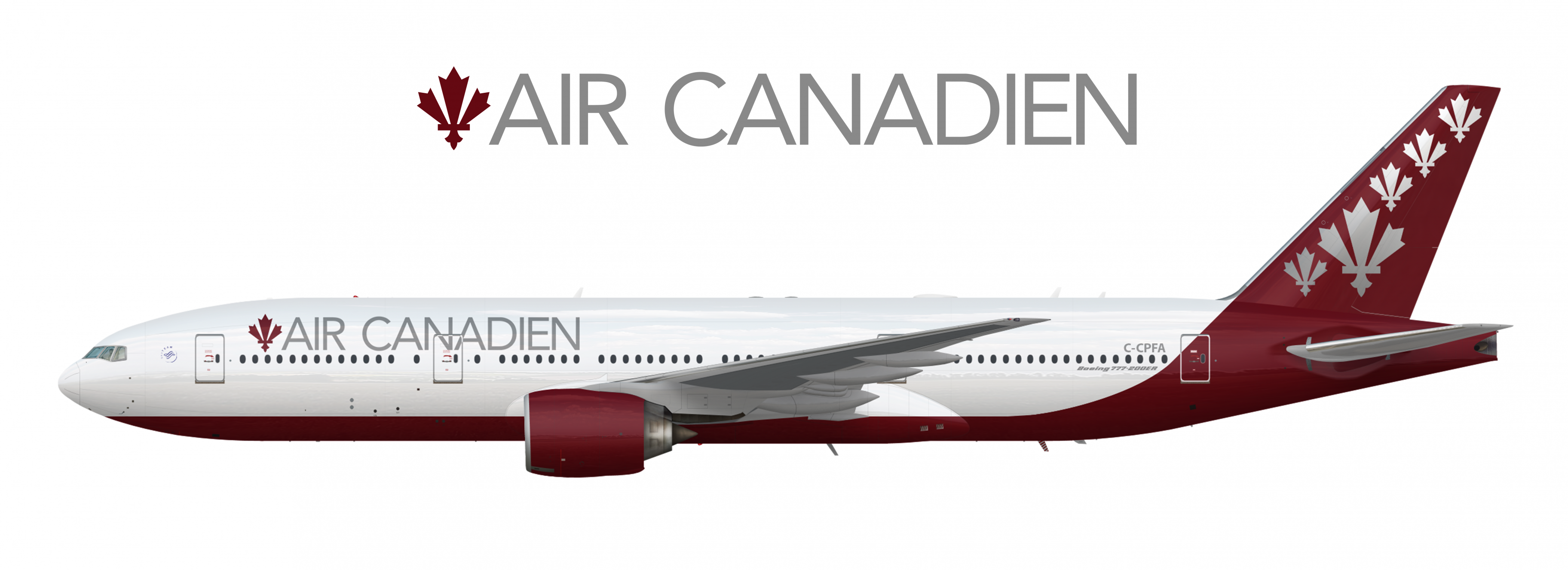
Airline - Air Canadien
Aircraft - Boeing 777-200ER | C-CPFA
Delivered to Air Canadien, 1997
Livery - Standard 2005
Country - Canada
In 2005, Air Canadien underwent a rebranding significantly changing their brand font for the first time in several decades, and introducing a vastly modernized livery. The first aircraft to be painted in the new livery was C-CPFA, which had been the first 777-200ER delivered to Air Canadien back in 1997. The same year (in 2005) Air Canadien joined SkyTeam, proudly displaying the alliance's logo at the front of the aircraft.


One of the things people don't like is change so keeping some aspects of the livery such as the logo similar would be advisable. I would suggest the same tail design as the 1995 livery
I forgot to mention in the description that the five Fleur du Canadas are meant to represent the five regions of Canada. The big one represents Quebec. I agree that huge changes can wreak havoc on a brand )this applies even more to the next rebranding I think) but I wanted to do something that would to do something for this new livery that would differentiate it from the 1995 one - having just one leaf would make the tails on the two identical - but still keep the basic identity of it. I was originally testing it with five small ones, but I felt that one large one surrounded by four smaller ones looked better and more like the original design.


Love the livery, Simple but still elegant. the only thing I don't like though is the tail, just having one symbol in the middle would be great. One of the things people don't like is change so keeping some aspects of the livery such as the logo similar would be advisable. I would suggest the same tail design as the 1995 livery