
 Sign In
 Create Account


- Owner: FancyThat (View all images and albums)
- Uploaded: Aug 21 2018 01:50 AM
- Views: 1,048
- Album Afresh By Fancy

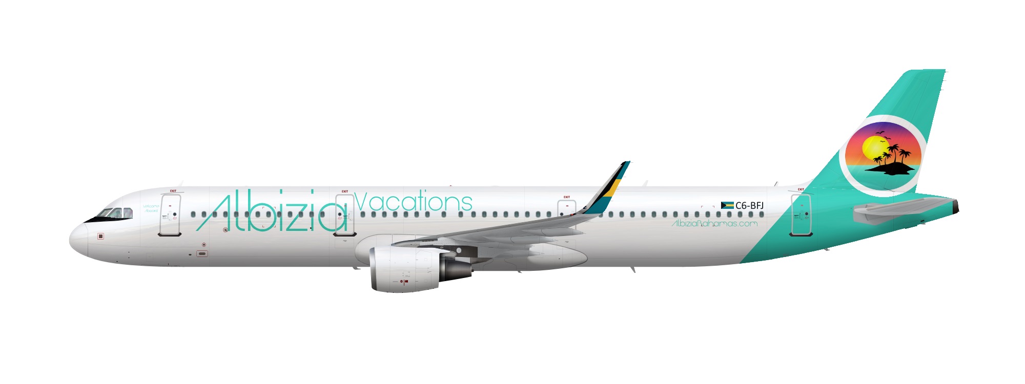
Albizia is a tour operator based in the Bahamas. They operate over 50 Airbus A320 family aircraft, operating flights throughout North America and the Caribbean. This A321 is one of seven painted in the Albizia Vacations livery.
Template by Med.
Logo by GetDrawings.com


50 A320-family aircraft (indeed, 50 of pretty much any type) is way too much for an airline based in the Bahamas. The livery is a good effort, but there are also quite a few things wrong with it: There's no reason - practical or aesthetic - to have anti-glare paint on an A321 in 2018. The placement of the title is really weird - try moving 'Albizia' down a bit, farther from the top of the fuselage so its more centered, and make the 'Vacations' either a bit smaller, or place it under the windows. The tail design is pretty good (although I'd never use a logo I didn't make myself, but that's just a personal preference), but I'd make the circle logo smaller, and place it higher on the tail, so it is confined only to the tail and does not 'leak' onto the fuselage. In terms of smaller nitpicks, the font you've used for the website on the rear fuselage is too fine and has too many irregularly shaped letters to be readable at any distance. Finally, while your idea with the flag on the winglet is good in principle, it looks sort of strange here. I'd recommend making the winglet the same blue color as the tail and rear fuselage. On a more general note, using clipping masks to make edges smoother is a good way of making any livery look 10 times better.
Thanks for the advice. I will use this in making new liveries, however I have no intrest in working on this livery further. Once again, Thanks!


50 A320-family aircraft (indeed, 50 of pretty much any type) is way too much for an airline based in the Bahamas. The livery is a good effort, but there are also quite a few things wrong with it: There's no reason - practical or aesthetic - to have anti-glare paint on an A321 in 2018. The placement of the title is really weird - try moving 'Albizia' down a bit, farther from the top of the fuselage so its more centered, and make the 'Vacations' either a bit smaller, or place it under the windows. The tail design is pretty good (although I'd never use a logo I didn't make myself, but that's just a personal preference), but I'd make the circle logo smaller, and place it higher on the tail, so it is confined only to the tail and does not 'leak' onto the fuselage. In terms of smaller nitpicks, the font you've used for the website on the rear fuselage is too fine and has too many irregularly shaped letters to be readable at any distance. Finally, while your idea with the flag on the winglet is good in principle, it looks sort of strange here. I'd recommend making the winglet the same blue color as the tail and rear fuselage. On a more general note, using clipping masks to make edges smoother is a good way of making any livery look 10 times better.