
 Sign In
 Create Account

Espanol Airbus A350-900
- Owner: S K Y (View all images and albums)
- Uploaded: May 25 2018 05:02 PM
- Views: 2,057
- Album SkySwimmer's Gallery of Confidently Eye-friendly Liveries
Livery design by SkySwimmer, Template by Medviation. Usage restricted without explicit permission from creator. © 2018

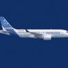
'Almería'
Model: Airbus A350-900
Airline: Espanol
Livery: Diversity
Country: Spain


While I do think you have a great little logo going, good job if you made that yourself. It works quite poorly on a plane, and the livery itself isn't very good either.
It's a good little logo indeed, but I didn't make it myself.
I shall return to my workstation and see if I can improve this.
Anyway, changed pattern on tail.
The stereotype is strong with this one, yet ironically other parts don't reflect Spanish image at all. But the real world Iberia airline is the same so why not. 
I love it!

The tail is really great. I love the idea, and the execution is top notch.
Not sure about the beige belly, feels a bit out of place, though I get where it's coming from.
The logo is quite fine, so is the font, and I like what you've done with the colour splashes, but I feel it just doesn't fit with the tail.
The name is wrong. You need at least a tilde over the Ñ to make it remotely correct, and it doesn't make much sense.
I like it when airlines include the aircraft type on the livery, but I don't like that you kept Airbus' colours there.
Lastly, and this is not specific to you but I see it far too many times here, I think the registration number font & size can use some rework. I'll look for some regulation but I'm pretty sure this doesn't fit in.
Thank you.
My main problem with this livery is to connect the logo and the tail design. So far, I come up with what you see here.
I don't see the problem with the beige belly, although in this third change I made modification on the nose part.
Yes, the spelling is wrong and doesn't make much sense, but I think it's easily recognizable. It's all about marketing and registration and administration issues.
As for the Airbus colour, I think it's just a common practice.
You see, I like to deliberately put a couple of not so annoying imperfections just to make it noticeable, and hopefully realistic. A small 'proper' misalignment, for example, or in this case, the Airbus colour that doesn't fit the overall scheme and the beige colour on fuselage that doesn't really important.
I kinda like it, I don't know why.
I think you're right about the registration number, so I changed it to something that I think is more acceptable.
Also in this 3rd (last) change, I added a couple of more decals and added name to the aircraft.
I hope you guy like it and thank you very much for the comments.


While I do think you have a great little logo going, good job if you made that yourself. It works quite poorly on a plane, and the livery itself isn't very good either.