
 Sign In
 Create Account


- Owner: Trevor de Verteuil (View all images and albums)
- Uploaded: Apr 25 2018 07:53 PM
- Views: 5,397
- Album Jetpac | Jetpac Hopper
Trevor de Verteuil. Templates by Med (Rokkit Bunny: EJ Design @ Shutterstock)

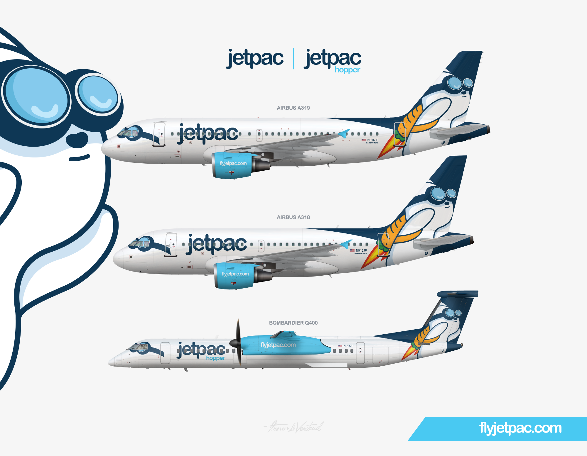
Jetpac operates a fleet of Airbus A318s, A319s, and Bombardier Q400s. The Burbank based carrier prefers to keep aircraft size down in order to increase frequency. While the Airbus planes operate on trans-con and high demand routes, the Q400s operate to smaller destinations under Jetpac Hopper's branding. Hopper's goal is to increase connectivity and sense of community on the West Coast.


Everything. The livery, the story line, the colors and symbols, if it were real the old livery would be up there with Spirit for my top least favorite airline livery if it didn't surpass it. Saguaro needs a better tail design in general. That gradient just doesn't work.
Anyway, we're getting off topic. Take your brands somewhere in the forums, Mallard.
Fine. Sorry everyone hates my airlines.

Ugh I have mixed feelings that are gonna be lost here on page four but I'll give them anyway.
The bunny with the jetpack carrot is a perfect mascot, and the livery is pretty well done. The forward mask is so unique and original, that is one of the best pieces on the site. Also, the name is extremely creative and well done.
However, I don't believe that the bunny mascot should be the tail design. I have no idea what you should use but for me the only reason I don't like it is because the bunny looks so odd the way it's given. Maybe if you had "Jetpac" on the tail with a small version of the bunny it would look better but I feel as if the bunny is too complex and almost unprofessional.
It's a wonderfully creative concept and is well thought out but to me the bunny on the tail the way it is just seems like an anime logo for an otherwise respectable airline. That's my lost opinion, but it's your choice.
Thanks for your honest feedback! I can totally see where you're coming from and as someone who's not a fan of animé myself, I can see why that would be aggravating. I make my own personal peace with the bunny on the tail because for me the drawing style isn't really animé as much as it is a contemporary American style cartoon but I absolutely see what you mean.
Ultimately the reason why I decided to display the bunny on the tail was because it is humorous and youthful which I think caters well to the airline's Millennial customer base.
Thanks for your answer. It definitely is humorous, I laughed when I first saw it as well. I can see it as a cartoon as well, and now that you've answered I like the brand more. Well done.

Oh my god that is beautiful!!!


Everything. The livery, the story line, the colors and symbols, if it were real the old livery would be up there with Spirit for my top least favorite airline livery if it didn't surpass it. Saguaro needs a better tail design in general. That gradient just doesn't work.
Anyway, we're getting off topic. Take your brands somewhere in the forums, Mallard.