
Northern Pacific Airlines | Boeing 747-100 1968-1981 livery
- Owner: Melodique (View all images and albums)
- Uploaded: Oct 04 2017 03:56 AM
- Views: 1,916
- Album Northern Pacific Airlines
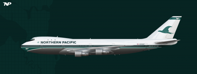
Boeings and NP's cooperation was very successeful, which was recognizable in planes like the 707, 727 and 737. The cooperation went so far that Northern Pacific had some influence on the design of the big jumbo itself: the 747. Orders where made immediately. The 747 reached whole new markets. Asia and Europe were now easy to get to and with even more passengers than before. NP saw themselves using two of the three big jumbos available: the 747 and the DC-10. In the Northwest it was Northern Pacifc to whom everybody would go to. In the 20 years the airline operated in expanded massively and gained a great reputation even if they had some incidents. But those were rare cases which everybody knew. A little decline of passengers occured after horrific incidents with the DC-10 but after a couple of years it went back to normal levels. Northern Pacific also managed to become a major airline. Most people in the country knew the airline and many people around world did too. Admittedly there was one concern and that was the uprising of the first low cost carriers which at that point didn't make that much of an impact on the airlines profit but certainly did worry the airline.
8.5/10
Anyway, with a guy like you, I shall raise my level of critique.
The circle of the logo is jagged. You need a better quality logo image, or just draw the circle by yourself. It is seen when I see the image in 100% size.
Don't let the white fuselage and engine layer visible. I can still see a hint of white peeking from behind the metal layer.
The black below the windshield (cockpit) overlaps the window frame a tiny bit.
If you use Boeing font for the 747-100 on the rear, that will look dramatically realistic.
I'd add a little more spacing between the emblem and the text, maybe the same amount of space as between Northern and Pacific.
Other than that, this is a standard(average) but pretty livery.
Nice
I'd add a little more spacing between the emblem and the text, maybe the same amount of space as between Northern and Pacific.
Other than that, this is a standard(average) but pretty livery.
8.5/10
Anyway, with a guy like you, I shall raise my level of critique.
The circle of the logo is jagged. You need a better quality logo image, or just draw the circle by yourself. It is seen when I see the image in 100% size.
Don't let the white fuselage and engine layer visible. I can still see a hint of white peeking from behind the metal layer.
The black below the windshield (cockpit) overlaps the window frame a tiny bit.
If you use Boeing font for the 747-100 on the rear, that will look dramatically realistic.
Thank you so much for your great critique guys ![]()
Yeah this is bueno ![]()
Simple, no-nonsense, elegant! Glad you made the extra effort on making a more custom look on the belly metal.
Thank you for the big compliment Med ![]()
Nice
Thank you Bfs ![]()
Yeah this is bueno
Thank you Vision ![]()
updated
-addressed the circle of the logo
-fixed the cockpit window overlapping
-edited the white fuselage layer
-changed the font of the 747 text in the back to the boeing font
-increased the spacing between the logo and the northern pacific text

 Sign In
 Create Account








Simple, no-nonsense, elegant! Glad you made the extra effort on making a more custom look on the belly metal.