
 Sign In
 Create Account


- Owner: X-Wing @Aliciousness (View all images and albums)
- Uploaded: Mar 23 2017 07:30 AM
- Views: 3,214
- Album Brand By Agre

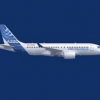
A rework of Oceanic's previous "Arctic" livery, now featuring the new Oceanic Wordmark, refined logo, and a more subdued use of color to create a simpler and more refined look for the Airline.
Notable new livery features include the black wingtips, reworked aircraft names, and the "Oceanic Airlines" titling over the entry doors L1 and L2.


 Love it!

I like the last version better.
Although I do like this, I am a bigger fan of the older variant as well 
Unfortunately you are both wrong, this version is far superior to the old one.
I'm just saying that generic optometrist font isn't doing it for me
I'm just saying that generic optometrist font isn't doing it for me

Although I do like this, I am a bigger fan of the older variant as well

No thank you.. Oceanic is ruined for me with this 

No thank you.. Oceanic is ruined for me with this
I actually enjoy this.

