
 Sign In
 Create Account


- Owner: -Newcdn (View all images and albums)
- Uploaded: Feb 09 2017 11:22 PM
- Views: 1,249
- Album Newcdn's Gallery


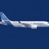
missing the black raccoon mask on the cockpit windowa, other then that its pretty good!
missing the black raccoon mask on the cockpit windowa, other then that its pretty good!
I find that very distracting.... I can live with the black titles and roundel below the windows, but I hope AC gets rid of the bandit mask soon.
I find that very distracting.... I can live with the black titles and roundel below the windows, but I hope AC gets rid of the bandit mask soon.
I got to admit, I think seeing this new livery will be as annoying as the all Sky-blue livery.

If anyone has connections in Air Canada. Kindly refer me to their brand image director. I'll give that person a massive concussion.

If anyone has connections in Air Canada. Kindly refer me to their brand image director. I'll give that person a massive concussion.

If anyone has connections in Air Canada. Kindly refer me to their brand image director. I'll give that person a massive concussion.
Why? The new livery is really good (except that maple leaf below the titles). The titles could be red, but black works as well.


No, I can't do the black. It just isn't right. Air Canada was fine as it was.


Minus the red stripe, yes. Near enough.